The author says:
Each year, Master Voider Democryos sends his brightest student into the war-torn countryside to work magic. But when the young Lady Marine leaves him for a mysterious man, he finds his own life ravaged. Forsaking the comfort of the citadel, he seeks to find her—not to gain her back, but to gain understanding. Traveling through the same forgotten lands where he previously sent his brightest students, Democryos picks up three strangers who are each missing something from their broken lives. As a group, they stumble upon a key from across the stars—not only to the war, but to immortality itself.
Nathan says:
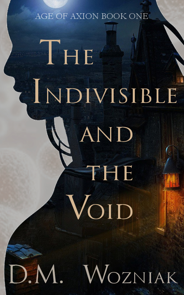
Wow. I really have no criticism of this one. The only thing that looks off to me is that too-large space between “D.M.” and “Wozniak.” I also might try putting the entire byline in allcaps, instead of smallcaps.
Good work!
Other comments?
My only criticism would be the silhouette needs a little refinement. Not to put too fine a point on it, but she would have to have size HHH breasts for that to be accurate.
Maybe she’s reclining on her elbows.
I think you can also see the curvature of the shoulder in the silhouette, which means the picture it was taken from isn’t edge-on. I think it is an angled shot from slightly to the rear, with the head turned into the plane of the photo. That would broaden the torso.
I’m not sure what would be gained by altering that. Presently the silhouette spans the width of the cover almost completely. If it were thinned around the bust, that would widen the small white strip on the left and potentially interfere with the text of the byline (which is in the same color). It might detract more than a more real-to-life silhouette would enhance.
Not sure if I can link a picture? I will leave it in the facebook comments and maybe the moderator could upload it. Silhouettes are tricky because what might make sense in photography may not when translated to the overall shape. I think the shoulder is elegant and can be played with. It would also leave more room to play with giving other weight/emphasis to the last words of the title.
I’m immediately drawn in: I need to read this!
Very nice! Perhaps your byline should be all caps and tighter kerning. — it almost disappears when it’s a thumbnail.
Very nice work. It establishes a forlorn ambiance that really seems to sit well with the description. It also includes elements that bring context to the blurb, once read, while at the same time being evocative in a vacuum. I wish my own could pull off half as much.
Thanks, everyone! I will work on the the silhouette and byline. Appreciate everyone’s replies! -Dave
I take it the (very well-endowed) woman in the silhouette is a very important character, if not the most important? I say this because at thumbnail size, she’s very nearly all I can see. The architecture within the silhouette is only comprehensible when seeing the cover from up close.
Also, what’s with the background outside the silhouette? Some kind of electron microscope picture? Such would suggest this story takes place in a rather higher-tech setting than the fantasy elements in the description would seem to indicate; maybe the setting is actually post-apocalyptic with the “wizards” having reacquired modern-day technology levels, sort of like the anime and manga for Vampire Knight, in which the wealthier characters were shown driving around in fancy cars even though the rest of the setting looked distinctly Victorian?
The only issue is the silhouette. The curvature of the breast is way off. Maybe work on that a little and then you have something that will really pop!
I almost read it clearly from thumbnail view. Id try enlarging the text just a smidgen and see if it looks better; other than that it’s perfect.
Very nicely done.
But it does need a little more contrast between the different elements. Especially in thumbnail size, the images within the silhouette are lost. The area lit by the lamp is reduced to an orange blob and the rest to only vague blurs.
Even at full size, there is little of the background image that really gets across the setting I think you are trying to convey, especially since the entire middle half of the image is little more than a black field. The moon, the lantern and whatever that is at the bottom left are crowded into the edges and corners.
And I have no idea at all what those nebulous shapes are on the left.
So, all in all, if you are trying to get across the period or setting of your book, you need to do this a little more effectively.
This all leaves what might be the biggest problem with the cover: it does not seem to really convey an impression of the book you describe. The book is evidently a fantasy sent in an imaginary world in which magic exists. You mention a “war-torn landscape,” a “Lady Marine,” “magic,” a “key from the across the stars,” etc….but the cover does not suggest any of these things. It could just as easily be for a romance set in Victorian London. I really think you need to get across the nature and theme of your book a little better.
With the sole exception of the spacing problem Nathan mentioned, the typography is fine.
This is great! But the other problem with the silhouette is that it has white antialiasing artifacts around it. Either use a silhouette with sharp aliased edges, or set the layer mode to multiply so that those artifacts don’t show.