The author says:
Present day with available science appealing to all sci-fi readers with romantic interest.
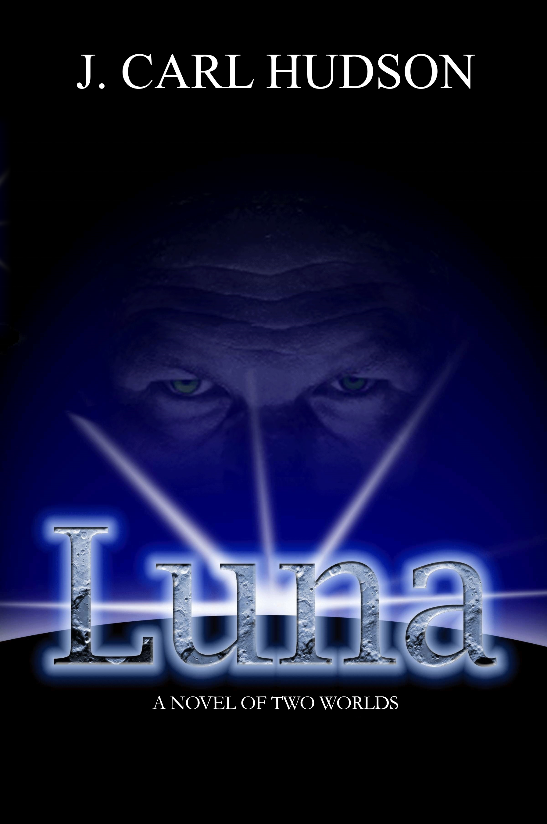
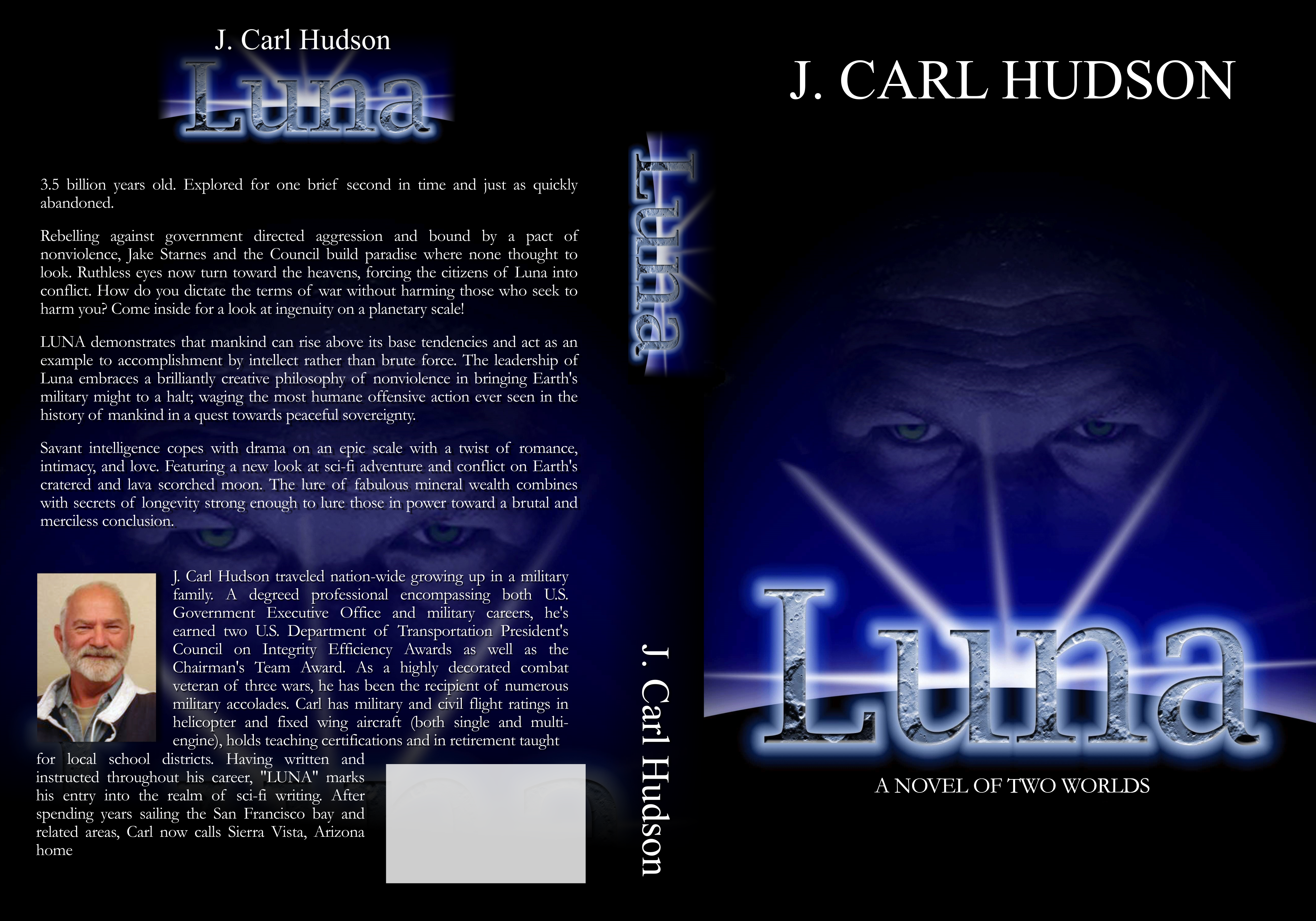
Rebelling against government directed aggression and bond by a pack of nonviolence, Jake Starnes and his Luna Council build paradise where none thought to look. Ruthless eyes turn toward the heavens forcing Luna into conflict. How do you dictate the terms of war without harming those who seek to harm you? LUNA demonstrates that mankind can rise above its base tendencies and act as an example to accomplishment by intellect rather than brute force. The leadership of Luna embraces a brilliantly creative philosophy of nonviolence in bringing Earth’s military to a halt; waging the most humane offensive action ever seen in the history of mankind in a quest towards peaceful sovereignty. Savant intelligence copes with drama on an epic scale with a twist of romance, intimacy and love. featuring a new look at sci-fi adventure and conflict on Earth’s cratered and lava-scorched moon. The lure of fabulous mineral wealth combines with secrets of longevity strong enough to lure those in power toward a brutal and merciless conclusion.
Nathan says:
I think the elements are mostly fine (although the byline font too boring for words), but you’ve got an awful lot of margin around everything that serves no purpose. You’d be better off letting what’s there fill the space:
(That’s not the best font for the byline — I just grabbed the first one I found that was sans serif and tall.)
And while we don’t often focus on the back cover… dang, that’s a lot of words.
Other comments?
Back cover suggestions: write a compelling headline. (Don’t repeat the title of the book as the headline.) Try “35 billion years old.” Shorten your bio and crop out your shirt which looks sloppy. OR, put your bio at the end of the book. Add a testimonial on the back cover in its place.
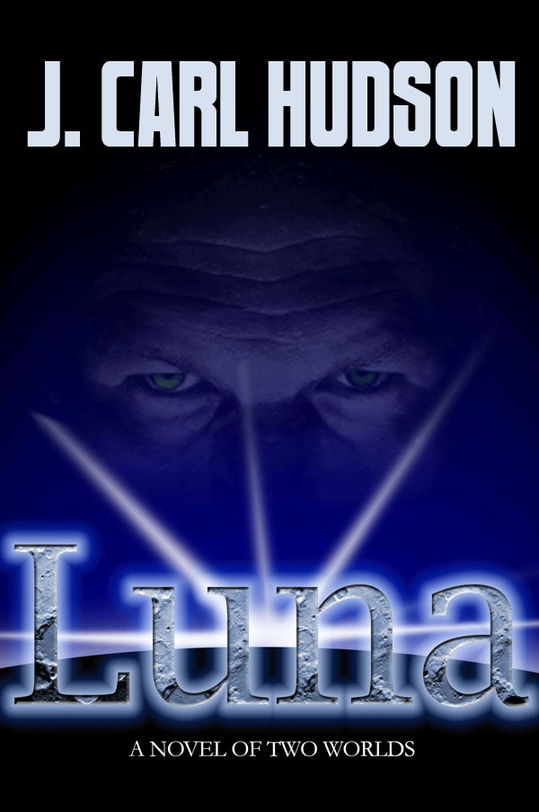
Cover suggestion: beef up “A novel of two worlds”. Make the face a little lighter because at a thumbnail size, you cannot see the face.
Not bad at all! Nathan’s suggestion that you make a little better use of the space is a good one. I think that the contrast on face might be bumped up just a wee tad, so that it doesn’t disappear entirely at thumbnail size.
My only really serious criticism is that I don’t think that the cover effectively conveys the idea that the book is hard science fiction (:”Present day with available science “). I think that anyone looking at the cover cold, without the benefit of having already read the description, would be forgiven for thinking that it might be a fantasy novel of some kind. There are really no elements in the cover that are unambiguously SF. Even the subtitle—“A novel of two worlds”—might mean something other than planets. (Of course, it is the face that really pushes the cover toward suggesting fantasy, since it is very wizard-like.) Perhaps instead of a blank, black curved shape at the bottom you could use an image of the moon (darkened, of course, to make it appear back lit).
Might something like the famous shot of Earth, Moon, and Sun in alignment work? (from 2001 I think) Possibly Earth suspended over the lunar sunrise already on the cover?
It would still leave the eyes on the back, where I feel they arguably work better than on the front (at leas as presently shown).
Not a bad start: having a guy’s face looming over a celestial orb like that does at least suggest something like a space opera, though unlike a lot of other novels that do this, there’s no established television or movie series underlying this. Not being a derivative work shouldn’t be a problem, however: just like your book, all of those series had to start from somewhere, right? On the whole, what visual elements you have on your cover so far are a good start.
What it mainly needs, in addition to a better font for its byline and tagline (something that doesn’t look like Times New Roman; that’s a standard font to be used in paragraphs, not for the standalone captions and titles on a book cover), is just a little more imagery. The face looming over the orb is all right, but there’s nothing to suggest that orb is specifically any kind of celestial object: none of Luna’s craters pockmarking the surface, none of Earth’s oceans and continents, no star field above it to clarify that this is outer space. Without at least one of these cues, the viewer could just as easily believe the guy’s face in the background is looming over some kind of dark crystal ball, and that the bright light on the horizon is coming from some kind of shiny amulet he’s got hanging around his neck just behind that ball.
For best results, therefore, put at least a star field and preferably either Earth or Luna’s surface on your cover. They don’t have to be incredibly bright, since you don’t want to draw too much attention away from the well-focused visual elements you’ve got, but they do have to be there. You need just enough imagery from outer space to indicate to prospective readers seeing the thumbnail “Hey! This book has space travel in it!”
For the back cover: as Peggy Nehmen says, no need to waste any of it on repeating the title from the front. If your potential customers are looking at the back cover and reading the description, then the front cover’s already done its job and they already know what the title is. For back covers, I generally recommend asking a “burning question” or making some kind of ponderous statement.
A few examples of what I’d put on that header for the back cover if I were the editor:
Earth waged war, but Luna waged peace.
Can one fight a war without violence?
True victory lies in defeating war itself.
Can victory come without bloodshed? Luna was going to find out.
Peaceful resolutions: now available on Luna at clearance prices.
What if the big curve was Earth, with a full moon somewhere over the author name? Just thinking…
That’s why I could kinda go either way on that.
I would REALLY suggest you ditch the texture on the text. It makes it look like the box art for a 90s video game.
It does look a bit 90s, but there is something I like about the lunar texture being present but the lunar surface being just a black orb.
This font seems fine, though I am not an expert, but might a different font help get away from the 90s look while leaving the texture in place? If the content of the book is in-line, does a 90s look help with the target audience?
FYI, gang: John is a client, and I suggested he post his cover here. Thus, as we are making his eBooks, (not his cover), I shan’t be commenting–please don’t hold your font suggestions on my account, right? (Not that most of you would, anyway.) Thanks.