The author says:
Two Go to Italy is a book describing travels in Italy by motorhome (campervan/RV). It follows on from Two Go to Spain which was published in 2016 and virtually uses the same cover with the difference only being the background image. I used a very dark font colour on the first book but it didn’t really work for this cover so I changed it to white.
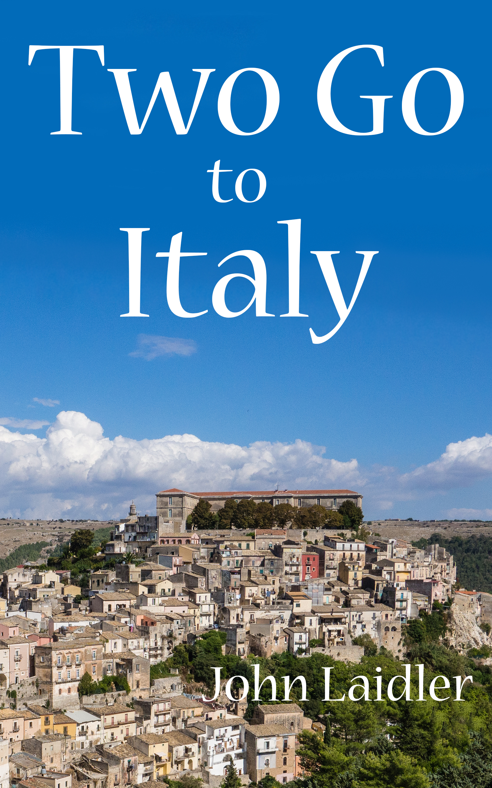
Nathan says:
Well, it’s definitely got Italy.
If a major part of the premise and appeal is that it’s an RV tour of Italy, shouldn’t there be some kind of visual reference to an RV? You may not have or be able to find a photo of an RV in Italy (that is, a photo of an RV which conveys “Italy” in its background), but you could put a clip-art RV behind the title. That would also give you a visual motif that you could add to the previous volume to tie them together visually.
Also, there’s no reason for the byline to be off to the side, or so small.
Other comments?
The byline could be in a different color— bright yellow maybe? And larger. It’s really not very visible. I agree with finding an RV image to add somewhere. I like the sky under the title though.
I’m sorry but I really hate this… it looks very DYI, like you just plopped text on a picture. Consider changing the picture to show the tone of the book. If this is funny stories pick something funny, if romantic, show that. is it a book about the traveling or about the vistas? in other words are you talking more about getting to the location or the location itself in the book? the cover tells us nothing about the type of book at all.
you might want to change out that author font for a handwritten one to suit a memoir. I like the font you have but it doesn’t sell the book. I get you’re trying to match for series branding but you might want to rethink that and make a fabulous cover and match the first book to the new one.
I felt bad for hating yours so made a sample for you
https://imgur.com/a/pY2zm
if you start with an interior view from an rv like this and remove the windows, you can put any scene into the window and change background color behind the text to match it. The text isn’t fancy but it’s arranged so doesn’t look slapped on. it has a hint of shadow and gradient and the slightest curve. a view from an rv window screams travel story. what you put in the window will set the tone. this one has dramatic flair but you could use anything. I picked the first free one on pixabey that caught my eye. the nice part is it can all be reused for the next book with very little work.
I hate that byline font, sm, but surprisingly, that title font kinda works. I like this. I shan’t lie–I like this more than I like the original submission.
I, too, feel that the submission is lacking a lot, compositionally and in feeling. I do like the title on the sky; that’s got decent contrast, etc. The image itself, though, feels a bit…underwhelming. Yes, it says ITALY, quite loudly, but..well, boringly.
If you’re somewhat married to this, and want to keep it consistent, and the series ditto…perhaps Nathan’s idea, finding an RV (I’d consider a sketch, rather than an image), and putting it behind Italy, only, might work? You could re-badge the first book, doing the same thing, except behind Spain (or…?, if that doesn’t work).
This one: http://www.eprintablecoloringpages.com/dad-and-family-in-rv-coloring-pages-printable-coloring-pages.html/tt-rv-gif is probably too comic. You could do something more staid, like so: https://www.canstockphoto.com/rv-motorhome-camper-6763132.html , although the colors make me say no to that one. This one has potential: https://www.canstockphoto.com/camper-9893615.html . Remember, it would be behind the location, so…{shrug}.
I would strongly consider trying some new fonts, too. Something with a big more spunk, if this is intended to be a humorous memoir? Travelogue? (n.b., to my fellow Critics–the first cover does have a small slice of an RV/camper/? on the cover, so while it’s not spelled out, the prospective buyer could infer that it’s a vehicle-camping trip.)
I see from reviews and praise that it’s a humorous memoir/travelogue, so you may want to invest in a customized drawing of a motorhome (perhaps filled with hapless adults, a dog, and whatever all else that suits) that you can use as the backdrop for the location–Italy, etc. That alone would significantly aid the current design, assuming it’s done right. You might have your artist make it QUITE long, just in case you end up writing about your travels to Montenegro or Saltimbocca-on-Avon, or the like.
And, yea…the font. I admit it, I somewhat like the touch of whimsy that the font imparts. I would, however, consider making the location name into something more solid (or, as I mentioned, magically turn it into an RV). Ditto with the byline–the cover would be a lot better-balanced if you’d center the byline (yes, yes, I know, you think it’s boring), and use a stronger, sans serif font for the byline.
Those are my comments.
Thanks – that concept works.
I had an idea that might look cool and be easyish to pull off. Maybe find a nice road image and fade it out on the edges and put the text along it. Not a straight boring road but slighly curving and write on a text path. Or try a clipping mask and put the rv into the text.
All right, this cover looks pretty much like what the book is, but it’s just so awfully generic. Nothing on this cover would be out of place for a brochure like you could pick up at any travel agency. This would be fine if you were advertising Italy to some potential tourists, but it’s my understanding this is supposed to be a book about what you specifically did while you were there.
While you were on tour in Italy, didn’t you take any pictures of your own? Whether or not they showed your camper, didn’t any of these pictures have a unique angle or perspective on something distinctly Italian? Basically, you need to be a bit more visually specific; you need to make this cover a cover about you and a fond memento of something you saw in Italy while you were there.
Unfortunately, there’s just nothing to draw me to this. The cover and the title are both completely plain, concrete descriptions of a trip to Italy.
I think you need to back up a bit and ask: Why should I care about your vacation? Is there heart-pounding adventure? Humor and heart? A soul-searching exploration of who you really are? Think about what your selling point is, and then show that on the cover.
Thanks for all the comments, very useful. Sadly I didn’t manage to get a picture of our RV anywhere interesting, which I did for the first book. I’ve some good photos of ruins on Sicily but they are Greek ruins!
I guess a proper bit of artwork in say a cartoon style might be the answer.
I’ve been playing with SM’s idea of looking out of the vehicle. So I took a photo (including my hand!) and quickly snipped it out and overlaid it on the paperback cover which I’m also creating. You should be abnle to see it here: http://www.john-laidler.co.uk/wp-content/uploads/2018/03/TGTI-Cover25-SW1.jpg
I think the perspective is all wrong – it looks like I am flying an aircraft though the photo of the town was taken with my feet on the ground. So for this idea to work I need to find an image taken from more road level and looking up.
I’ve had a look at the other version of the paperback cover, I’m not sure the shocking pink byline works but I’ve added a dropped shadow to the text and it seems to stand out better though this might be a cliche. You can see it here: http://www.john-laidler.co.uk/wp-content/uploads/2018/03/TGTI-Cover26.jpg
I guess there are two problems, firstly its my baby and therefore looks wonderful but the other is I’m a European and I don’t do garish! Understated suits me.
That’s actually not too bad-looking: I could easily believe your RV is sitting on a hill overlooking the town. Just be careful with your actual cover to do a more meticulous and refined cut-and-paste with it: the rough edges revealing your sloppy use of the “magic wand” function (or whatever it’s called on your image editor) are obvious at a glance even before zooming in, and the foreground is not properly anti-aliased to blend in with the background. As ever, I recommend softening and then sharpening the whole picture so as to blend the foreground and background consistently while maintaining the crisp details of everything else in the picture.
Thanks, it was done quickly just to see what it looked like but I wasn’t aware of the anti-aliasing trick to make it blend together.
These tweaks are making it worse, not better, I’m afraid. You still are not answering the basic question “Why should I read this?”
That’s the killer question and why a bit of custom artwork is probably the answer.
I’ll shut up after this one – just changed the title font to something bigger. http://www.john-laidler.co.uk/wp-content/uploads/2018/03/TGTI-Cover26-fonts.jpg
John:
I actually like your original title font. I wouldn’t mess with that, and I do think that the last few attempts–the ones that don’t look like you’re flying a spaceship into the town–are quie a bit better.
Did you see that one drawing, of the RV, that wasn’t cartoony? I think I posted a link to it…didn’t I? I bring it up b/c you said something, earlier, about a drawing..?
This one? https://www.canstockphoto.com/camper-9893615.html ?
Yes, I did see and it would be more the sort of style I would use. Thank you. 🙂
It wasn’t until I wrote this second book I realised how badly written the first one was! We are off to Spain again in 5 weeks for a 3 month trip visiting the places we haven’t seen yet including some bits of Portugal. This will give me enough new material to produce a completely revised version of the first book (Two Go Back to Spain – or something like that). At which point I will seriously consider commissioning two covers, one for each book.
So I’m not dismissing the comments made – I’ve very much taken them on board but time is against me as once we leave the UK in the middle of April trying to sort out any serious issues on an Android tablet isn’t going to be very practical and I don’t want to delay publishing until July or August. So I’m going to go ahead with the originals – very slightly tweaked and look to putting it in a new cover later in the summer.
My first book has sold steadily in the UK (2K+ copies – not exactly bestseller but more than I expected) but it fits into a very small niche and readers seem to be able to find it. For example, enter “motorhome Spain” into the Amazon uk website and the book is at the top of the listings presented. Even on Google UK “Amazon motorhome Spain” has it usually in the top three entries. I must stress this is the UK market, I’ve only sold one copy in the US ever!
To reiterate, I was fondly and foolishly hoping the reaction to the cover might mean only a few small changes were required whereas it probably needs to be taken outside and shot. I should have guessed this because covers of similar books do generally have proper artwork covers, usually in a humorous cartoon style. I shall start looking for an artist as my drawing skills are even worse than my photography skills. 🙂
Thank you all.
I like it, but your name is hard to see. Since you have no RV image and I’m not convinced it’s needed, what about centering your name and making it look like an Italian license plate?
https://i.imgur.com/ZwifbHp.jpg
Many thanks but I’ve since planted a few trees using Photoshop so the text is now against a dark green background. But then as no one knows who I am of course does it matter! 🙂