Bad Sands

The author says:

Title: Bad Sands (The Sandglass Chronicle #1)

Genre: Sword and sorcery fantasy

Target audience: Young adult

Set in the fictional land of Ternia, in the year 99 AS. After the Sunder War, 99 years ago, the people of the three continents of Ignisk, Glyne, and Fernlea mostly avoid contact with one another. A young man, born and raised in the great West Desert of Ignisk, must make the perilous journey north to Glyne in order to save his mother from an illness not seen since the war. Unforeseen developments steer his path, but will it lead to glory, or disaster?
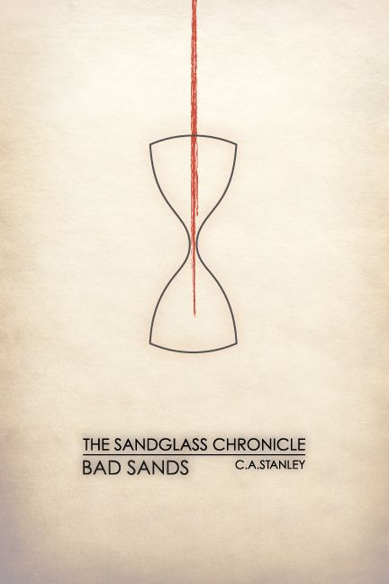
Bad-Sands

Bad-Sands

Nathan says:

I like the whole “minimalist movie poster” thing as much as the next guy, but I fear it has misled a generation of designers.  The reason that those movie posters can work is that we already know the movies in question — so when we see an iconic image from that movie, we can identify it and understand the image and its meaning.  But if you’ve ever looked at one of those posters for a movie with which you’re completely unfamiliar, it falls flat because it’s completely meaningless to you.

This cover exhibits the same problem.  If we already knew and loved the book, then this cover could be a witty encapsulation or callback to a central image of the story… but if you’re marketing your book only to people who have already read it, I’m thinking you’ve confined yourself to a very small market segment indeed.

Now, I actually like the type treatment very much, and I think it could work wonders with a different image (and if it were larger — there’s no reason to confine it to the center of the cover).  But there’s nothing here to tell the potential reader of YA sword-& sorcery that THIS BOOK IS FOR YOU, which is what a cover’s primary mission is.

But like I said, I like the print.  I think it could work very well to tell the potential reader that this is “not your father’s high fantasy” — but only if juxtaposed with artwork that tells them that it is fantasy.

Other comments?

A Greater Strength

The author says:

Lieutenant Commander Vinyanel Ecleriast, a dragon-riding elf cavalry officer, embarks on a reconnaissance mission vital to the security of his homeland. On a cross-continental quest, he hunts stolen talismans before they fall into the hands of those who would use them to penetrate the illusion that shrouds the elven capitol from enemies. A gypsy prophetess, a rival marksman, a bookish swordsman who fights with grace, and Vinyanel’s would-be assassin make up his eclectic squadron. Only if Vinyanel can keep his worsening symptoms of battle trauma at bay, and the whole squadron can learn to trust one another’s strengths will they intercept the malice set to befall the elven race.

A Greater Strength is sword-and-sorcery fantasy that appeals to the readers of Terry Brooks or Tracy Hickman (Or Jill Williamson in the Christian Speculative Fiction market, but that’s probably more obscure than helpful.) The books aim for a New Adult and Adult audience. This cover is for an ebook re-release of the book, as I have reclaimed my rights from a defunct publisher and would like to get the book back on the market, rather than collecting digital dust on my hard drive. Thanks for any input you have for me!

GreaterStrengthDragonShadow_white

GreaterStrengthDragonShadow_white

Nathan says:

Since this is labeled as the second book of a series, I looked up the first book’s cover on Amazon, because consistent branding between books in a series is very important:

cover[1]

The first two things I noticed are:

  1. The dimensions aren’t the same.  (The first cover is taller than the second.)
  2. The type treatment, while similar, is still distinctly different.  You have the title in a different place, and you haven’t continued the larger initial letters to the second cover.  The leading on the second cover (that is, the space between lines of type) also makes it harder to read.

I think you should definitely follow the first book on those details — not only are they an integral part of your series’ identity, but their handling on the first cover just looks better.

As far as the cover image itself, the best option would obviously be to have another painted cover in similar style as the first one (again, series identity), but if that’s not an option…

I think the areas for improvement on the second cover become more obvious in the thumbnail: There’s not a focus to your image.  Nothing is central; nothing is distinct, save the dragon’s shadow, which is then competed against by map and sword and book and…  (Plus, if you move the title higher to match the first book, it will interfere with the shadow’s head, which is the most visible part.)

I don’t know how much of the original image was cropped to make your cover; if there’s extra, my first step after moving and conforming the title would be to scootch the image down, so that the shadow’s head is central to the space left between the title and byline. Don’t worry that you lose the sword etc. in the thumbnail if you do that; your thumbnail is better off with a single focal image.  The other details will be just fine if the reader only discovers them at larger size.

Other comments?


The Eyes in the Gingerbread House [resubmit]

The author says:

This is a remake of the cover for this book, which hopefully is better than the first. Book info remains the same: A middle-grade satire about government and digital security in the U.S. involving an evil Santa Claus. It’s mainly humor/satire with fantasy and some sci-fi elements, set in a future Canada where Santa is real and runs a global Christmas operation. It is NOT dystopian by any means. It’s just normal Canada with some slight interference from Santa’s surveillance department.

One line pitch: After a school trip to the North Pole goes awry, revealing some unpleasant truths, a twelve-year-old aspiring journalist and her friends must find a way to bring down Santa’s global surveillance operation.

I know this doesn’t look like traditional MG fantasy covers, with a painted scene from the story in a frame, but I thought that since the story is slightly different from traditional MG fantasy ones (because of the satirical elements), a more modern, simple, and graphic design (as opposed to artwork) focused cover would fit the theme. The left lens is supposed to look like the view from a futuristic camera with a laser targeting/tracking/whatever system (the kind in sci-fi and spy movies that involve lots of red lines on the display), and the right lens is more or less a scene from the book. I know they probably won’t be visible in a thumbnail, but I’m hoping the general shape of the beard, hat, and slightly ominous looking glasses might entice readers to take a closer look, where they can see all of the little details. Hopefully this cover is better than the last one, and thanks for the help!

The Eyes in the Gingerbread House

The Eyes in the Gingerbread House

[original submission and comments here]

Nathan says:

Much, much better. I can see the Christmas vibe from 20 feet away, and the artwork is both clean and focused.

I don’t know how well confining the title to the hat/beard works.  For one thing, I’m always suspicious of divided titles — the eye has to jump and quest for where to continue with what should be a continuous thought — and for another, it crowds the artwork, while leaving the teal background (that’s teal, right?) empty and expansive.  I would play with cropping the artwork so that it leaks off the edge of the image, and seeing whether you can bring the title into one place.  (I also think the calligraphic font for “Gingerbread House” is unnecessary, and might be overkill.)

Re: the glasses: I like the concept of the surveillance camera-eye.  Remove the reflections, so that it’s clearer.  You’d get more impact from that eye if you just left the other as an inert lens — “Christmas” is already well-established, so you don’t need a Yuletide scene in there to reinforce it.

I think you’re definitely on the right path here.  Any other comments?

Fighters of the Code

The author says:

Yes, I know you have been eagerly awaiting this in your update feed! The wait is finally over. Book two in my series is here to judge!

Blurb

giant expansion untapped. An ancient threat ignored. A spunky elf re-pantsless. The vast expansion to the massively multi-player online role playing game Annals of Gentalia has been spread wide open and Anders, the elf protagonist from the last book is primed and ready to experience everything it has to offer. Anders must set off on an even higher staked quest to attempt to save his own ass. He and his companions are stretched to the absolute limit attempting to reach the climax of the island expansion. Many questions weigh heavily on Anders’ mind. Can he find who was responsible for breaking the world? Is this expansion also filled with sexually charged monsters ready to take advantage of any avatar that gets in their way? (Of course it is! This book would be dreadfully boring if it wasn’t!) More importantly to Anders though is his own personal question, “How could I possibly have lost my pants again?!”

Fighters of the code - Front Cover

Fighters of the code - Front Cover

Nathan says:

<george takei>Oh my…</george takei>

I will let everyone else give their opinions on this on.  Me, I’m overcome with the vapours.

Phoenix Afterlife [resubmit]

The author says:

This is a draft of a new cover for my book, Phoenix Afterlife. I previously submitted my original cover (https://covercritics.com/?p=1349) and received a very useful critique. The new cover, produced by Rena Hoberman at CoverQuill (whom I found through your Designers for Hire links), takes into account all the feedback that I received on the original cover. Thanks for any further input you folks care to give.

newCover

newCover

[original submission and comments here]

Nathan says:

Absolutely beautiful.  The steel-and-glass building, together with the square sans-serif font, gives the proper first impression of cutting-edge or near-future.  I love how the text on the spine just perfectly meshes into pre-existing elements of the image. And I didn’t notice the guy in the window at thumbnail, so it was an added discovery when I looked at the full-sized version.

If I were to tweak one thing (and this isn’t a make-or-break element), I would change the woman’s posture, leaning her to one side as she’s running, and maybe raise her hand so it looks like she’s reaching for the silhouette on the second floor, not the front door.

Other than that, though, perfect. I’m glad you were able to find a designer who could give you a cover appropriate for your book.