The author says:
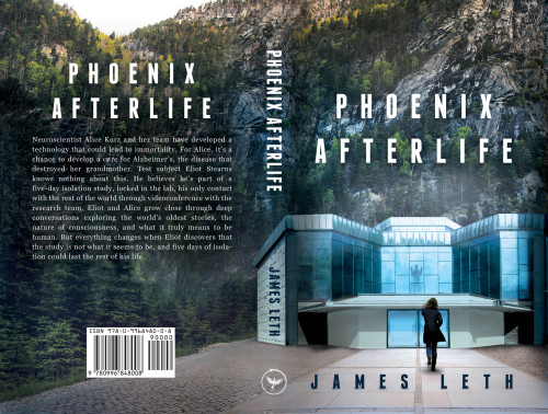
This is a draft of a new cover for my book, Phoenix Afterlife. I previously submitted my original cover (https://covercritics.com/?p=1349) and received a very useful critique. The new cover, produced by Rena Hoberman at CoverQuill (whom I found through your Designers for Hire links), takes into account all the feedback that I received on the original cover. Thanks for any further input you folks care to give.
[original submission and comments here]
Nathan says:
Absolutely beautiful. The steel-and-glass building, together with the square sans-serif font, gives the proper first impression of cutting-edge or near-future. I love how the text on the spine just perfectly meshes into pre-existing elements of the image. And I didn’t notice the guy in the window at thumbnail, so it was an added discovery when I looked at the full-sized version.
If I were to tweak one thing (and this isn’t a make-or-break element), I would change the woman’s posture, leaning her to one side as she’s running, and maybe raise her hand so it looks like she’s reaching for the silhouette on the second floor, not the front door.
Other than that, though, perfect. I’m glad you were able to find a designer who could give you a cover appropriate for your book.


I can’t add much to Nathan’s comments. Nice job!
There are one or two small comments (though the cover would work just as well regardless)…
I wish the girl’s hand were a little higher. At the moment it is even with the roof line which A. makes it hard to read and B. makes it look as though she were pushing the building. Raising the hand would make it more distinct and the gesture more urgent.
The perspective of the building and its shadows look wonky, but I wouldn’t worry about those.
What a marvelous transition! It certainly will help you stand out more than before, which I hope translates to sales.
So I love the concept and the general layout, but I think the execution is not nearly good enough. It would be great as a photoplasty done for fun, but it is not cover quality.
The problem that jumps out at me at first glance is the enormous woman headed for way-too-small doors, but there are many others:
-The obviously rendered building against the photographic background.
-The perspective. The roof of the first floor is at a sharper angle than the roof of the top floor, etc.
-The shadows. Sharp on the building, fuzzy on the ground. Angled on the building (or parts of it?), straight below on the ground. Fully lit walls of the building have shadows underneath them as though it’s floating.
-The man inside is also much too enormous to fit through the doors.
-The background photo is cloned.
I have to disagree with you on a couple of things.
«The problem that jumps out at me at first glance is the enormous woman headed for way-too-small doors.»
Nope, the woman’s the correct size. She’s much closer to the camera than the building, so she has to look noticeably bigger than the doors.
«The perspective. The roof of the first floor is at a sharper angle than the roof of the top floor, etc.»
The perspetive is fine. Okay, maybe it’s not perfect, but the one problem you pointed out is not a problem at all. Here, take a look: http://i.imgur.com/z7QO6Z3.png (I’ll get back to the man later)
I may have not drawn the red lines as precisely as I could, but it shows that the perspetive of the building doesn’t really have any problems. The fact that the horizon line cuts the woman right in the middle also proves my previous point. If the horizon line passed through the middle of he thighs, *then* that would make her bigger than the door. Not by much, though.
«The shadows. Sharp on the building, fuzzy on the ground. Angled on the building (or parts of it?), straight below on the ground. Fully lit walls of the building have shadows underneath them as though it’s floating.»
The shadows underneath are the only big problem here. It’s the thing that most make the bulding look like a cut-out pasted on top of the background. Okay, there’s the fuzzy/sharp, but there’s nothing wrong with the angles.
«The man inside is also much too enormous to fit through the doors.»
As you can see, I’ve put the silhouette of the man on the door to check that. And actually, you may be right about this one. I didn’t change the size of the man when I did that, but he’s farther away from the camera than the door. I would’ve needed to make the silhouette on the door bigger if I wanted to be accurate. The problem is I’m not sure how much bigger that would need to be, so he could either be bigger than the door, or not. There’s also the fact I extended his legs because part of them are obscured by the building, so I may have made them too long.
My point is, you can’t be sure he’s too big for the doors just by looking at the picture. I do think there is a problem with the proportion between his size and the whole building’s size, though. The building looks kinda small, I think.
The path where it meets the building is 60% of the width of the path where the woman is (and it’s off center, so there’s another thing). When you shrink the woman to 60%, she’s obviously too big for the doorway.
The other points also don’t stand up to scrutiny (you’ve left off the perspective line that obviously doesn’t match, for instance). But more importantly, you can’t argue an image into looking right. If readers look at your cover and go “That woman’s way too huge,” you won’t be there to personally explain how they’re wrong.
You both forget that perspective lines work on people too. If you translate her height, she’s just as tall as the red representation of the figure in the window. While both of them can fit through the door, the doors are usually quite a lot taller than an average person, so there should be more room between their head and the door. They should both probably be a bit smaller, but they can fit through the door. Also, both figures are the same height, so at least that’s good.
If you judge by the vanishing point, then the perspective on the path needs to be steeper. Whatever way you look at it, it’s wonky and wonkier the closer you look.
Nice work. I must point out, with all due respect to Nathan, that the figure’s hand, if you look closely IS pointing directly at the form in the window. I don’t think you need to change a thing.
I really want to like this more, but I’m seeing a couple of things that don’t work for me. Both have to do with the building. First, the building doesn’t fit properly into the background topography for me. It screams cut and pasted to me, rather than being cleverly done. Second, the doors on the first floor (as has been pointed out by katz) are far too small for either figure on the cover (more dramatically the woman).
Positives: I like the background, the typography, and the overall concept. I’ll second what Nathan said about the spine.
It’s a huge improvement over the original submission. I think with the right tweaks, this one can be made better. Or, you can just ignore me and go with it as is. 🙂
It definitely does not need much, it looks good – the background photo repeats itself, but most people will not first thing spread the book open, flatten it, and look at it like that.
On closer look though the perspective is slightly wrong, it makes me think the woman will hit her head on the lintel. Moving her lower as if closer to viewer would probably fix it – she could, as an element on cover, be bigger: not that she should be 3 metres tall. The house itself seems a bit crooked too, but that could be just modern architecture – the designer could see if any angles should be tweaked. Other minor, minor tweaks could include moving the title a bit more up and making it a little bigger/more visible.
I have to admit that upon reflection I think the perspective, shadowing and pasted-on look of the building does indeed work against the cover.