The author says:
Yes, I know you have been eagerly awaiting this in your update feed! The wait is finally over. Book two in my series is here to judge!
Blurb
giant expansion untapped. An ancient threat ignored. A spunky elf re-pantsless. The vast expansion to the massively multi-player online role playing game Annals of Gentalia has been spread wide open and Anders, the elf protagonist from the last book is primed and ready to experience everything it has to offer. Anders must set off on an even higher staked quest to attempt to save his own ass. He and his companions are stretched to the absolute limit attempting to reach the climax of the island expansion. Many questions weigh heavily on Anders’ mind. Can he find who was responsible for breaking the world? Is this expansion also filled with sexually charged monsters ready to take advantage of any avatar that gets in their way? (Of course it is! This book would be dreadfully boring if it wasn’t!) More importantly to Anders though is his own personal question, “How could I possibly have lost my pants again?!”
Nathan says:
<george takei>Oh my…</george takei>
I will let everyone else give their opinions on this on. Me, I’m overcome with the vapours.


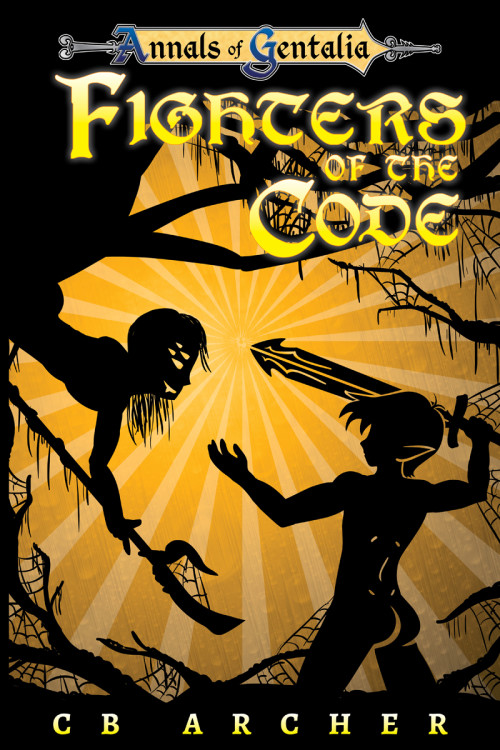
It bothers me that the protagonist looks like he has some depth to him but the drider (is that what it is?) looks completely flat.
That’s true. Something should be hanging down there. I think the author’s probably more interested in the buttox region than anything else.
The butt is pretty important, it is his main weapon in the books after all…
I am interested in making else everything look just as good as the butt though, so please, any comments (butts or otherwise) are appreciated! 😀
True, a few touches, like an ear, some ab lines, and gaps to show the legs could help the Spiderboy look better (yes, it is a Drider creature), thank you!
He didn’t read as a drider to me at first – maybe scooching the body over to the right and showing some more of those hideous spider legs?
I didn’t realize it was a drider; I thought it was just a person hanging out of a tree. I agree with giving him a little more definition to make it clear what’s going on. And his linework isn’t quite as neat and precise as the elf’s; for instance, his inner elbow isn’t quite lined up with his outer elbow and his hand seems to protrude out of his arm with no wrist joint.
But that’s just little stuff to clean up on what’s fundamentally another great, sexy cover.
If you wanted to be really shameless, you could put those radiating yellow lines coming out of the drider’s weapon instead of the sword so they draw your attention right to the business end of things.
I can’t really think of much to say that I haven’t already said about your first book. One bit of advice I do wish to repeat: make it look like the light is reflecting off your elf, not shining through him the way it is now. Give the picture at least the appearance of some depth.
Yes, I forgot to do that this time, good news though, I already fixed that (but had already submitted there cover here).
It did work so nicely last time!
I knew you would notice!
Once again, nicely done, Waffles.
I checked out the cover of the published version of book 1 to check for branding consistency. The only suggestion I would make, and it’s similar to what others have said, is to add some depth to the drider. The creature on book 1 has so much texture to it that it comes alive off the cover. By comparison, drider boy looks flat.
Btw, if you haven’t submitted book 1 to book reviewers, an indie site that’s friendly to m/m content is POD People. Emily Veinglory is the reviewer there that I believe would be the one most interested in reviewing your book. No guarantees of course.
Long and Short Reviews is another indie and erotica friendly site.
Wow! Thank you DED, I will certainly check them out. 🙂
Waffs:
I truly have nothing to add. Everyone here has already said it. However, I know Emily Veinglory a bit. Let me know if you don’t hear back from her.
I would just add that the “Fighters” isn’t very legible, but if you change the font here you’d have to change Book 1 too and I like how it looks on Book 1 🙁
Dear Maker, you should have seen it before I altered a bunch of letters. The first version of this was Fjoiters of the Code.
A word of advice, if you are making a series make sure all the letters of the font are legible! :S
That’s why I made my own. It might not be the greatest font in the world but it’s mine and I love it <3
What I miss from the last cover is that level of fine detail which becomes more apparent in the full size version (as opposed to the thumbnail).
For example, in the lower left hand corner there’s a tendril which appears to be on a quest for elfbutt. I almost want that tendril to be a bit phallic.
Great cover, btw.
Well, this is still good, like the first one, but I like the part one better. Better quality artwork. This looks clunky, in full size, the last one was more detailed – and while our elf is cute the spider-boy looks a bit deformed (from the neck down, I get he has extra eyes). Better colours: this one has yellow on top of another yellow (I dislike the background shade anyhow, but that could be setting on my screen or some such. It lacks vibrancy.) Orange? Red? Pink, even? As long as there is a bit of contrast to the yellow of the title. The title was more readable in part 1 – since it was on black background. I would keep the same font, just for series matching reasons, while this one does look good too.
Thank you Tuula, it was a bit hard to read, with the lack of black behind the title, combined with the yellow on yellow problem.
I ended up changing the text colour, and it does pop much more. Shadow behind the letters also helped!
Plus, that Spiderboy was a bit deformed and lackluster! 🙂
The physical proof copy I have is a really nice background colour, so I don’t want to change it, but with the blue text I agree it is better.
Thank you everyone! A lot to revise and think about. I will work on this and then post a new link!
Thanks again! 😀
The cover really isn’t all that bad, with a few caveats.
The title seems to be crowded into the top quarter of the cover. I would lower it.
The left-hand figure is confusing. I take it from the other comments that experienced readers of the series recognize what is going on and who or what the figure is supposed to be, but you should not design a cover that is explicable only to the initiated. If it makes sense only to those who are already familiar with the stories, you risk losing new readers.
Even if a book might be a first novel, understanding what is going on in its cover should not depend upon someone having already read the book. That is putting the cart before the horse. For instance, you say that “The butt is pretty important, it is his main weapon in the books after all…” but this is something one would only know after the fact. The cover for this book is filled with similar specific references that probably make perfect sense to the initiated but are meaningless—and, worse, potentially confusing—to the new reader.
I don’t think anyone really knew what was going on with the Spiderboy Drider thing to be honest. He isn’t in any other books, so even someone who read the first book wouldn’t know what that is. He did need some work.
🙂
I am rather confident anyone who looks at this cover would be pretty sure that the elfbutt is important though, at least visually, if they read anything about this book or not! I mean, dang, that is poppin’. The fact that he uses it in the book… really couldn’t be shown on any book cover that Amazon would allow.
Hello everyone!
I have made the first batch of changes to this cover… well… the third batch technically.
I don’t want to re-post it really, because it isn’t a true full revision and other covers need to be in the spotlight sometimes, not just mine.
Here is a link. Let me know! ♥
https://annalsofgentalia.wordpress.com/2016/02/29/fighters-of-the-code-revised-cover/
Oh, yeah, now I can actually see the spiderboy’s butt as a butt, and not mistake it for a shadow. But now everything’s got a nice highlight except Anders. Which might not necessarily be a problem, but it does make Anders stand out (or not stand out? What’s the opposite of pop? Flat?). Still, I don’t think adding the same highlight on Ander’s silhouette would work. Best leave it like this.
And the sword is still “transparent”, so is the line between the sword and Ander’s hair. Is that deliberate?
The yellow detailing on the drider is just what I wanted. I actually disagree about the transparency thing; I prefer the cutout look rather than the solid highlights, but that’s just me. I don’t like the gray highlights, though; I think they’re unnecessary business. If you keep them, add that kind of highlights to the elfboy too.
Also, I hope this is a rough draft, because all the new stuff needs to be a ton tidier.
One of the biggest problems facing an author who wants to create their own covers is objectivity. What seems of immense importance to them is inexplicable to the uninitiated reader, what seems to be transparently obvious is a mystery. For instance, the author says “I am rather confident anyone who looks at this cover would be pretty sure that the elfbutt is important though, at least visually…” I’m sorry: it’s just a butt.
And the character protruding from the tree has a face that is literally nothing but a bunch of mysterious glyphs that might be tattoos for all anyone knows. In fact, the design of the cover draws the eye to the center, so the sword and face tend to be the focus of attention rather than the (evidently) all-important butt.
I think the cover looks great…but I would absolutely simplify the face on the one character. I realize that this might not make it wholly accurate to the story…but being a literal illustration is not the purpose of a cover.
Hello everyone!
I just needed to come here and say that this book is out now. Hooray!
Yay! May it find many readers 🙂
Thanks you Tuula! 😀
Congrats, Waffs! It’s not my genre, sorry to say, but I do wish you the best. Go get ’em!