The Stray: The Plan [resubmit]

The author says:

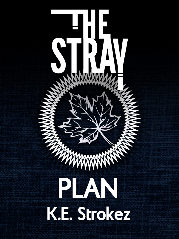
Re-release of “The Stray: To Plan”. Changed the title since people kept getting it wrong. It’s cyberpunk mystery, paranormal adventure, science fiction plus school life. The characters are teens, but the language and situations are more suited to adult readers: so it’s not New Adult cos the characters are too young, but it’s not specifically Young Adult because of the situations (and the profane language). As the first book in a (very long) series, the cover is meant to be simple and establish a pattern. The leaf symbol is integral to the story.

Cover 4 Scrivener-01

Cover 4 Scrivener-01

[original submission and comments here]

Nathan says:

I think this is a lot stronger in both original size and thumbnail size: the central image is an icon, and the rest of the cover doesn’t detract from it.  (The primary consideration isn’t whether the leaf is an integral part of the story, but whether it’s a memorable graphic element.  In this case, it is.)

I’m still a little confused by the title, since what I see on the cover is “The Stray: Plan,” or possibly even “The Stray Plan” (there are two different fonts in use, but both being strong san-serif fonts, I can see how they could blur together).  You might be well served to add a colon after “Stray.”

Other than that, I think it’s a good job.  Anyone else have comments?

Sundrop Sonata

The author says:

Sundrop Sonata is a contemporary woman-and-child-on-the-run suspense novel featuring a heroine whose skills as a piano turner both trip the action and eventually resolve it…The widest target audience would be women readers who are looking for something different in mystery and suspense novels or who have a music background/interest.

Sundrop Sonata Cover

Sundrop Sonata Cover

Nathan says:

I think it’s a good cover, but not for the book you describe. (BTW, I assume “piano turner” is a typo, unless we’ve started rotating them like crops.)  At best, it could be mistaken for a “cozy” mystery; at worst — and more likely — readers would assume that it’s a memoir, or litfic.  The “A Novel of Suspense” sub/supertitle doesn’t make up for the fact that there’s no suspense in the cover.

And what does “suspense” look like?  At its most basic, it looks like something is wrong with the world.  Too many shadows, or too stark, or lighting that says that something is out of kilter. The photo for the cover of your book is the opposite — it looks like everything’s perfect.

Now, here’s what I did in five minutes, playing with exposure and saturation and a couple of filters.  I’m not saying this is a good cover, but I think it shows that making things look a little less “perfect” and “right” is good.

Sundrop Sonata Cover

Again: Not a good cover. But I hope it indicates the possibilities.  If I were working with the original photo, I’d be playing with things like having the girl be the only red tone on the cover, adding some scratch marks, playing with a heavier, grittier font… I hope this gives you some ideas.

Anyone else?

This Friday: The Cover Critic, in person!

This Thursday through Saturday (February 11th through 13th), I’ll be participating in Life, the Universe & Everything (aka “LTUE”), a slightly fannish symposium on science fiction and fantasy held in Provo, Utah.  On top of having some items in the art show, participating in discussion panels, and barking sudden nuggets of wisdom to bewildered random passers-by, on Friday at 5pm I’ll be giving a presentation on “Book Cover Design for Self-Publishers.”  If you’re local and you don’t participate in LTUE, you’re missing out on so much I can’t tell you.

Sparkle

The author says:

Contemporary fantasy with some horror elements.


scoutcover4

scoutcover4

Nathan says:

Hmm.  Lotta problems here, and I don’t know which to address first.

First, I suppose, is that the main image is composed of elements in disparate styles which don’t blend well together.  You’ve got an over-processed (and poorly composited) photograph of a house in the middle of a digital sketch.  They look like they were thrown together not by design, but by desperation.

The digital sketch is a problem by itself, because it looks just like what it is: A hasty sketch. Lord knows I love sketch artwork, but this is too scribbly to be much more than a guide for a later, more controlled rendition.  And the scribbled details to either side look almost like digital graffiti — they distract without adding anything.

I could go into font choices and such, but I think you’ve gotta correct the main image before any other repairs make sense.

Am I wrong? Other opinions?

Bethany

The author says:

Experimental literature in the key of science fiction. Are you reading or being read? Are you the character or the author? Are you the created creating their creator? Ponder these questions and more as you are taken through a labyrinth of false memories, alternative timelines with an overly maternal Artificial Intelligence.

bethany cover maybe

bethany cover maybe

Nathan says:

I’m in a little bit of a bind here, because “experimental literature” usually means it’s willfully obscure and isn’t meant to appeal to most people… so a cover that does just that is right on target.  You can’t represent genre, story content, etc. on the cover, because the book is meant to defy expectations.

So by those standards, um… I guess it’s good.

Seriously, I’m gonna defer to the other commenters on this one.