The author says:
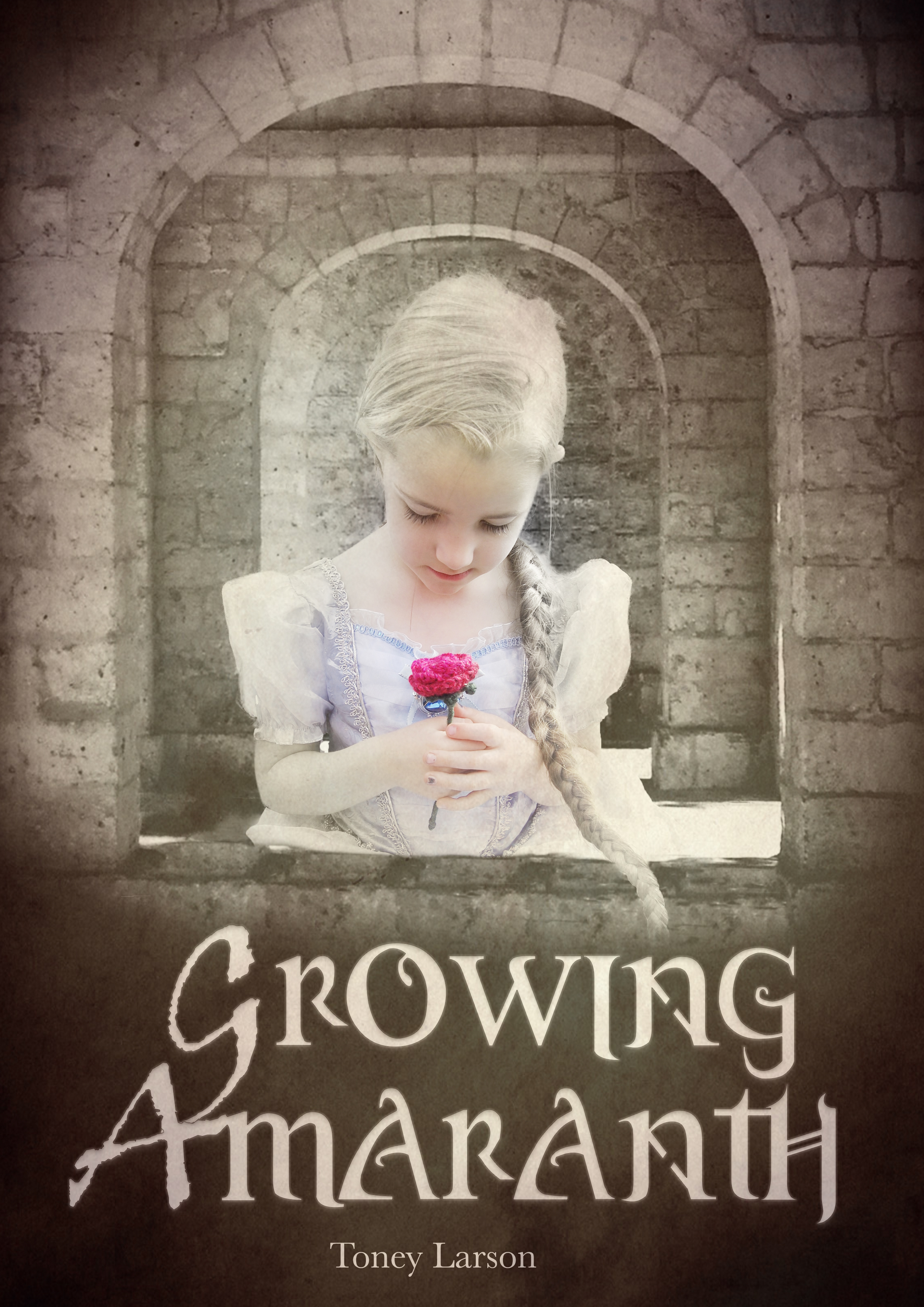
The first of a series of high-fantasy books with more of an emphasis on historical fiction. There are multiple characters and multiple plots in the story all tied together under a single plot involving an economically stagnant country on the losing side of a war set in a world greatly influenced by Medieval Europe and East Asia.
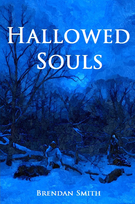
Synopsis: War rages on as various kingdoms struggle to gain power and maintain their freedom. From the shores of the Grey Sea to the mountains of Cosca, chaos reigns. It is a tale of murder, rape and war. Here a peasant girl masquerades as a princess; a deposed king schemes to regain his throne; and fierce pagans strive to regain their freedom. As opposing forces scheme and plot to gain power, a strange sickness blows in from the mysterious east and ravages the land. Not even Spenta can save them as everyone, from fools to sages, realize that even the most hallowed of souls can do nothing.
Nathan says:
It’s well-executed art, and I don’t know how much of a draw it will be for readers. In thumbnail, all I can see is “blue” (and maybe “tree”). At the larger size, while I can see the human figures, I have to hunt for them, and I can’t make out enough detail to tell setting or genre from their clothes. Couple that with a font that is the epitome of “generic,” and you’ve got a cover that tells the reader as little as it can.
Is the original artwork that intensely blue? If not, I would scale that waaaay back, and let other colors at least give a penumbra of a palette. Also, you could trim the artwork so that the characters are larger and more central (the only thing you’d lose would be some trees and sky). Then find a font and font treatment that helps convey the fantasy genre (not Algerian!), as the artwork still probably wouldn’t be able to do all the heaving lifting in that regard.
Other ideas?