The author says:
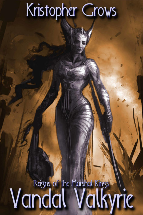
Changes include overlaying text directly onto the background image and adding a drop shadow. A less ornate typeface is used (actually the same font, but there is a world of difference between the all-caps and lower case for this font).
A dark fantasy and cosmic horror novel, book 1 in a series. The main characters quest to bring justice to the dread lord of an evil nation. But all of their actions are orchestrated by titanic forces that move in the shadows of history, seeking terrible ends that these mortal pawns cannot begin to imagine or oppose.
The art is a sketch by Alex Ruiz at Conceptmonster.net used with permission, my role was in colorizing and formatting it as a cover.
[original submission and comments here]
Nathan says:
Getting there. Still not there yet.
Remember that the purpose of type on a cover is, first and foremost, to be read. Against a busy dark background, your title especially needs to stand out and be understood. That means bolder, thicker letters, and more dynamic contrast between the type and the art.
Let’s say you’re browsing Amazon, and these two thumbnails are at the bottom of the page. Which one is going to catch YOUR eye?
(That’s my five-minute do-over, just grabbing a font that was convenient and futzing with the art. Not the best font, not the best layout, but you get the idea.)
Any other comments?


I know this is Cover Critics, not Title Critics, but after a moment’s thought it seems to me that “Valkyrie Vandal” is a bit catchier, so give that some thought if you aren’t already super attached to “Vandal Valkyrie”? Of course, it’s entirely up to you, just wanted to share another perspective.
I like the new look. Just need to adjust the color of the text. I prefer the positioning on the left, but the text color that Nathan used. Perhaps enlarge the title just a tad.
This is pretty much what I wanted to see after your last submission. Thicker lettering would indeed make the cover stand out a little better, but don’t slap any of it over the middle of the art the way Nathan does; that would be a mistake in my opinion. Other than needing to tweak the font a bit in this manner, I’d say you’re good to go.
One of the problems with using found art is that it often was not intended from the start to be a book cover. In creating the art for a cover, the artist will allow space for the type that will eventually be added. This is why when you see the original art for a paperback it will often look bottom heavy. The artist was careful to leave an area where there was nothing much going on.
This, of course, was not the case with this cover.
I think, too, that a second problem may have arisen that often afflicts authors: They like the art so much they become reluctant to cover up any of it. In either case, the result is type being crowded into the top and bottom of the covers.
Nathan’s solution is a good one. The most relevant part of the art is the upper half of the figure so there is no real reason not to place the title across the middle of the cover. Actually, the art might even be enlarged so that the valkyrie is much larger and becomes easier to see what she is. The title could then be across the lower half or third of the cover.
Here is a suggestion (ignore the typeface choice: it’s just for placement)—-
oops.
Rats. I’m having trouble attaching the image. Sorry.
I agree with Nathan about the font suggestion (bolder, but not necessarily the one he chose) I’m on the fence about center placement or bottom placement, and Ron expressed my earlier observation succinctly, but I just have to say, KUDOS! It is MUCH improved over the previous iteration. Good Job.
Do be careful with your margins though. A couple of your ascenders/descenders are getting mighty close to the trim edge.
This is the sort of thing I had in mind (the typeface is, as I said, just placeholder):
http://black-cat-studios.com/lulu/
I do like what you did. I just love the art so that seeing more of it is what gets my attention.
I think this is pretty good and I think Nathan’s treatment is too much. Top and bottom text is better when the cover features actual art. But I don’t like the fonts very much; they still don’t scream “fantasy” or “dark” to me. Plus I keep thinking your name is Kristopher Crows (OT: that would be a cool pen name).
I like the art. I have to admit that I cannot warm up to the color job. It’s just too discordant for me.
And I haven’t like any of the fonts so far. Not the original nor the rework (same font), and none of the suggestions. This cover needs something else.
Of course, I’m a bit of a font wonk, so…ignore me.
No, no! Fonts kick my butt, so I’m always interested in what a font wonk has to say.
Here’s the thing: fonts are, in the nitty-gritty of it, hard to learn, and generally boring. You have to suffer an awful lot of tedious books, learning crap like ascenders, descenders, yadda (half of it woefully outdated now, because, shhhhhhhhhhhhhhheeeeeeeeeeeeeeeiiiiiit, who sets type anymore?).
The person who designed that font actually tried. You can see that some of the pairs were thought about. You see how the “G” in Grows nestles nicely up against the r? That’s forethought.
But then you get those bloody V’s. URK. The a’s have to stand off of that, for no really good reason. If the designer had been a font slave, he’d have created a font pairing for V+a. See, this is the tedious part–he (or she) paid attention to some combos, but not all. After all, who wants to create a kerning pair for every conceivable possible consonant and vowel pair? Or diphthongs? And so on? Unless you’re very OCD–more so than I–you can drive yourself crazy with this stuff.
Anyway: the font isn’t quite right. Not so much because of the kerning pairs, or lack thereof. It’s just that the feel of the lettering isn’t fantastical enough, or horrific enough, for this cover. The genre is “dark fantasy” and “cosmic horror.” This presents, admittedly, challenges. Fantasy fonts usually have the elf, hobbit, supernatural-romance, yadda, vibe, and horror tends to lean toward slasher-flick ideas.
You can see what I mean–check out Foglighten, which some folks like for Fantasy. That’s far too light, too “fluffy” for something referred to as dark fantasy. Horror? Well, there are a plethora of creepy fonts. Like Caracura.
My sense of the book is that it wants a font more like Brand New Burn. Or Dogma. (I’m deliberately sticking with discussing fonts that Derek put on his infamous list of 300 fonts, so that people don’t have to go far to see what we’re looking at.) But both of those may also lean too far toward horror. As I don’t know the book…hard to guess.
I think I’d try to channel a late-dark-ages (style) font, something that evokes your basic Vikings. There are obviously heavy nordic influences here, hell, just given the title. Yes, of course, the huge Viking Valkyrie is a dead giveaway, but you want to stay thematic. (If this were an established author, I’d say use a traditional serif that has strengths, instead of troping it out, but for a new writer–well, nobody ever went broke sticking with what people instantly recognize.)
There are a couple of decent “Viking” or Celt-styled font options available. 1001 Fonts has a short but decent collection of them. I just don’t see how you get away from that tired trope, given the title and the imagery. If the Valkyrie actually looked like, say, a fairy, then perhaps you go with something else, but this book? I’m thinking at LEAST Ringbearer, or…you know, if you used Black Chancery for the first letter (the V’s) and used Beyond Wonderland for the remainder of the letters…that could really work. (I wouldn’t like the Beyond Wonderland foofy V’s, for this title, but I’d like the rest of the letters). The fonts I’ve mentioned in this paragraph are on 1001 fonts, if you want to look at them. The grunge factor of Beyond Wonderland would be super with this battleground cover, IMHO. I wouldn’t quibble at using Ringbearer, either, though.
Sorry…see, this is what happens. Font reveries take over my brain. 🙂
I also don’t like the current font (the capital “G” and the lowercase “w” stick out, in a bad way). I don’t know about the position of the title.
A note of caution, many of the fonts mentioned here are available for free, but they are only free for personal use. If you are using them on a book cover for sale, that is considered commercial use and usually requires a purchased license. Just sayin’ 🙂
Actually, both Black Chancery and Beyond Wonderland are free for commercial use. Ringbearer is free for personal use, and I was unable to find any commercial-use licensing info therefor. (There is another Ringbearer font that is donation-ware. I can’t find anything about the version I was looking at on 1001Fonts.com.) Dogma is donation-ware–so it’s up to the user. Brand New Burn is indeed commercial-ware–by the author of the Infamous Bleeding Cowboys (so I suggest, if you’re going to use it, do so now, before it becomes old hat, like Bleeding Cowboys).
My personal preference is to blend the Black Chancery and Beyond Wonderland.
I forget sometimes that not everybody who comes here is in the trade.