The author says:
Growing Amaranth is a retelling of Rapunzel. Amaranth lives in a secluded cottage with her mother when she meets a young boy who helps her realize she’s not as free as she thought. Her mother traps her in a tower when she discovers her friendship. Amaranth starts at 9 years old, but it follows her until she is 17. Its for YA, focused more on emotionally abused youth/adult. It is set in a fictional medieval/regency time.
Nathan says:
It’s a nice image. Let’s make it pop!
- It’s the Rapunzel story? Make the braid longer! I don’t care if it actually figures into the story. Make it longer!
- Play with the contrast and saturation. Make the picture come alive!
- Why are you hiding your byline in teeny type? You wrote a book. Be proud! You’d got that extra space along the top — put your byline there, then make the title just a bit larger to take up the space you just vacated.
Other ideas?


There are a lot of things I like about this…and it perhaps needs only a little fiddling with.
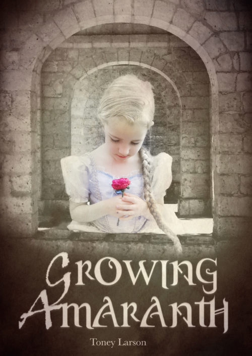
The composition seems a tad bottom heavy. I would suggest moving everything up a little…but that would cut off the top of the front arch…and the arch makes a nice frame for the girl. Instead, I would take a clue from Nathan’s comment about your name and move it up to the top, making it larger at the same time (I don’t think I would make the title itself larger, though).
There is a quality about the girl that makes her look pasted onto the background…whether she actually was or not. At the moment she appears to be on a plane in front of the window and wall. The disappearing braid also contributes toward the pasted-on appearance. Perhaps a little shadow on her to help place her behind the sill would help (and a shadow from the braid onto the sill would help as well).
You may want to give some thought to making Rapunzel appear closer to the age of your intended reader.
(“medieval/regency”? That’s quite a combination given that about 300 years separate the end of the medieval period and the beginning of the Regency!)
It is a nice image, im just worried it looks more like a scripture verse style inspuration book than a YA fantasy.
Since you want YA/young adult, a seventeen year old seems like a more compelling choice for a model. Remember, young readers read up, not down, so they’re more likely to reach for a supercool teen than a kid.
* I’m.
* inspirational
Ugh, sorry. Phone keyboards, amirite?
I agree with Ron Miller and O_Batto, make the girl older if possible. Plus, I might be the only one to care about this, but her dress is definitely not medieval, nor Renaissance (which is what I think was really meant). And you might think about having the girl looking up from the flower directly at the viewer.
This one is not doing it for me for a few reasons. First, while the photomontage isn’t bad, it looks just wrong enough to catch my eye: The architecture is lower-res than the figure, there’s no shadow under the braid, and the rest of the lighting looks just not-quite-right enough to make me keep looking at it to figure out what’s wrong. Part of me wonders if it’s so low-contrast to hide problems with the lighting.
Second, it’s so low-contrast that it doesn’t grab my eye. It’s so low-contrast that at first I didn’t notice that part of the image was black and white. The rose is a focal point, but it’s so small, just a dot in the thumbnail.
Third, it’s way too twee for YA. Little girl in a princess dress holding a flower! Other people mentioned the age of the girl, but even if she were a teenager, this would still be way too light and fluffy for your audience. YA tends to go for opulent strapless ball gowns in vivid colors, across all non-contemporary genres.
The blog is eating my comments!
Sorry. Rescued. Too many links triggers the spam filter. I’ll try to teach it to be less sensitive.
My fault. I may have included more gown pictures than strictly necessary.
It is a bit cutesy for the subject matter – but I think that could be fixed with just fixing the colours: the whole picture is too bright, but I would also darken the arches further, making it a gloomy, oppressive environment, and make the flower dark, blood red. Otherwise, yeah, why not? It is quite good – I agree with moving the author name to the top, there is plenty of space.
And… err… I know that is not a design thing… but I can’t stop myself anyway so here goes: Why Amaranth? Lately I have seen it pop up a lot as a name in self-pub fantasy. All it reminds me of is that it’s some sort of health food, like quinoa. Anyway I would search in Amazon etc. to check there isn’t a lot of other books named after Amaranth that yours could be mistaken for.
Her name bothered me too. Its a grain.
Three points of contention from me:
1. Your cutting and pasting is difficult to detect from this distance, but a closer examination reveals to me the tell-tale signs of boundary-blurring (particularly down at the girl’s waist), ringing compression artifacts from resizing, and different levels of graininess suggesting that the girl and the background are both either from photos taken with an old analogue camera or run through a noise-adding filter to give them that “retro” look. Granted, this is the best cut-and-paste job I’ve seen in a while, but the instincts of the others here who detected something “off” about this picture are sound; some of your target audience are likely to notice this too. Again, this was much more difficult to notice on the cover as fitted to this blog post; should you try cutting and pasting again, you could probably make your cutting and pasting even less detectible by shrinking the cover until it merely fills a standard 1080p monitor rather than the 4X monitor it easily fills right now.
2. I’m not certain that the girl’s age on the cover is quite so important as other critics are making it out to be, but her appearance definitely smacks of a Purity Sue, that pernicious form of Mary Sue character who’s just a little too morally perfect in every way for older readers’ taste. Sure, fairy tales are by definition fairly formulaic and morally simplistic; as I seem to recall our host Nathan Shumate once mentioned in one of his movie reviews, saying a fairy tale is too formulaic and/or simplistic is a lot like complaining that a Western has too many horses in it. For a more intellectual retelling intended to appeal to more mature readers with a taste for moral complexity, however, that blindingly pure virginal white dress and relentlessly serene expression on her glowing face smooth as a marble pillar is likely to be a deal-breaker. She needs to have something that hints at her newly discovered adolescent doubts about how free she is: a different dress color (scarlet red to symbolize her oncoming pubescence is just one possibility), a more perturbed expression on her face, or even just a more shadowy background to symbolize doubts eclipsing her formerly sunny disposition from suddenly taking to examining certain long held beliefs she’d never thought to question before.
3. Mostly miscellaneous details: the window through which the girl appears could use some vertical centering; it’s too close to the top. Your byline definitely needs to be bigger, and separate from the title; one or the other should go on top to maintain some vertical balance to the shot. Finally, that long hair braid on this latest version of Rapunzel definitely should be longer as Nathan Shumate noted, and should not fade out into a digitally frayed end but be either hanging down out of sight or have some kind of appropriate binding device holding it together.
In short, beauty and innocence are fine; just try to keep these aspects age-appropriate to your target audience. Your protagonist should have a genuinely romantic beauty, not just a child’s naive cuteness; and the innocent purity of one who knows and chooses what’s right over what’s wrong, not just one too ignorant ever to have considered doing something naughty. Let’s see some growing pains on your cover.
I am troubled by a number of things in this cover. (a few have already been mentioned, so I’ll skip those) First, the difference in tone from the arches to the girl add to the pasted on look. The arches are almost sepia toned, and the girl full colour. It might be a tad more successful if everything but the rose were sepia toned. And, sepia toned or not, it is crying out for some contrast and depth.
Also, I’m a little put off by the Disney princess “costume”. It gives it a feeling of “dress up for halloween” rather than a fantasy story who’s premise I’m supposed to buy into. There’s clearly a time period/appropriate garb wrongness here when compared to the description.
The font is interesting, but the use of a grunge font for the first letters, when the rest of the title is not grunge doesn’t really work well. It just looks like two different fonts. The G’s and A’s in the rest of the title are interesting enough to look good without doing the switcheroo. You could make them larger if you wanted something that looked different but complimentary.
And finally, the scale feels off. If you buy into the idea that the first arch is a window… how is the second arch (that appears to be the same size in perspective, and roughly the same number of bricks) one that reaches the floor…? Perhaps the second arch could be stretched so that you don’t see the bottom.
I hope some of that is helpful.