The author says:
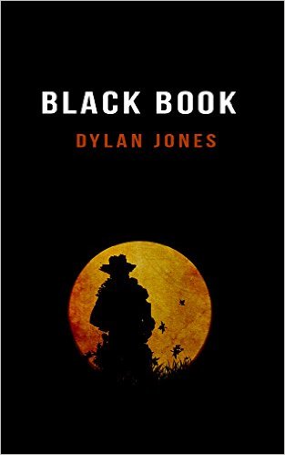
A lightning fast action packed sci-fi thriller for fans of Stephen King’s Dark Tower and Lee Child’s Jack Reacher. Sheriff Jack is an elite soldier from the future, trapped in the Wild West. He must find and protect the sacred Black Book before someone or something else does. The clock is already ticking for humankind, but for Jack the countdown has only just begun.
Nathan says:
Hmm.
Obviously, the most important component of the covers of the books that you cite are the huge letters proclaiming “Stephen King” or “Lee Child.” You can’t really go that way.
And I’m going to assume that this is a quick sketch version of the design concept, so I shouldn’t worry about things like how the title doesn’t line up with the byline, or how the cowboy silhouette is artifacted against the moon.
A common observation around here is that red text against a black background is surprisingly unreadable. Your byline is in orange so it’s not as bad, but in the thumbnail it still becomes a smear.
For the rest… I’m of two minds, so I’m going to have to defer to the hivemind instead. Does the minimalist approach work? Could it work, even if this one might not?