The author says:
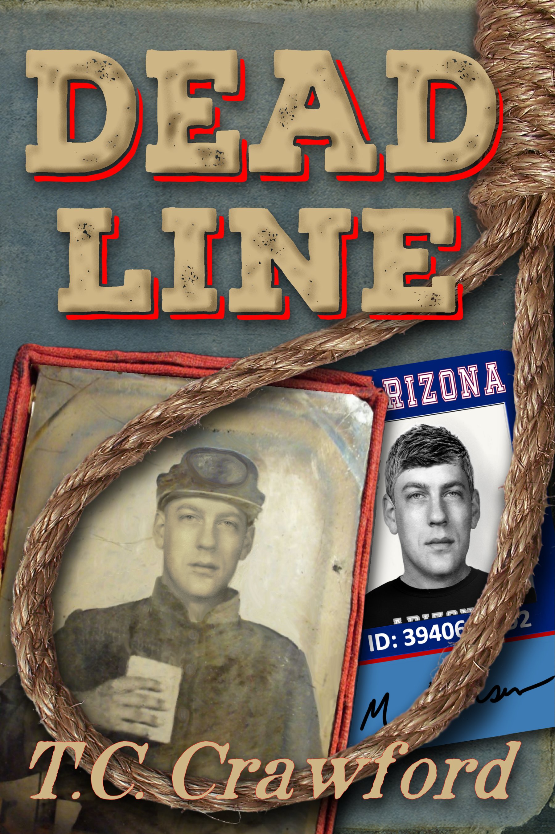
Two men. Two centuries. One destiny. Tom Dorin, a maimed and disillusioned veteran of the Civil War, builds a new life in the Arizona territory. Jon Hansen, a graduate student in Tucson, Arizona, finds an antique photograph in a decrepit roadside museum. A disturbing portrait of a long-dead man who could be his twin. Only two facts are known about the man in the tintype. His name was Tom Dorin. On March 13, 1874, he hanged. What begins as research into Tom Dorin’s life for a master’s thesis, becomes an obsession for Jon Hansen. An obsession that consumes every waking moment, and threatens every relationship in his life. Until the morning he wakes in Tom Dorin’s bed. In the Arizona Territory. On October 19th, 1873. Only one fact remains certain. It is recorded history, unalterable. On March 13, 1874, Tom Dorin hangs. No one knows why.
Nathan says:
What you’ve got here is well-rendered. However, I think some changes to the initial idea are in order for the cover to attract readers like it needs to, for a story that is essentially “Somewhere in Time meets Back to the Future III.” (Yes, that means a lot of work for you if you follow my critique. No, I’m not sorry.)
First: The strong red and blue elements of the cover call to mind not just a western, but a pulp western magazine from the thirties and forties. Since your story isn’t a standard shoot-’em-up, I think you may be giving the wrong impression and turning off the readers who would actually enjoy the story.
Second: The two different photos of the same face is a good idea in theory. However, to really work, the pictures need to be in complete parallel, directly across from each other, with each taking equal visual weight. Here, the tintype occupies much more space, but the isolated blue on the student ID, and the much starter monochrome in the modern picture, keep the two from being balanced. And while the cover makes sense once someone has read the synopsis, I don’t think it works the other way around, which is how it needs to work. And I don’t know if monkeying with the balance between the two pics will fix it.
If someone handed me that synopsis and asked me to design a cover, here’s what I’d do: A sepia-toned western street with people in period garb, and in the very center of the illustration, a figure in modern clothes in full color, facing away from the reader. I think the normal color at the center would draw the eye toward its natural center of focus, and the contrast between modern and period clothing would be very apparent, making it clear that this is a story about a modern man in the Old West. (I’d render the title in a distressed western font.)
Anyone have different ideas?
