The author says:
Dead Line is a time travel adventure, set in the current day and in the 1860s/1870s. The locale is Arizona, Tucson and its surrounds. It is intended for adult readers. Jon Hansen, a modern grad student of history, finds an old tintype photograph of an outlaw, Tom Dorin, who could have been his own brother, or even his twin. The only facts known about the man in the photo is his name, that he was a Confederate veteran of the Civil War, and the date he was hanged: March 13th, 1874. Intrigued, Jon decides to make Tom the focus of his thesis paper. His research slides into obsession, until he’s in danger of losing his relationships, his scholarship, and perhaps even his mind. Until the morning when Jon wakes up in a strange room, with a 19th century world outside the window. Everyone he encounters calls him Tom. Now, his scholastic deadline has become a very real dead line… For despite all his diligent searching, one fact about Tom Dorin’s life remains a mystery. On March 1th, 1874, WHY will Tom Dorin hang?
[original submission and comments here]
Nathan says:
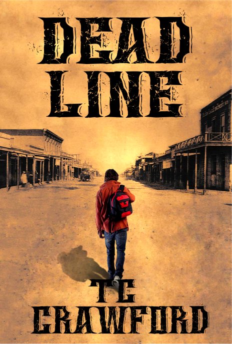
I like the idea behind this cover a lot better. (I should, because it pretty much follows my suggestions from the first submission. :))
I think this also illustrates the utility, if not the absolute necessity, of having a second designer for ideas and tweaks.
If I were handed this cover in PhotoShop and told to play with it, I’d experiment with the typeface (is there too much detail in it?). I’d play with washing out the sepia further, to isolate the main character more. And because he’s isolated by color, I’d experiment with making the figure larger or smaller.
I don’t know which of these options I’d choose; I’m very much a design putterer, especially when I get to final details. So all I can tell you concretely is that this cover is better, but it could be better yet.
Anyone else have suggestions?


You’re almost there; I see you decided to go with a somewhat more symbolic approach, placing the protagonist in Old West settings with modern clothes. I’ve done my own ten-minute revision to illustrate what remains to be done so far as increasing the contrast between the protagonist in full color and the background in washed-out sepia tones: with my editing program, I decreased the background’s saturation by 50% while increasing the protagonist’s by 100%.
Apart from that, about the only other improvement this cover needs is that it ought to be larger: on my 1280 X 1024 flat screen monitor, a 464 X 687 image is all too easily swallowed up. If you want to publish this in an e-book format, try to make your cover at least 800 X 1200.
Actually…800×1200 isn’t large enough. You’ll get rejected from pretty much all the retailers for using a cover image that’s too small. You need to have a cover that’s not less than 1,000px on the short side (width). It’s a hard and fast requirement for most major retailers. So: make it QUITE a bit larger.
I stand corrected. So… 1000 X 1500 at the very least, and don’t hesitate to make it larger than that if you can.
I think it looks good. The only thing bothersome is where the figure’s feet are tangent to the “TC”—I would move the figure up just slightly so there is a space between it and the type. This may require reducing the figure in size or moving all of the art up in order to maintain the compostion. Another (and perhaps better) solution would be to place the author’s name in one line.
I agree with everyone so far. I think there may be a tad too much going on with the text, as Nathan has said, but I can’t decide if I like it or not. It’s evident you are going for an old wanted poster style, which suits your synopsis. I also agree with Ron that the ‘TC’ is getting lost in his feet. The only other thing I would inquire about (and this is just nit picking now) is the sun setting in front of him because it looks like a blurry version of the sun past the town, if that’s the case his shadow is in the wrong place. Not that anyone would notice (or care even) it’s just something that caught my eye and had me wondering. Overall, I like it, looks great.
Generally this is a really good composition for your subject. I don’t like RK’s revision; desaturating the background is fine but saturating the figure is way too much. (I think there are very few situations where it’s a good idea to increase saturation beyond its starting level.)
I agree about making the byline one line so it’s away from the feet. The other thing that jumps out at me is that the shadow is pointing in the dead opposite direction of the lighting on the figure. (The figure has multiple light sources, but one of them is clearly on the left.)
Thank you so much for your input, both on this and the original submission. I knew my original was far from hitting the mark, but I couldn’t see what was wrong. You guys nailed it, and saved me a major embarrassment. I learn something every time I check in here, and I do appreciate the generosity of your time and expertise and hope someday to be able to pass that generosity on.
I’m applying all the current suggestions, with the exception of upping the saturation so much on the figure. I tried it both ways, and I have to agree with Renee Gauthier that it was a tad too much.
Re: The image size. Yes, the original is MUCH bigger, and is sized for a 6″x9″ cover template. Just didn’t want to choke Nathan’s inbox with a monster. 😉
Re: the lighting issues. The ‘sunset’ is an artifact of my upping the saturation on the old photograph. It goes away when the saturation is lowered. I didn’t mess with the shadows in the original photo, and based the figure’s ground shadow on their angle and direction.
As to the lighting on the figure, I’m stumped. I actually mirrored it from the original (backpack was over his left shoulder originally) because the *strongest* lighting on the original image seemed to be coming from the left, putting that sleeve and the backpack in the strongest light.
At my level of minimal graphic expertise, I’m not sure how to fix that, or even if it can be. I looked at a LOT of images of men walking away from the camera, and this one was the only one that was the right age/build/clothing/mood for what I was after. Any suggestions for correcting the issue? Is it something a non-artist/designer would even notice, do you think?
Re: The font. I have to admit, I’m not married to this choice (Wings of Darkness,) but it’s the best I could find. Other contenders were Nashville, (too plain, and didn’t like the big chunk out of the E,) Working Class Hero (too zombie Western. This book is more Somewhere In Time meets Westworld,) and CM Old Western, which is a bit too feminine and happy-fun-time for the book’s title and mood.
For the back cover blurb, I’m considering Opera Lyrics Smooth as it’s old-style but very readable– but will it clash with WoD on the cover?
I’m on a budget tighter than the bark on a tree, so I need commercial-use fonts that are free or around $50 to license. Any suggestions?
Thank you all again, and Nathan, if this reply is out of line, please delete it with my apologies.
Yeah, I understand the issue. But the main light visible on the legs comes from the left, so especially on the left leg, we can clearly see the shadow coming out of the lit edge of the leg.
And unfortunately I don’t have a good solution; I know you can’t just go grab an identical walking-dude photo except with different lighting, especially since virtually all stock photos will have studio fill lighting.
As for the font, I think part of the problem is the distressing outside the letters, since it’s on a background that’s already distressed. Maybe if you just erased that?