The author says:
Synopsis: When one door closes another opens. An adage painfully true for Alexandria Shaw, who is invited to an exclusive club for a night of fun, but after meeting Landon Miller, she is left with a heart-pounding night that leads to a world of danger and a web of deceit. The novel is a mystery/suspense setting in current day.
Nathan says:
If an author sent this to me as a concept, here’s what I’d do:
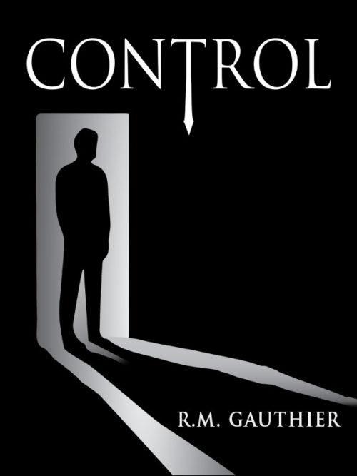
- Make the title bolder. “CONTROL” demands a more commanding font treatment.
- Make the byline bigger across the bottom. (I’d probably also switch out that Trajanesque font.)
- Add a grungy color shadow to the black.
Other suggestions?


I think the cover is pretty good almost as is!
A few touches would help it along even further.
For instance, I’m not sure why the light coming through the door has such irregular edges. This is especially noticeable at the bottom left corner of the doorway. I can see where having the lit area of the floor be angular—it has a kind of unnerving effect—but there are too many irregularities that look simply like bad drawing.
The shadow of the figure could be improved. While it doesn’t have to be completely realistic, I would certainly consider lengthening the triangle of light on the floor between the shadow’s legs.
There is some funkiness going on in the shading where the doorway meets the floor, near the feet of the figure. This also includes the odd-looking variations in tone in the lighted areas. All of this could be cleaned up.
I don’t at all understand the significance of the emphasized “T” in “Control.” I would take Nathan’s advice, close up the kerning a little and make the title larger.
I do like the monochrome color scheme, though.
Nathan nailed it.
This is the first cover on this site that I’ve seen on thumbnail that just made me go “NICE.” (OT: I love that this site is in the sidebar of Lousy Book Covers, so I see the covers at thumbnail size before I come over here and see them at full size, just like a reader on Amazon would.)
Unfortunately, while I love the concept of the art, the execution is really messy. Ron pointed out the main problems. The door should be an actual square (or trapezoid if it’s foreshortened). The edges of the light should be exactly straight. The light gradient should match up properly at the edge of the doorway and should be tangent to the direction of the light. The shadow should be identical to the silhouette except distorted to match the patch of light. And the silhouette should be more accurate, especially the feet. (Go ahead and find a photo you like and rotoscope it really closely.)
I like the idea of the arrow, but making it get wider makes it look like a necktie. Keep the shaft uniform width and put a wider head on the end.
I don’t think any added grunge is needed. It’s a great minimalist concept and when you clean it up, it’ll be a great cover.
The T looks like a sword to me. Is there a sword in the story?
Right. With cleaner lines, (more accurate shadowing) this really works. Not sure of the significance of the tie shaped letter… Is there a “50 shades of grey” reference here? That’s what it made me think of.
I agree a more interesting (larger) font wouldn’t go amiss. But nothing too kitchy.
Good JOB!
As a side note… to make your author name larger, it might be interesting to put the R. in the far left black stripe, the M. reversed in the white area and Gauthier in the far right black stripe. I’d play around with that to see how it worked. Just a thought.
Thank you all for the great suggestions. The ‘T’ is a neck tie, not as a reference to Fifty Shades, but the man in my novel is a businessman. Was going for shady on the doorway, but I’m glad to know it wasn’t liked and will clean it up. You guys are great and said everything I have been doubting. Thanks again.
Oh, it’s a necktie that looks like an arrow rather than an arrow that looks like a necktie.
I liked the idea of an arrow because that’s a very dynamic symbol and it’s pointing towards the center of your cover, helping create a focal point. A tie, though, is a pretty mundane symbol to give such a prominent place in your image (not many people will be reading your book because it’s about a businessman). A more detailed silhouette should be sufficient to give the impression that this is a well-put-together person.
I admit—I thought that a small dash of screaming blood red would be nice, here…but I couldn’t QUITE make up my mind where to put it. I thought about a blood-red tie-tack, for the tie/arrow–but that wouldn’t work in thumbnail size.
I liked Tamian Wood’s suggestion for the lettering; perhaps that might provide an opportunity for that splash. Of course–the rest of you mayn’t agree with me that it might be a nice focal point.
For the title font…hmph. What about Imperator Small Caps? With a bit of weight and spread (letter-spacing) added? That might just be enough oomph. It pretty much works as-is, so I’m loath to suggest messing with it too much. I would try to do something a skosh different with the byline, however.
Although, as I said–given that it works fairly well as-is, I’d consider not messing with it, over messing it UP. Nice work here.
I had no idea that was supposed to be a necktie! I think the right thing to do would be to simply abandon it. The cover will work fine (indeed, much better) without it. It’s really just one visual element too many…and one the significance of which would be lost on someone not already familiar with the story.
If you want to make it clear to the potential reader that the figure is a businessman, perhaps you could try something like this. http://black-cat-studios.com/lulu/
Is it just me, or are the porportions off? I recall Kindle covers being longer, somehow. But IDK.
Hey, Kitty:
Kindle proportions are (generally–there’s no one-size-fits-all for all the devices) a 1:1.6 aspect ratio. So, say, 1000 px wide, 1600px tall. Some of the HD’s are 1:1.7. But if you stick to 1:1.6, you’ll be safe.
I have the latest/greatest suggested file sizes/shapes in an FAQ article on my website: http://www.booknook.biz/working-with-booknook.biz/what_is_the_correct_cover_size_for_amazon_ebooks . The latest is 1600 (w) x 2560 (h), and they suggest a dpi (if coming from print) of 350dpi. We try to keep that article updated, so if you bookmark it, and check it occasionally, it should be solid as a reference.
hth
The concept’s good, and the art’s good. In my opinion, all it needs is a bit of refinement: the silhouette is just a little too smooth and blobby, making it look more like a trophy statue than a man; also, the “necktie” attached to the T in the title looks more like a blade to me. As others have noted, the doorway is also a bit crooked and the light shining through it isn’t shining in a pattern as straight as it ought to be (unless the ground on which it’s shining is supposed to be uneven, which might be the artist’s subtle hint to us that the doorway is actually opening into a cave or a dungeon or something else with a rough-cut floor, in which case that’s actually rather clever).
My recommendations:
1. To give that silhouette more detail, get a large generic photograph of an actual man standing in the same neutral pose against a blank background as the figure on this cover, and use an image editor to grayscale it and increase the contrast to 100%. Cut and paste the resulting black-on-white silhouette onto a gradient like the one seen on the cover, and shrink the whole arrangement down (using re-sampling to ensure seamless edges) to fit the doorway on your cover.
2. Straighten out that doorway and the beam shining through it. The process for doing this should be fairly self-explanatory.
3. If that truly is supposed to be a necktie rather than a blade or a clock hand (another possibility that occurred to me while looking at the T in your title), put a proper knot in it somewhere to indicate as much, and optionally add some pattern to it; real neckties are rarely printed in one solid color.
I get from the genres mentioned in the synopsis that if this is some kind of cloak-and-dagger mystery, it’s obviously meant to be more cloak than dagger; hence the recommendation that what looks like a blade right now be made to look more like the necktie the artist says it is. If any of the “danger” mentioned in the synopsis is from an actual weapon (rather than some kind of purely metaphysical corruption), however, a drop of blood somewhere in the artwork or title to hint at the physical violence may be appropriate. Other than these minor tweaks, I’d say the cover is ready to go.
If the ground were uneven, the bumps and hollows would create their own shadows in the raking light. (But I’m splitting hairs; we’re all in basic agreement about which way this cover ought to go.)
I am in general agreement as well, but I seriously dislike that tie.
Firstly, do we need to be reminded about the 50 shades, still? Secondly it just looks ugly, and thirdly it makes me at least think What’s so special about the letter T? Put a white tie on the silhouette, if you want, a la Sin City, if you think we still need that: I am not sure saying Look, another 50 shades of clone! -is a selling point anymore, but I could be wrong.