Ossie & The Babe

The author says:

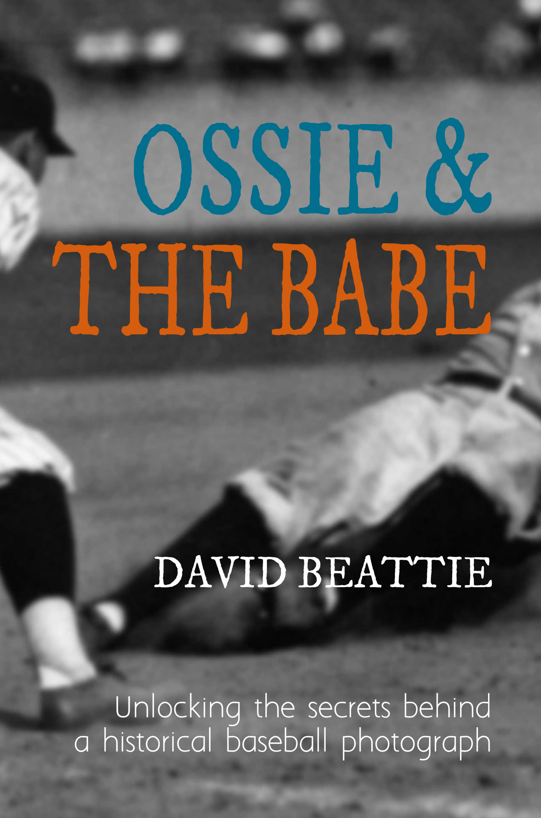
My book is the true story of a quest spread over many years. I was given a vintage baseball photograph, and found it arresting in its stark simplicity and the intensity of its action. Two players occupy the foreground: a runner identified as Babe Ruth is sliding hard into third base, while an unidentified infielder crouches to apply a tag. Questions sprang to mind at once. Who was the infielder? Where was the game played and when? Why were the distant left-field bleachers nearly empty, if that’s Babe Ruth? Was Babe going to be safe or out? A longtime fan but a novice to baseball research, I set out to crack the photo’s mysteries. A few answers came easily, but others were more elusive. Out of thousands of old baseball photos, this one turned out to be one of a handful that have defied full identification even by dedicated experts. As so often happens, there were unforeseen complications and surprising revelations; there were side trails to follow and broader contexts to explore. Embracing all these has enriched the experience and has helped to elucidate why baseball occupies a special place in the fabric of North American society.

Ossie & The Babe front cover

Ossie & The Babe front cover

Nathan says:

Kinda nice when the subject of your book is an image, isn’t it?  You go into the design process knowing what you have to work with, at least.

Not having seen what the rest of the photo looks like, my first recommendation depends a lot on factors I can’t know, but I’m wondering if shifting the image right so that the player on the left is a little more visible (and a little more instantly recognized as a baseball player) might be a good strategy.

I also understand that blowing up an original photo is going to give you a fuzzy image — the problem is that we’ve seen so many fuzzy images without that rationale (i.e., people just not knowing how to process an image) that I fear some readers will just assume that it’s a poor image choice.  Are there any texture or flaws to the original image — scratches, dust motes, etc. — that would show more clearly that what we’re looking at is an enlargement of a historical photo, and further show that this is a faithful reproduction of a blurry-at-that-size photograph?  Does the original photo have any tinting, or any yellowing from age?  I think that should be included, rather than bleached out.  Shucks, even if the original image doesn’t have any tinting, I think it would be okay to “cheat” a bit and add a light sepia tone.

I like the font for the title, but I don’t know that the color scheme works.  On a black-and-white Kindle or Nook, the title is going to wash out into the gray background.  I’d play around with making “OSSIE &” darker and “THE BABE” lighter so they stand out better against their respective backgrounds.

And finally, I really don’t like the font for your subtitle.  You should keep with the theme of period typefaces; look back on some advertising of the period — especially sports advertising — and use that as inspiration to pick another font.  Or go for a good handwritten font; it would add the connotation that this is a personal quest.

Other ideas?


Functional & Funded

The author says:

This nonfiction book was put together and published through Bookbaby within the last year. It deals with the imperative to pursue operating resources that persists among most nonprofit organizations in the public and private sectors. Featured is a strategic combination of “business as unusual” along with often equally unusual common sense, derived from the author’s years as an acclaimed trainer among nonprofits. It is a workbook, if you will, for anyone in or around nonprofit fundraising, and that’s a passel of people.

12698609_10201657032543268_2887076427773804556_o (1)

12698609_10201657032543268_2887076427773804556_o (1)

Nathan says:

It looks great to me — professional, on-topic, business-like.

If I were forced to come up with suggestions, I’d have these two:

  1. Is there a possibility that potential readers will see the DNA and assume it’s a science book?  I don’t know that it’s a great danger, but as a possibility…
  2. “How to create the only proposal your organization will ever need!”  I’m not a non-profit guy, so maybe your potential readers will know exactly what kind of “proposal” you mean, but it seems a little vague to me.

Other comments?

3 Days of Grace

The author says:

Shortly after moving to Prague, Grace is attacked by a werewolf and has now 3 days to decide if she wants to go through with the transformation or not. The intended audience is more or less young adult with a sense of humor. I would especially appreciate feedback about the typography.

Big-Cover

Big-Cover

Nathan says:

[looks at description]

[looks at cover]

[looks at description]

Are you sure this is the cover to that book?

I mean, I know I’m not the target audience for a YA werewolf novel, but I’m pretty sure that a werewolf novel should give some indication of it being a werewolf novel… or at least not look like it’s something completely other than a werewolf novel.

All we’ve got is an Old World cityscape. That’s not indicative of genre, readership, or anything else that would allow a potential reader to identify him/herself as the target audience.

And the typography, as especially requested, is awfully gentle. Even if this isn’t a slam-bang werewolf action novel, it still seems gentler than is warranted.  Between the flowing script and the words “3 Days” and “Grace” in the title, I would assume that it’s a Christian drama at first glance.

(And “RSPOB Series?” That’s an entirely uninformative series name — once again, it’s not telling the reader anything about the novel. And given that this is the first entry in the series, it’s not like you can count on name recognition to bring in the returning readers.)

I think this is definitely a case of a bad initial concept… or maybe even no initial concept.  You need to sit down and think, “What would catch the eye and the mind of my target reader?  How would I use that half-second of attention before they move on to the book sitting next to mine to tell them that, yes, this IS a book that will interest them?”

Good luck.

Any other comments?

Tyr

The author says:

TYR is a space fantasy (part one in a series) that follows Kai Brecken. It’s set in an undefined ‘future’ and takes place partly on a planet (Egeria) and partly on a spaceship. The target audience is lovers of sci-fi/fantasy/Vin Diesel. Thank you in advance!

COVERPLAY2

COVERPLAY2

Nathan says:

No glaring problems that I can see.  Let’s go to fine-tuning!

  1. While the star-scape is visible at full size, in the thumbnail it just blends into a gray texture.  I’d suggest adding some extra stars the look like stars even from a thumbnail.
  2. I don’t think your byline needs to be so small.  I also don’t think that a typewriter font is the the right font for this cover.
  3. Back cover: The planet that takes up half the cover really doesn’t need all the focus; it would be better as background. Don’t you have a bio note, or a blurb, or a publisher logo that you could use to fill in that shadow-side?

Other comments?

Rock the Boat [resubmit]

The author says:

ROCK THE BOAT is an erotic romance or maybe a (romantic thriller I’m really not sure) set in current day America. A simple love affair becomes complicated when a soldier shares his new wife with his best friend. Parental disapproval escalates to lies and manipulation. A man with an obsession, a kidnapped spouse, and a murder, change a happy home into a nightmare. One that might be fixed by choosing the right man. this is my third attempt at a cover. I’m going for a hint of sex in a thriller vibe. The covers for erotica books are not at all the ‘feel’ for my story. Mine has very little actual erotica in it.Sorry I’m not clearer, I’m confused myself on my genre.

rtb4.JPG

rtb4.JPG

[original submission and comments here]

Nathan says:

If this isn’t erotic, then you are going to have a lot of readers angry at you for the bait-and-switch, because that definitely ain’t a “hint of sex in a thriller” vibe.  That’s a bikini babe.

The most important role of a cover is to attract the kind of readers who would enjoy the book.  That means you need to know who your target audience is.  Then you need to figure out which other books those same readers would like, and use the covers of those books to learn how those readers are accustomed to being marketed to.

Until then, you’re just throwing random things into PhotoShop.