A Girl Called Thief

The author says:

A MG/YA Fantasy/Fractured Fairy Tale.

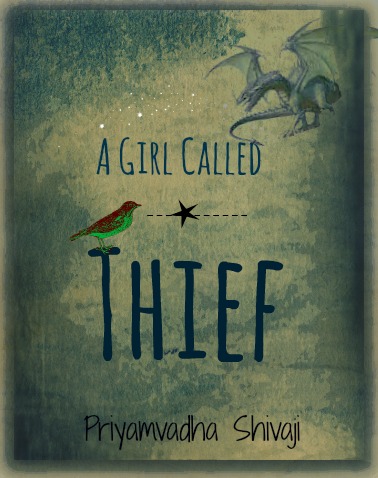
Synopsis: Once upon a time, there was a girl who set out to learn the meaning of fear. Twelve-year-old Saena likes to steal words. She sees them shimmering in the air, beautiful and fragile and perfect; sometimes she plucks a word that she really likes and stores it away in her head so that it belongs to her. One day she plucks the word Mama, and her mother disappears into Saena’s head. This time, something is different. Saena has stolen her mother, and she can’t seem to return her. When a gold-necked nightingale with a strangled voice and red-and-green feathers appears at her window one night and promises to help her get her mother back, Saena is only too ready. Thus begins an adventure fraught with danger, as Saena and the nightingale – which calls itself Jiu – travel the secret moonlit roads that will take them into Fairy Country, guided by Saena’s mother and the words. They travel up hill and down dale, and across sparkling seas and cities made of glittering bone. Along the way Saena collects a strange assortment of companions, none of whom are even remotely what they seem. The words have never failed Saena before. But as they come closer to the place where all the lost things go and where the dark fairies hold sway, Saena is finding it increasingly difficult to see them. Her mother’s voice is fading fast, and at every turn Saena discovers more and more about her mother that puzzles and befuddles her. Who exactly is the Red Fairy? Why does the name Marya Morevna taste so familiar on Saena’s tongue? As a word thief, Saena knows better than anyone that nothing can be hidden away forever. But perhaps some things are better left alone…
cover-version-1

cover-version-1

Nathan says:

At first glance, I like it — the only problem I see is that the colors on the bird clash with the rest of the color.

At second glance, a few other problems emerge. The dragon in the upper right looks like it’s cut-and-pasted out of another source, as evidenced by the fact that it’s standing on nothing; you should find an image of a dragon flying (one which you have appropriate rights to, of course). And what’s with that dotted line through the star?

Other comments?
Gift of the Master [resubmit]

The author says:

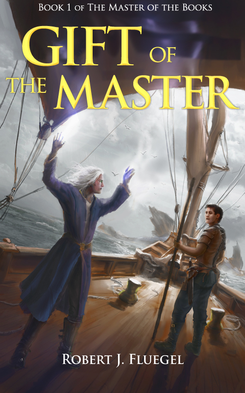
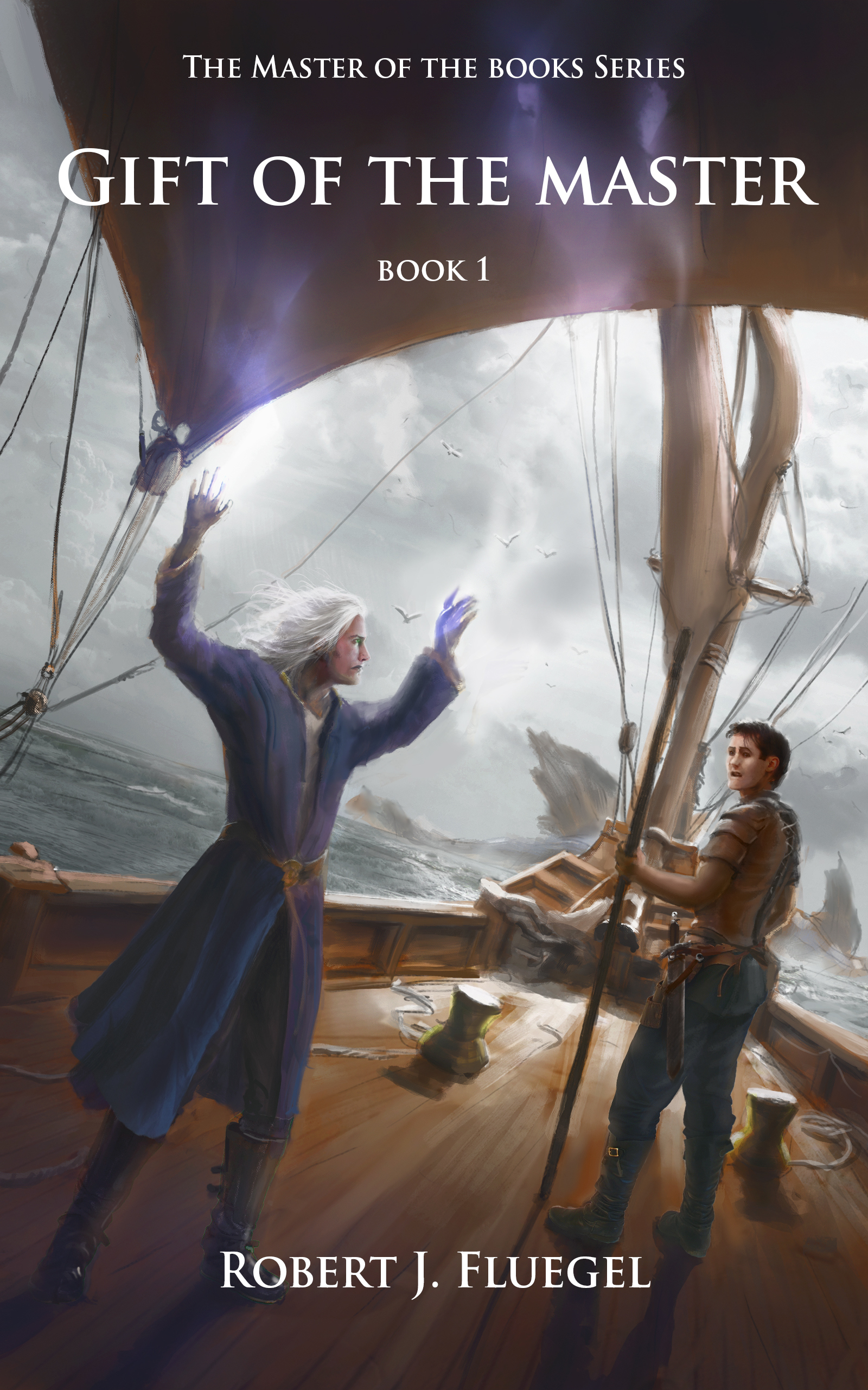
Tommy is a 15 year old recluse who’s only friends are the characters in his books. On his birthday he is suddenly pulled into the World of Books and he quickly finds that reading about a battle and trying to survive one couldn’t be more different. Artwork is by Edouard Noisette.

book-1-cover-offficial

book-1-cover-offficial

[original submission and comments here]

Nathan says:

This is custom artwork, yes?  I think it’s terrific.  No complaints there.

I think your type treatment has swung to the other end of the pendulum from your previous version.  It’s very clear, but it’s awfully small, and pretty dull. Trajan is still a workable font, despite its overexposure, but it needs to be spiced up a big, especially as the title itself.

Your artist left plenty of space for the title, as a good cover illustrator will.  Don’t be afraid to fill it more — there are no essential details you have to worry about covering.  Here’s a starting point:

book-1-cover-nathan

I think I’d continue to play with edge shadows, to make the text more distinct where it overlaps on the bright sky at the edge of the sail.  (And I’d similarly make the byline larger.)

But I think you’re almost there!  Other comments?

Hallowed Souls [resubmit]

The author says:

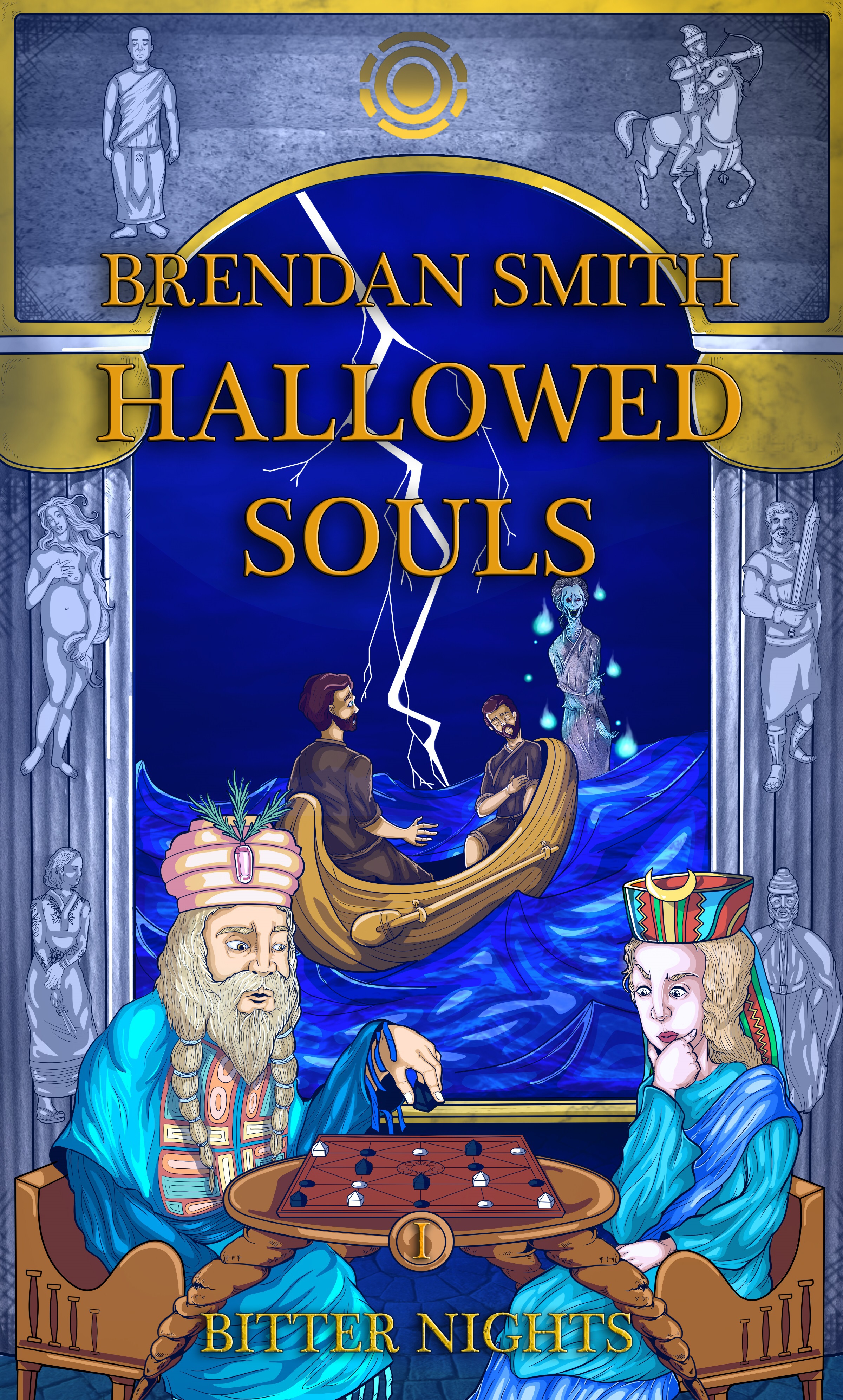
I had forgotten to mention this in my prior submission, but the title is a reference to a major schism ongoing in the first book, as the book series is primarily focused on religion and its flaws. I had taken most of the suggestions into account, such as a more fantasy-esque art style and bigger characters. I did make a font for this that was somewhat Asiatic, but I decided to abandon it as it did not fit the art style.

War rages on as various kingdoms struggle to gain power and maintain their freedom. From the shores of the Grey Sea to the mountains of Cosca, chaos reigns. It is a tale of murder, rape and war. Here a peasant girl masquerades as a princess; a deposed king schemes to regain his throne; and fierce pagans strive to regain their freedom. As opposing forces scheme and plot to gain power, a strange sickness blows in from the mysterious east and ravages the land. Not even Spenta can save them as everyone, from fools to sages, realize that even the most hallowed of souls can do nothing in the end.

hallowed-souls-book-cover-draft-1

hallowed-souls-book-cover-draft-1

[original submission and comments here]

Nathan says:

You’re not going to like this: I think the first submission was better.

Why? Because this kind of semi-cartoonish illustration looks like a chapter book or middle-grade book, which is absolutely not your target audience. The readership for an epic political-historical fantasy is not going to pick up something that looks like a volume of The Magic Tree House, and vice versa.  The original cover told us nothing about genre etc., but at least it seemed aimed at adults.

There are other issues with the focal event of the illustration and the placement and readability of text, but those would be rearranging deck chairs on the Titanic.

The advice I’ll give you is advice that I give often: Look at the covers of the books that you expect your target readers to have read and liked.  See how that audience is used to being told, “These are books for you.”

Other comments? Am I wrong?

Self Reliance

The publisher says:

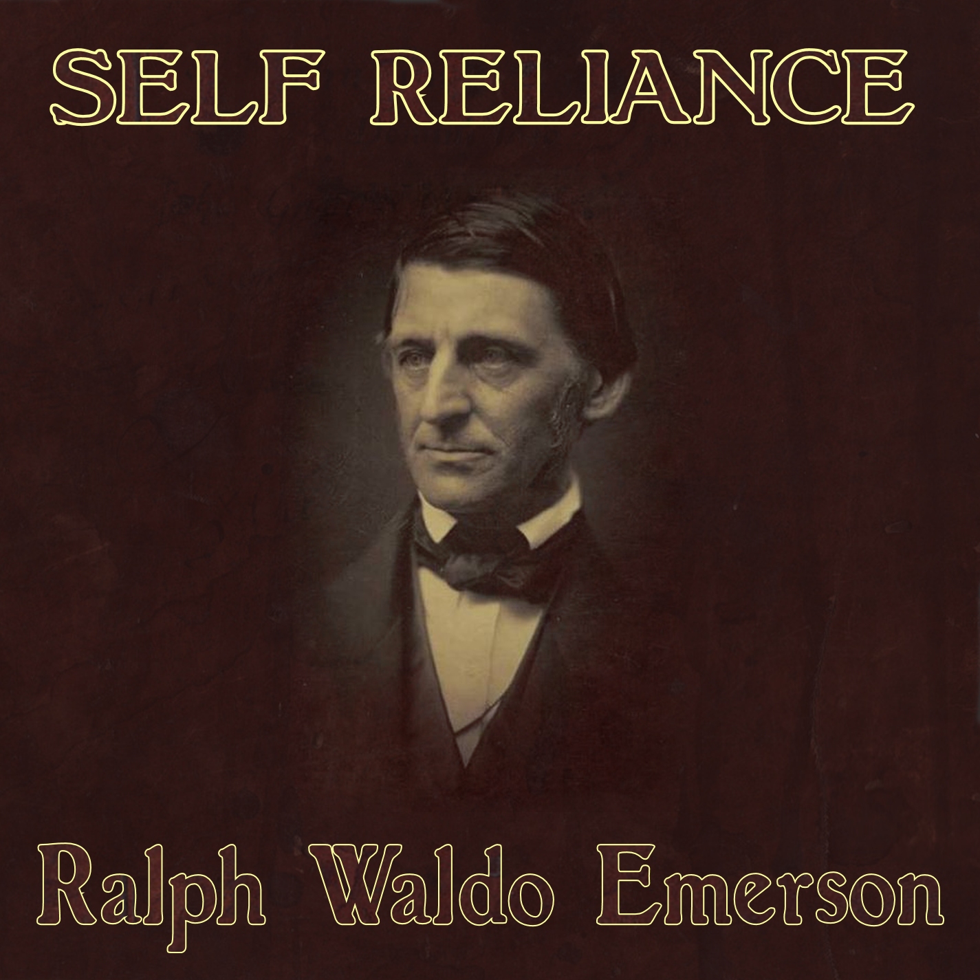
The audio (CD) version of the classic American essay, Self Reliance by Ralph Waldo Emerson.

selfreliancecover

selfreliancecover

Nathan says:

I think you can see for yourself the problem with the outlined type in the thumbnail: It makes it much harder to read.

Beyond that, I can only suggest that you include your own line from your submission, “the classic American essay,” under the title. And maybe a credit for the reader under Emerson’s name.

Beyond that, I’ve got nothing. Anyone?

Ash to Ash

The author says:

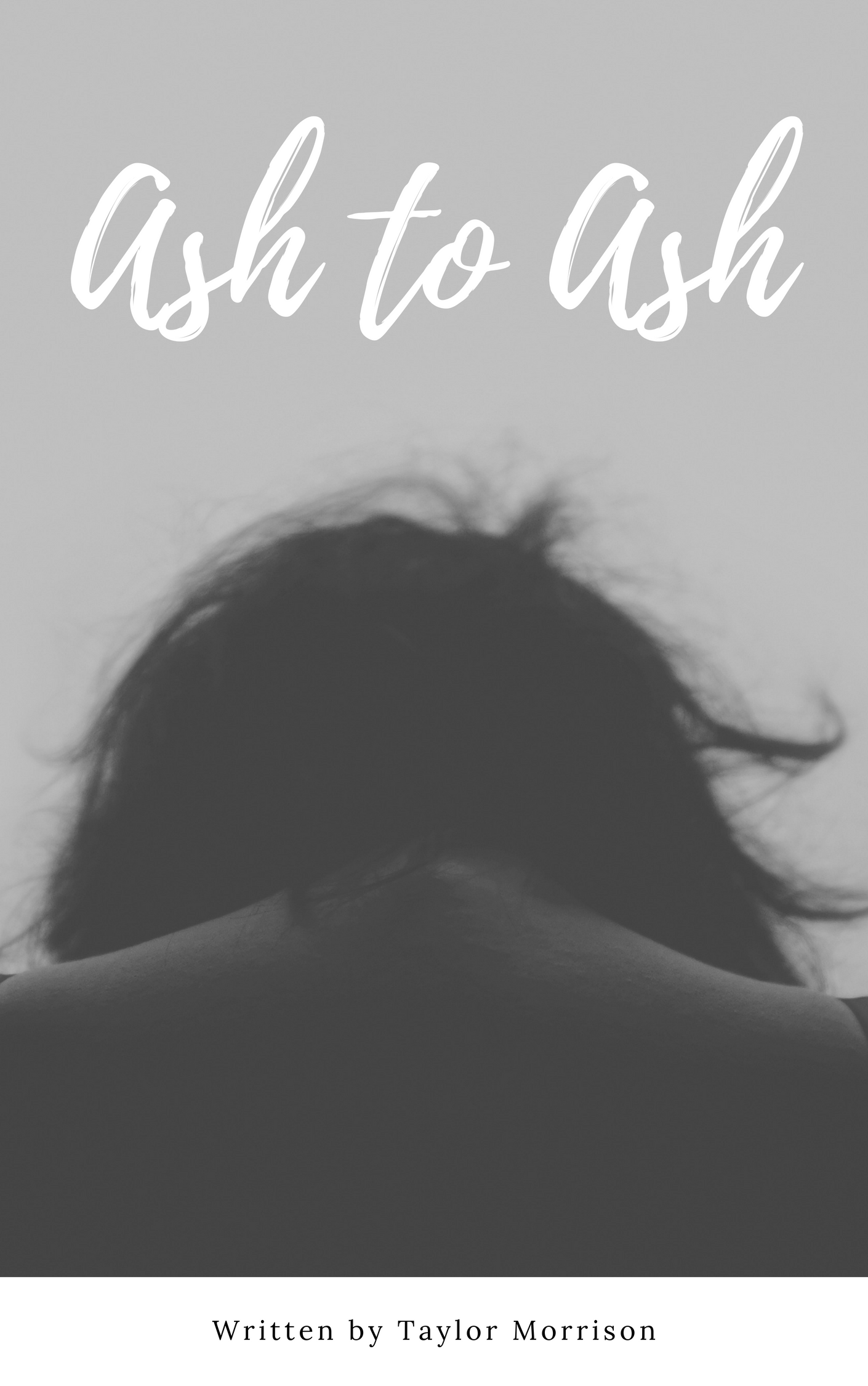
Natalie just wants to be normal, but after an almost deadly attack by a man named Ash, her life becomes anything but. Now she must save her sister from a literal monster whose made Natalie his number 1 obsession. Young Adult/Fantasy Novel

an-incredibly-poignant-piece-1

an-incredibly-poignant-piece-1

Nathan says:

This is a pretty good cover… but not for your book.

What I’m getting from your description is a suspense thriller, possibly with a paranormal angle.  The cover you’ve got is perfect for a young adult drama, but it’s got no suspense or excitement to it.  There’s nothing here to tell the target audience for your book that this book is aimed at them.  Look at the covers of the books that you’d expect the readers of your book to love as well, and see how your readers expect books to be targeted at them.

And a couple of technical notes:

  1. Having your byline in a white section tacked on to the bottom makes it look like an afterthought.  There’s no reason that your name can’t be in white across the model’s lower back — it’s not like you’re going to be obscuring any important details of the image.
  2. “Written by” is unnecessary. If you see a phrase and a name on a book cover, you know that the phrase is the title and the name is the author.

Other opinions?