The author says:
Natalie just wants to be normal, but after an almost deadly attack by a man named Ash, her life becomes anything but. Now she must save her sister from a literal monster whose made Natalie his number 1 obsession. Young Adult/Fantasy Novel
Nathan says:
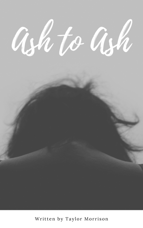
This is a pretty good cover… but not for your book.
What I’m getting from your description is a suspense thriller, possibly with a paranormal angle. The cover you’ve got is perfect for a young adult drama, but it’s got no suspense or excitement to it. There’s nothing here to tell the target audience for your book that this book is aimed at them. Look at the covers of the books that you’d expect the readers of your book to love as well, and see how your readers expect books to be targeted at them.
And a couple of technical notes:
- Having your byline in a white section tacked on to the bottom makes it look like an afterthought. There’s no reason that your name can’t be in white across the model’s lower back — it’s not like you’re going to be obscuring any important details of the image.
- “Written by” is unnecessary. If you see a phrase and a name on a book cover, you know that the phrase is the title and the name is the author.
Other opinions?


Honestly, if I hadn’t read the description I would have thought this to be a book of erotica.
I agree with Nathan and Will that this is really nice cover…but probably not for this book. It simply does not convey anything at all of what you describe the book being about.
That being said, any suggestions about the typography would be moot since the art really needs to be replaced. (Though, just in case it were to happen again, I have to second Nathan’s remarks about the credit line.)
Perhaps you could retain the present image by simply adding another visual element, one that would suggest the monster/fantasy theme of the novel.
I’ve stared at this cover for a couple of days now, and I truly don’t know what I can add, in terms of salvaging the image for this particular book. It’s a nice image, but honestly, I think it’s a very poor book cover, for any book. It’s simply not adequately telling. (Perhaps for literary fiction or poetry–but nothing else that comes to mind.)
The font is okay, but I’d like to point out that at thumbnail size, it looks like Ask to Ask. Not Ash. Ask. One of the downsides to all these handwriting and script and brush fonts that are simply everywhere you look now is that many of them have one or two cute letters, or cool swashes, or lettering alternatives–but as FONTS, they don’t work that well–as evidenced here. There aren’t enough characters around the h’s to make it clear that those aren’t k’s, in context.
My second biggest issue is that there’s inadequate “pop,” by which I mean color contrast. Yes, of course–you have black, gray, white, and the white and black do constrast, but not directly. I’m a big believer in strong color contrast (orangey-red on teal, yellow on green, etc.) to draw the eye. And this is just…bland. I think that while B&W can have such crispness and clarity, that’s not happening here, in this image.
Combine those things–an image that’s not very indicative as to genre, lettering that’s not easy to read correctly in thumbnail, and the complete and utter lack of pop/contrast–I just think this warrants a do-over. Start from scratch.
If you have the original image, IF it is really in color, you might want to consider Ron’s idea–put something in the background that suggests a monster/fantasy book.
Sorry–I wish I could say something more positive, but…that’s all I have.