Jon

The author says:

Genre SciFi

Audience 15 to 70

Jon

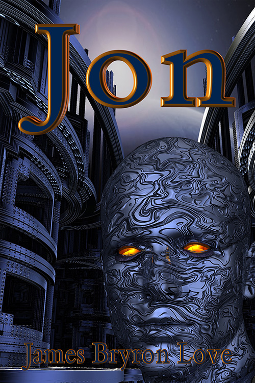
Escaping from his home world he crosses through the multiverse to hide on an obscure planet. Jon is arrogant and believes he can do anything that he wants including influencing the events on that planet. His android is the most advanced of its kind as well as being illegal on his planet tries to control Jon with mixed results. The bounty hunters are on his trail and if he doesn’t listen to the advice from his android he is likely to get caught. Jon rarely listens to anyone.
joncover-500

joncover-500

Nathan says:

So, is that Jon on the cover? The android?  A random alien who looks cool?  Why are we looking at what we’re looking at?

I very rarely find “portrait of a person” covers engaging, because they don’t show the character doing anything.  I get no insight into the character, and thus into the book, by his presence.

Also, everything is so dark, including the title and byline blending into the illustration. Even just reversing the colors in the type — orange characters with a deep blue border — would make it more readable and eye-catching.

Anyone else?
The World of Rigel Chase: Rise of the Shaper

The author says:

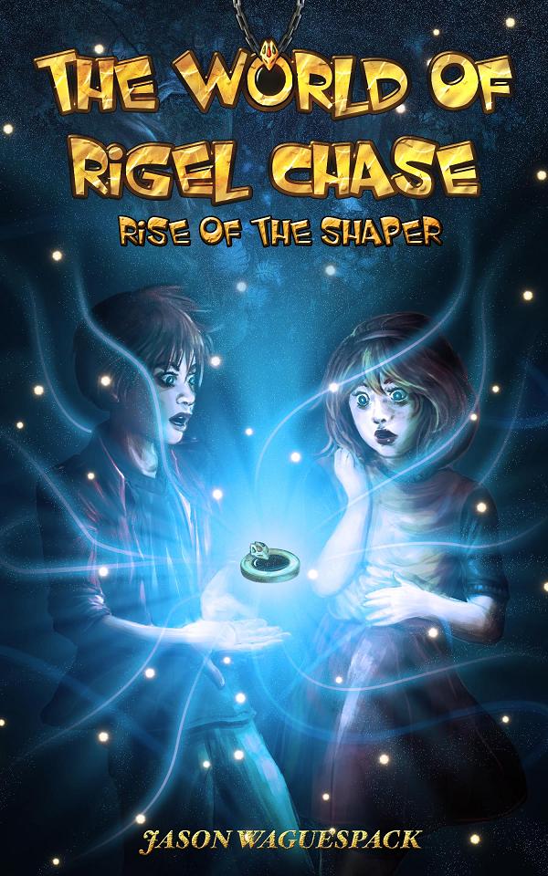
The World of Rigel Chase: Rise of the Shaper is the first of a series of fantasy adventure books for middle school kids and up. Rigel is a kid with a gift for talking animals, lush alien forests and powerful young warriors, but he never imagined he could make them all appear in his backyard one night. Thanks to a magic golden medallion, he can make the inhabitants of his imagination come to life and even transform himself into a flying superhero. But things take an ominous turn when Rigel and his new friends are hunted by sinister creatures who want his special powers, and the librarian who gave him the medallion has suddenly disappeared.

riseoftheshaper_final-full-reviewversion-jpg

riseoftheshaper_final-full-reviewversion-jpg

Nathan says:

Many of my comments center on the boy figure on the left:

  1. I understand that the shadow under his eye is supposed to be the result of the glow below his plane of vision, but he looks like a zombie.
  2. I don’t know what he’s looking at, but it’s not the floating medallion in front of him.
  3. Is he supposed to have a left hand on his right arm? Because that’s what it looks like.

My other comments:

I’m not in love with the border around the letters in the title, and I definitely think it should be removed in the subtitle.

Make your byline bigger! And the font it’s in clashes the the one used for the title and subtitle.

Other comments?

Steve’s Web

The author says:

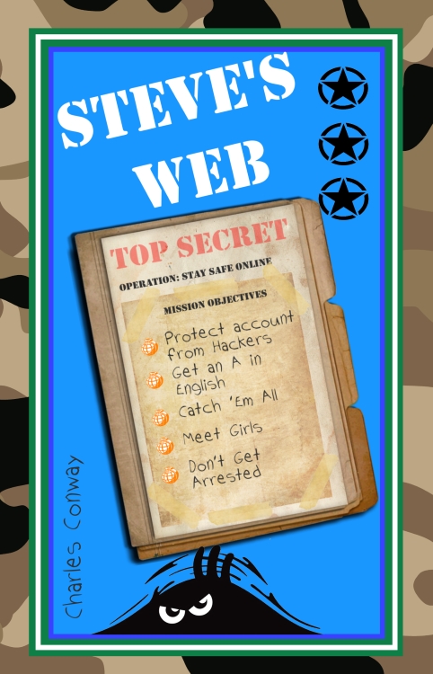
Steve’s Web is a book of short stories with a strong Internet Safety theme. The protagonist, Steve, tells his stories in his own words and relates how his online gaming account was hacked, how he convinced his English class (and himself) that Martians have already landed and how a virtual monster put him in hospital! The book is designed to appeal to primarily boys aged between about 9 and 14.

stevefrontsmall

stevefrontsmall

Nathan says:

Cute, but… YOU HAVE MARTIANS* IN THE STORY AND THEY’RE NOT MENTIONED OR DEPICTED ON THE COVER???

*or the possibility of Martians

Look at how middle-grade books are marketed.  They are not sold with text-heavy covers than don’t really tell you about the story or stories.  They are sold with clear, grab-your-attention titles, and clear, grab-your-attention artwork.

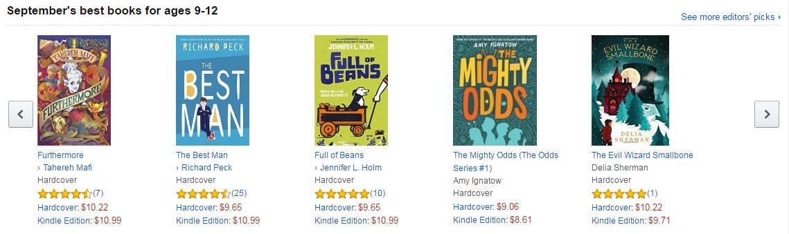
Here’s the top row of books Amazon is featuring for that age range:

shot0001

Clear, interesting text, and an interesting central image. This is how the target audience for your book expects books aimed at them to look.  Will they know that your book is also aimed at them?  Learn from your competition.

Other comments?

Traakenholt

The author says:

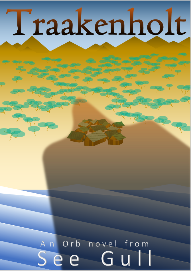
Book Micro blurb: ‘When two young fisher sons dare each other to visit the forbidden island of Traakenholt their destinies become entwined in the curse of the ’First and Final Dragon’. Now they must sacrifice everything as they battle the terrible force they have unleashed.’

This book is intended to be part of a hard sci-fi/hard fantasy series. The series is very wide ranging in plots and settings. Nevertheless, I wanted to try and find a graphical style that is simplistic and flexible enough to retain a certain level of commonality across the whole series.

book-cover_r01-png

book-cover_r01-png

Nathan says:

Here’s the problem: Nothing I see could be interpreted as signifying a hard SF novel.  You want to take the long view with series branding, and that’s fine, but you’ve got to get readers to open the first book in the series first, and there’s nothing here to tell hard SF readers, “This is a book aimed at you.” (While there’s also nothing that’s “hard fantasy” about this either, at least it doesn’t have the vibe of “definitely not hard fantasy” like is has with hard SF.)

There are other design tweaks we could go into, but until we correct the problem of the initial visual concept not being aimed at your target audience, it’s all straightening deck chairs on the Titanic.

(I will point out, though, that your pseudonym is unbearably twee.  Hard SF readers are not a readership known for their endearment to such things.)

Waiting For You

The author says:

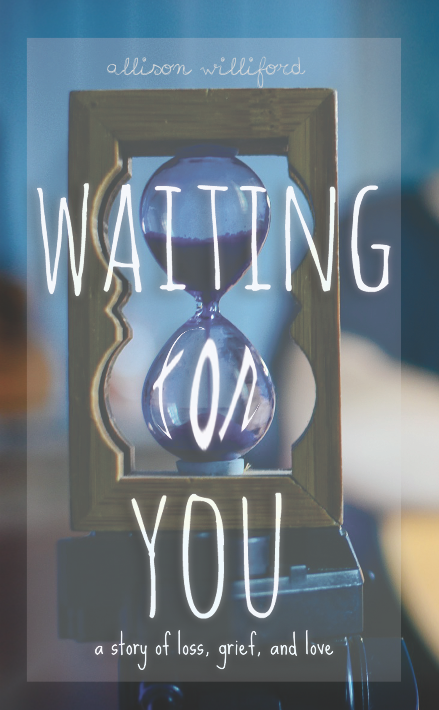
Waiting for You is a contemporary Women’s Fiction novel set in Charleston, SC. Shortly after Kylie Lewis meets Adam, an aspiring musician with a history of his own loss, her mother is diagnosed with terminal breast cancer. Stricken with the fear of her inevitable loss, she struggles with her budding relationship with Adam, despite his empathy. This novel is aimed at women, mainly aged between 25-35.

9_2_16cover_blue

9_2_16cover_blue

Nathan says:

With the caveat that I’m not the target audience, here are my comments:

  • Any time you wrap, distort or otherwise modify text, it adds as much emphasis to it as bolding it.  Thus, your title comes across as “Waiting FOR You.” It also renders the hourglass less immediately recognizable as an object, because it pulls the lower bulb into the mental space of reading the title while leaving the upper bulb in the background. My advice would be to let the “FOR” be in the same unaltered font as “WAITING” and “YOU,” and don’t worry about it exactly overlapping the lower bulb.
  • The title font has a problem: the capital “I” has cross-strokes on the top and bottom fully as long as the top of the “T,” rendering the latter harder to read.  I’d experiment with using the font’s lowercase “L” in place of the capital “I” both times.
  • Your byline is hard to read even at full size, and in thumbnail it’s utterly invisible.  I don’t know how married you are to that font, but at the very least I’d enlarge it so it rivals “WAITING” in width, use uppercase for the start of both names, and maybe play with making it bolder.

I’ll leave other comments to the rest of y’all.