The publisher says:
The audio (CD) version of the classic American essay, Self Reliance by Ralph Waldo Emerson.
Nathan says:
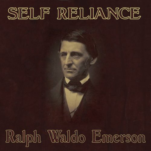
I think you can see for yourself the problem with the outlined type in the thumbnail: It makes it much harder to read.
Beyond that, I can only suggest that you include your own line from your submission, “the classic American essay,” under the title. And maybe a credit for the reader under Emerson’s name.
Beyond that, I’ve got nothing. Anyone?


Can’t add too much to what Nathan said other than to underscore his comment about the readability. The image of Emerson could probably be enlarged a little without any undue crowding.
It’s a bit too monochromatic for my tastes. Although it’s tasteful, and there’s nothing horribly wrong with it, but I feel it’s lacking the eye-candy contrast that usually draws eyes, and therefore, buyers.
I’m uncertain if maximizing the ability to draw eyes would be the correct strategy in this case, given the content. It is a famous, classic essay so it benefits from a certain degree of name recognition. The target audience isn’t browsers, as usual, but searchers specifically for this or similar philosophical content. The trick isn’t go get them to buy the essay but to buy this version of the essay, and the way I think to do that is to create the most appealing ambiance on the cover rather than simply creating the most visible one.
Well, then, I’d have to ask–given that the overall thrust of this website is to maximize eyes (with a cover) and sales therefrom–why is this here? I’m acquainted with the content, of course, but presumably, you’d like it to sell? No? After all, there are dozens of other books, containing Emerson’s essay, on Amazon, and a few Audiobooks, as well–most using this most-famous image of the man himself, varying only in overall color tone and text face usage.
If all that was needed was an artistic critique–well, that’s a whole other story. While good art doesn’t hurt a cover, the two aren’t necessarily the same thing.
I think that the font, usage, and coloring on this cover are not ideal, either for ambiance or for commercial purposes.
So, since my perspective is pretty strictly covers as marketing instruments, I’ll leave further commentary to my peeps here. They are designers, which I am not, and if all that’s being sought is generic artistic feedback, I’ve provided mine on the fonts.
Let me preface this with I am not a designer of an sort, but I find this a bit dull. Maybe aim it more towards the target audience. If this is for college kids, add a graded paper behind him with a big ole A plus. If this is meant to be enjoyed while sipping wine beside a fire maybe add that. Also, whenever I buy audio books I skip them if the readers name isn’t front and center as it’s a sure sign its amateur day and going to be awful if the reader isn’t listed right up front.
Putting a music note or headphones somewhere on the cover would also be good to make us quick browsers happy. We could see it was an audio book without reading the blurb.
S.
That colour there that is outlining your letters… that’s a good colour for your letters! 🙂
Shouldn’t the title be “Self–Reliance”? The hyphen is required in today’s proper spelling. I don’t know if it was there back in 1841, but according to dictionary.com, it’s been in use since 1883.