The publisher says:
Astrologer’s Proof features a clandestine group of people who have all the money, connections and computing power to decide whether Astrology is real. Using elaborate hacking schemes, they secretly obtain massive amounts of data on the American people to perform a grand astrological experiment. The story takes place in present day America over a two year period.
Genre: Science Fiction
Target audience: Readers of soft science fiction, contemporary fiction, techno-thrillers. Astrology lovers.
Authors’ readers Astrologer’s Proof may appeal to: Kevin Wignall, Michael C. Grumley, Douglas E. Richards, Adam Fawer, Ray Bradbury, Kurt Vonnegut.
(We are trying to decide if the silhouette man helps the layout or not.)
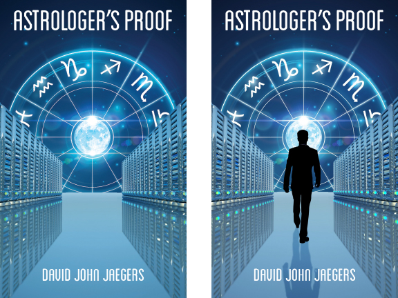
Nathan says:
Of the two, definitely the one with the silhouette. Without the awareness of scale that the human figure brings, the shapes along the side aren’t immediately recognizable as computer banks.
I will note that the man’s shadow doesn’t seem to match the single light source visible.
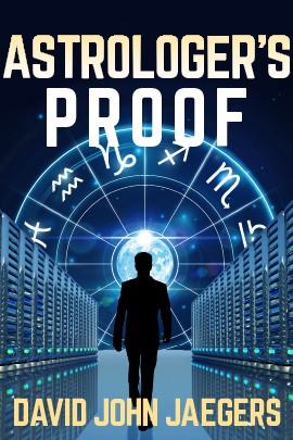
Some of the words you use to describe the story, as well as authors you cite like Kevin Wignall, Michael C. Grumley, Douglas E. Richards, etc. definitely puts this book into suspense-thriller territory. However, I don’t think the cover supports that. There’s not enough foreboding to it; it’s too centered, too clean, and the title doesn’t “loom” enough. You should look at the covers for the authors you list and see how to signal to readers that this book is for them.
My five-minute redo actually took 10+ minutes; I recently replaced my computer, and hadn’t restored all my fonts. But you can see where I’m heading here:
Other comments?