The author says:
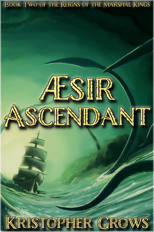
The Reigns of the Marshal Kings continues with Aesir Ascendant. It is the story of the great, shining king and the dark history which surrounds his rise, his voyages of exploration, and his ultimate fate beyond the edges of the world. A dark fantasy and cosmic horror novel, book 2 in a series that began with Vandal Valkyrie, critiqued earlier on this site. This book has a heavy nautical bent, will be darker, and suffers from the mid-trilogy ‘depressing’ ending. Original Cover Art by Chris Garrett, http://chris-garrett.deviantart.com/, and is used with permission.
Specific concerns: I have added a thin white drop shadow to the upper left of the text to lend the letters a glow. Does it work? Would a black shadow for darker contrast be better? I added some simple texturing to the letters for visual interest. Does it detract or is it not going far enough? The art is practically perfect for this specific book. Is it adequate for the genre? Also, how is the font? I seem to have a particular weakness with fonts.
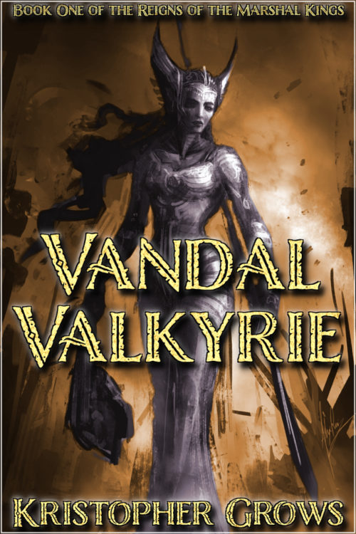
Many thanks all. I hope what I’ve learned here so far has yielded a somewhat less amateurish result. I’ve sent along a current version of the first book’s cover and an early mock-up for the third’s to allow comparison across series. Art for the first is by Alex Ruiz, http://www.conceptmonster.net, and used with permission.
(The final version of first cover, for comparison:)
Nathan says:
Good work incorporating our comments on the first cover (visible here), and also on maintaining both the typeface and type placement for the second cover; a lot of people don’t understand the importance of type placement as part of branding.
However, before we get to your questions regarding drop shadows etc., I have some concerns about the artwork on the second cover — not in itself, as it’s unquestionably good artwork, but again in terms of branding and series continuity. You gone from an image on the first cover in which a human figure is the central, dominant part of the layout, to an image with no human figures; on top of that, it’s a layout with no dominant single element (certainly not in comparison to the first cover), and literally nothing in the center. I think that’s definitely a series branding mistake; having established a “series look” on the first cover, you should do all you can to tie the first book to the second, and I definitely think that having a central human figure is a big, big part of that.
I would also say that the difference in art and stroke style between the covers (scribbly “speed-painting” vs. smooth and refined) works against you.
What says the collective?


Something annoyed me about the book, and it’s not the cover image: I don’t understand what a “Marshal King” is? I looked for this title on Amazon.com and also on the internet, and I did not find anything. Could the author mean “Martial” king? That might be a leap of deduction, but it’s something that, I think, would bother anybody wondering whether to buy it.
A good question, though one which doesn’t come up much in the first book. The it is a marshal in the sense of military rank, such as a field marshal. In some countries it is the highest army rank, equivalent to a fleet admiral in the navy or a 4-5 star general in the modern US military.
In the setting all independent kingdoms are subject to the Salvation Council that undertakes the great Buildings to push back the horrors, think of it as a feudal UN with teeth and no patience. The Marshal Kings are the kings of North Marshes, but they are also hereditary commanders in the Council Army because North Marshes was founded as a Council Army outpost. The king’s duties as a marshal actually supersede his rights and duties as king.
It is a fair point that it may confuse a prospective reader, but other than not labeling the series I’m unsure if there is any way around it. Nobody would initially understand what being the lord of the rings entails, or who or where ‘Narnia’ is either. In both cases, though, telling the reader that it is a part of those series is critical. I could try to think of a different series name.
Perhaps an attack from the deck of the ship, a central figure charging the kraken?
If we look at this hard enough, we can always find something to nitpick (such as the text across the top not being very legible in the thumbprint), but consistency is pretty much all that matters at this point. Basically, I wouldn’t recommend changing anything on your second cover that you wouldn’t simultaneously go back and change on your first cover as well. Since that criterion presumably doesn’t apply to much, my overall advice is “don’t fix what isn’t broken” and “don’t mess with success.”
You didn’t say a whole lot about what’s in the book in your description, but I take it from the cover that this story involves either a kraken attack or a sea-battle with some other kind of tentacular sea monster or eldritch abomination. The “mid-trilogy ‘depressing’ ending” mentioned in your description presumably means that like so many other trilogy writers, you’ve decided to emulate the original Star Wars trilogy and make this the Empire Strikes Back of yours. (Fair enough; just don’t go writing a sucky prequel trilogy sixteen years after you finish this one, all right?) If these impressions are accurate, then I’d say your cover is ready for publication.
I like the drama this conveys. The picture tells a story and, in my view, it’s more successful than Book One. My only suggestion would be to bring the ship forward so that the title is set against the mast. That would continue the theme of a main central image. There might also be an opportunity to look at a bow figurehead appropriate to the story.
The halo effect you mentioned is too subtle to make any real difference.
Looking at the second cover independently, it seems to lack some focus. I think part of that might come from the fact that the art is bottom-heavy: the upper third of the cover—all of the space above the title—is pretty much empty. The result is a kind of blandness.
If, for instance, there had been more tentacles, or larger ones, in the upper third of the art this might have helped alleviate some of the overall sameness of the cover. The problem is that there is nothing really dominant other than the title itself, which absolutely overwhelms the cover. This is underscored in the thumbnail version, where all you see is the title.
The curvilinear lines potential in the tentacles has not been exploited at all. Instead, they have been reduced to half circles.
There is also a cartoony quality to the art which is especially evident in the rendering the ship that works against the effectiveness of the cover.
I like this one better than the first one, actually. It’s a very dynamic image.
I like the image. It’s great. Lots of movement and drama, but I too am troubled by the blank spaces in the center and above the title. It feels like the title should be there, but I get why you didn’t. However, if you enlarged the ship to make it the central character, you’d loose all the tentacles, and then all you really have is a ship.
Perhaps you could make the ship a little larger and more central, and add a larger, suction cuppy tentacle (ie, foreground, more detail), in the upper space to balance it better.
I may have mentioned this in the first book, but if you ever want to go to print, those text objects are WAY too close to the trim edge. And just for aesthetics in general, it tends to make it look less than professional.
Thanks all. And for Tamian specifically, thanks for the warning about the margins. These ones are specifically the Wattpad covers. On the few physical copies I’ve printed for editing purposes (at Lulu, much cheaper than using a Kinkos) I use a version with wider margins. From a design perspective the differences are fairly minor, so I just include the one in submissions.
Probably a bit late to say this – but I am afraid I rather dislike the way the sailing ship is drawn. I have always liked sailing ships, looked at pictures of them, read napoleonic war naval stories and the like, and it looked wrong to me. First impression was that it looked a bit plastic toy and rigid. Further staring and I can see there is no rigging for the mast – that is possibly one of the things that was bugging me subliminally.
Might also be the way the light and colour is done on the sails. I don’t know enough about how to paint to pin it down better than that.
I know it’s been a while, but I just had to say, these are good covers but I hate the fact that you’ve used both a drop shadow and an outer glow on the main text.
I’m always wary of either effect, thinking they are too often used to compensate for a fault in the design. But we all use them and they can be effective done right. I’d actually say your covers are somewhere I’m perfectly happy to see a drop shadow used because it’s appropriate to the style. Adding a shadow to the title gives it that extra punch to really stand out.
I would take all effects off the other text, personally. I think it actually makes that text harder to read, especially in thumbnail size, and it;s not needed. You have picked a nice light colour for your text against consistently dark and low-contrast backgrounds. Your text should do fine without shadows. Keep a shadow on the title to give it the extra oomph, but lose it on on everything else.
But no one EVER needs two effects on their text! Take the outer glow off! It’s not adding anything and having something cast a shadow and a glow is just… illogical.
It might seem a small thing but it’s one of those tiny amateurish details which can really undermine an otherwise very well done cover.
I’d also say I think the illustration needs to move up. Or you could enlarge it, dragging from the top right hand corner so everything shifts up in that direction as it gets bigger. You might lose the edge of that foreground tentacle though. At the moment you just have a lot of empty space in the top third of the cover. I can see you don’t want to make the series name bigger for the same of series consistency.
Another option is to move the text rather than the illustration. I think the title is slightly cramping the ship anyway, which would benefit from a bit more negative space as a focal but small detail. Maybe try placing the word ‘Aesir’ above the tentacle tip and the word ‘Ascendant’ below it?