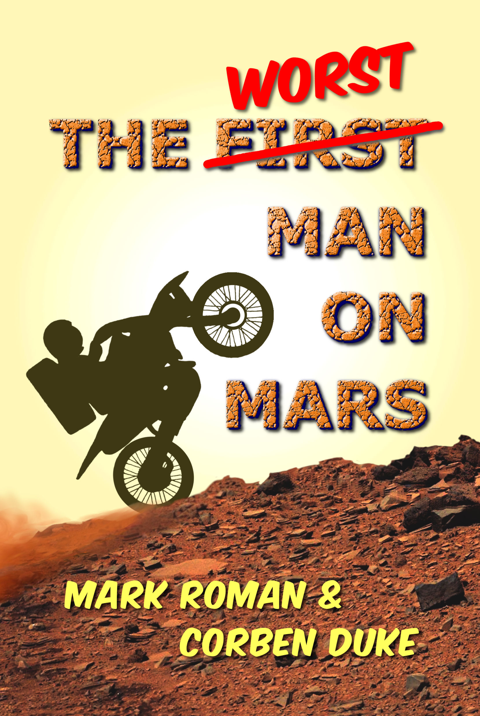
Project Team Leadership and Communication

The designer says:

This is a textbook designed for students and business professionals who are entering into their first project leadership role. Chapters cover the basics of leadership and team dynamics, project fundamentals/management, stakeholder communication, and some common pitfalls to avoid. This cover should target students and early-career business professionals equally. Thanks in advance for your feedback!

Nathan says:

The two great things about textbooks:

  1. They’re not impulse buys.  An instructor, department head, etc. will carefully evaluate what text to use for his classes.  That means that the cover doesn’t have to carry as much weight in the persuasion process.
  2. Selling one individual on the book means that dozens of copies just got sold!

Because of those factors, as long as a textbook cover provides a clear title and space on the back to describe its merits, the rest is gravy.

That said, what I would be tempted to do here — and this may be just me — is add some red or orange to a few of the icons on the front, just for variety and a touch of warmth.

Other comments?

Thrill Kings: Fragmented Sky

The author says:

Impulsive young test driver of the world’s first interdimensional motorcycle, enlists the help of a terrified news-crew-intern to expose a murderous army colonel who is trying to steal the technology. Night of adventure/end of the world

My other cover. I’m having trouble picking between the two.

Nathan says:

If this were a graphic novel, I would definitely say go with the second one.  However, with a prose book that will be first seen at thumbnail size on Amazon and other sites, I think the first one has more “instant impact.”

Anyone disagree?

Quality DNA

The author says:

In 2059, every person’s DNA is recorded in the Genome Database. Even though Annette’s perfect baby girl was the product of a one night stand, she knows the database will give her the name of the sexy stranger who fathered her child. Instead, her baby’s DNA matches that of a man she’s never met who died several years ago. Irene works at the Social Department and is assigned Annette’s case. When more and more instances of births that don’t make sense and babies who shouldn’t exist cross her desk, she realizes there’s something deeper going on. Her investigation sucks her into a sinister organization with a single goal in mind. Misguided matchmaking. Deranged medical experiments. Outright terrorism. All in the name of finding one elusive thing: Quality DNA.

Nathan says:

This is the kind of cover that relies almost entirely on its ability to interest the eyeballs and make the potential reader stop in their browsing.  With that in mind, I think that the random color patterns detract and distract from the impact of the cover.

Sorry, I’m a little under the weather today, so I’ll let the rest of our cadre of helpful commenters helpfully comment.

Catslash

The author says:

In 1985, a modern-day witch casts a spell on a six-year-old boy who’d been annoying her that turns him into a black cat. Ten years later, he escapes the witch and takes up with a little six-year-old girl whose guardians are sexually abusing her. Starting with her rapists, anyone who wrongs his new owner or himself is going to be severely crippled or killed in mysterious “accidents” in the years and decades to come, with no one to stop him; for who in our skeptical modern society would ever suspect a cat of being the killer?

Basically, this is an urban fantasy with more than a little psychodrama-style horror to it, as we’re given a view of events that might occur in a horror movie through the eyes of the sympathetic “monster” killing off a whole slew of rather unsympathetic victims.

Nathan says:

Look at the books that urban fantasy readers buy. Look at the books that horror readers buy. Does your book look like either of those?

Urban fantasy books tend to have some indication (usually in the background) that the setting is present-day, and rely on color scheme and ornamentation (swirls, etc.) to indicate the presence of magic.

Horror books tend to rely on grungy textures in both image and font to flag their genre.

In contrast, your cover combines two flat image components in such a way that the cat is almost invisible at thumbnail size, and not much better at full size.  The font you’ve chosen does nothing but display the letters; it doesn’t pulls its weight in telling about the book.

Just take a look here and brainstorm, “If I want my book to be bought by the people who buy these books, what do I need to do differently?”

Mended Wings

The author says:

Mended Wings is a Young Adult novel that tells the inspirational story of a young woman’s recovery from a traumatic brain injury. Her name is Flicker, and she is a survivor. Her journey celebrates the dignity involved in making choices, and taking risks to achieve one’s goals. Readers cheer as they watch Flicker take flight.

Nathan says:

This isn’t a bad cover, but it inspires me to use one of the running gags from LousyBookCovers.com: “Photobombing woodpecker!”

I think there are some suboptimal decisions here.

  1. There are definitely covers which succeed with minimal spots of color in a largely monochromatic image, but they use the color as a focal point wihin the image. Here, the upper two-thirds of the cover is monochrome — then you suddenly have color with the title and with an image element which is entirely separate, in layout and content, than the main image.
  2. I would suspect that very, very few potential readers will be able to identify the bird as a red-shafted Northern Flicker (I had to google it), and without knowing that the bird is a flicker, the subtitle “A Flicker’s Tale” will make no sense — especially if they have read your description.  It will seems as nonsensical as “A William’s Tale.”
  3. Not as big a problem, but I think that the subtitle font clashes with the title and byline font; not similar enough to complement, but not a good contrast either.

So my main recommendation would be to work both the bird imagery and the spare use of color into the main body of the layout, instead of having them confined to one area as an afterthought.

Other comments?