The publisher says:
Astrologer’s Proof features a clandestine group of people who have all the money, connections and computing power to decide whether Astrology is real. Using elaborate hacking schemes, they secretly obtain massive amounts of data on the American people to perform a grand astrological experiment. The story takes place in present day America over a two year period.
Genre: Science Fiction
Target audience: Readers of soft science fiction, contemporary fiction, techno-thrillers. Astrology lovers.
Authors’ readers Astrologer’s Proof may appeal to: Kevin Wignall, Michael C. Grumley, Douglas E. Richards, Adam Fawer, Ray Bradbury, Kurt Vonnegut.
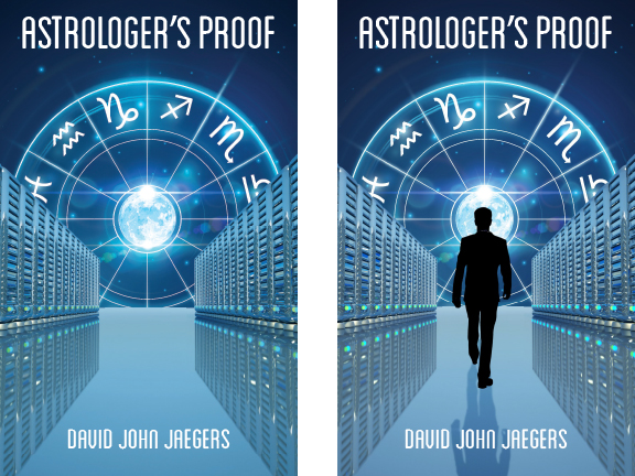
(We are trying to decide if the silhouette man helps the layout or not.)
Nathan says:
Of the two, definitely the one with the silhouette. Without the awareness of scale that the human figure brings, the shapes along the side aren’t immediately recognizable as computer banks.
I will note that the man’s shadow doesn’t seem to match the single light source visible.
Some of the words you use to describe the story, as well as authors you cite like Kevin Wignall, Michael C. Grumley, Douglas E. Richards, etc. definitely puts this book into suspense-thriller territory. However, I don’t think the cover supports that. There’s not enough foreboding to it; it’s too centered, too clean, and the title doesn’t “loom” enough. You should look at the covers for the authors you list and see how to signal to readers that this book is for them.
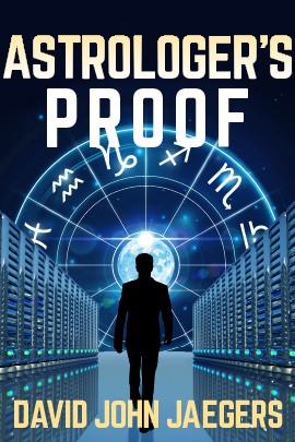
My five-minute redo actually took 10+ minutes; I recently replaced my computer, and hadn’t restored all my fonts. But you can see where I’m heading here:
Other comments?


I normally don’t care much for sihouettes, but in this case I think it works. The cover certainly needs something in that space: otherwise there is no focus. Looking at the left-hand cover, it is clear that there is something missing: the eye is led to the center of the cover…and there is nothing there.
I think Nathan’s remake is very good…though I’m not too sure about the type cutting across the figure’s feet, as though he is wading through the words. I would maintain a little space between the feet and the top of the type.
I agree. Thanks for your comments.
I think this is pretty good but I have a few suggestions for you to mull over:
1. The radial zodiac is very clear but the banks of computers are not so clear. How about using a different image to convey the SF digital theme? Perhaps a cone of binary code around the circular zodiac … with the code being sucked towards the centre (denoted by the binary code shown stretched in perspective)
2. Rather than a silhouette figure, how about using an all-seeing eye in the centre of the zodiac (Earth is the iris) … or is that too obvious? The silhouette man doesn’t work for me. He looks a bit too much like a clip-art man.
3. Nathan’s fonts make the cover much stronger.
The cover has excellent bones, and with the suggested font and scale changes it is much improved and can be improved more. Something Nathan may have done but didn’t mention explicitly, I think he darkened the image slightly to help give a more foreboding tone. This could be done selectively to the servers to enhance the effect while still lighting the scene with the zodiac wheel. The servers’ size relative to the man could also be enlarged and the banks moved closer together to make them loom like skyscrapers. This would yield a ‘tunnel to the light’ sort of effect.
On to more specific matters, which I’ll address in the order of Corben’s bullet points:
1. The binary idea is not a bad one if you’ve the graphical know how to do it. Alternately you could rip off the established Matrix visuals but make every character a zodiac sign. This veers farther toward cliche, but it is an option.
Something simple that may instead help the existing art look more like computer banks is changing some of the power lights on the bottoms from green to red. It will help them look like an actively working server farm while also singling each server out as a separate unit. Don’t use a regular pattern though, it must be random for the right effect. If you’ve the ability you can enhance this idea by also adding a random assortment of small red and green lights to the undersides of the horizontal bars moving up each server. Single pixels might be enough. If you really want to get fancy the small patterns of red and green lights could pick out rough symbols for the zodiac signs on the front of the 12 biggest servers, subtly of course to reward the careful viewer.
2. A giant eye in the middle of a cover can be risky, because it has become a red flag for many people due to overuse. It’s not that it’s a bad idea but it may be a bad idea to use in the present media culture. To avoid potential clip art problems with the silhouette you could try to use a less complete silhouette, where the coloration of the character’s body and cloths is somewhat visible along the edges of the blackness. Movie posters do this all the time, here is one (never seen it):
3. Again, the font changes are very good.
I didn’t do the image tag properly. It was for “Gran Torino” and the address is here http://www.firstshowing.net/img2/gran-torino-poster-silh-full.jpg
Very effective and it’s a perfect idea for another possible book cover.
I really like your idea of changing some of the power lights to red / green. Thanks for your comments!
Thanks — I like your ideas. Not sure how to accomplish #1. By the way, I had another layout with a close up eye and binary code as another layer. The author preferred this layout instead.
First off, I really like the astrological wheel, it’s an interesting idea and well presented.
I would rethink the computer banks. Until I read that that’s what they were, my guess was file cabinets… Although a more avid reader of sci-fi could find them more recognizable than I.
The blues look nice but they might be too peaceful for a sci-fi thriller. Personally, I might go for a more greenish hue to look more unsettling, but definitely with more contrast as seen on Nathan’s example. The bigger title is also a plus.
The silhouette is nice (it adds mystery and a center element that a reader can relate to). A rim light could be added, although it might make the silhouette less contrasting. Worth playing around with to see if the “clip-art” look mentioned previously can be avoided.
Agreed, thanks for your comments.
Nice adjustments, Nathan, and a great,mpositive duscussion all around. I’d like to add that my eye was a bit baffled over the bottom server rows…I initially took them to be a reflection of the upper ones on a high-gloss floor. (I think this is caused by the two rows of green lights on both sides, making the bottom image look like the top one’s reflection. And maybe by something being a bit off about their perspective re: the horizon.) With that in mind, on the second cover, the placement of the figure appears to be wading through the level of the floor. This messed with my perception of what the cover was trying to show about the book, distracted me to a degree. Also related to this perception, I think, is the horizon line beyond the server rows seeming abnormally high if the floor is actually supposed to be at the base of the lower server rows. I think this is fixable by randomize the red/green lights as suggested, or flipping those lower images so they don’t look like a reflection but like the units stacked atop each other with the lights all at the bottoms.
Or are the bottom rows reflections and the figure needs to have his feet on the floor instead of in it?
Tile lines may aid in defining the plane of the floor.
Thanks for your comments. There is a reflection of the servers in the high gloss floor. I can lower the horizon line to the bottom of the server rows. I appreciate the input 🙂
First, I have to say, this is a pretty darn good start.
I’m not a huge fan of the full on black silhouette either, but you DEFINITELY need the man for focus. Nathan’s 10+ minute redo helped your title and by line tremendously. The darkening helped it greatly too.
Though, two picayune details, the ROO isn’t standing out as well across the light blues of the top of the zodiac, so perhaps a deep blue very soft shadow could help that a smidgy. And a ginormous apostrophies always bug me. They can be scaled down so they are there and doing their job, but not SMACK in your face. (I know that was a quickie, but I just wanted to mention it)
I love the idea of the random lights detail but don’t forget to repeat in the reflection. Perspective tile lines would further draw the eye to the center, and give it a more photo realistic (less vector flat drawing) but they’d have to be subtle so it doesn’t get too busy.
Nice job though. Kudos.
The reflection! Thank you. it would look positively bizarre without the reflection.
I agree with your comments. I think it might be too complicated to add perspective tile lines to this stock photo.
Oooo, and a few stars in that sky wouldn’t go amiss. But again, subtle.
Oooop, upon closer inspection at a larger size, I see that there were a couple stars. The darkening didn’t help them, but it helped everything else. Perhaps you could add a few back after the darkening.
I like the design of the second one overall, but the execution leaves me cold. It feels very stiff and computer-generated, especially the man. I’m afraid what I’d like is the same basic design but done in a softer, looser medium, like photomontage.
thanks for your comment. I think the man is stiff too, this was the best economical stock pix that I found. An earlier layout version had a motion blur / the man was running into the horoscope.
I was looking at it, thinking it is slick but sort of bland and uninteresting… and then bingo, fixed by Nathan’s mock up. And yes it is better with the man in it. Of course it needs some tweaking – why is there a pace above the title for example – but it is basically OK, with just darker colours and less wasted space. I would also think about the colour scheme, does everything need to be same shade if blue, like the lights on the bank of computers? Never seen a teal light on a computer; maybe that is why people do not see it as a bank of servers? By all means keep the overall colour scheme, but tweaking or adding a few other points as highlights would liven it up, I believe. Maybe think also colour perspective, warm colours seem to be closer than cold.
thanks for your comments. I’m going to start with making / changing the artwork per Nathan’s ideas.
I definitely recommend the silhouette; the Moon by itself doesn’t provide sufficient focus. While the font our host’s ten-minute revision uses puts it a little too close to the margins (and therefore needs to be a little skinnier), he’s got the right general idea: your title and byline need to loom as large as possible. For best results, however, try to place your revised title a bit closer to the top margin and keep it from bleeding into the astrological symbols the way his does.
Apart from that, the picture itself needs nothing more than a few tweaks. As noted, the silhouette works fine, but its shadow ought to be more elongated if the only light source is the Moon behind it; and you might want to add a few internal features to it to clarify whether it’s walking toward or away from us. As for the computer banks, don’t most actual such devices these days come in grayish-black cases with the blinking lights on them mostly being red, white, green, and (just a little) blue? Whether or not that matches the ever-changing fashions of our time, that’s how a lot of your readers would expect computer banks to look, so I’d suggest changing their color scheme accordingly.
Thanks for your comments. After reading everyone’s ideas, (all were very helpful and constructive) there’s a lot to consider.
Nathan, what font did you use on your re-do?
It’s called Norwester.