The author says:
Set in remote mountains of Nevada and travels around the US and abroad in current time.
Book 3 Die-Hard Patriots, a Political thriller Series.
Audience: Conservative men with interest in politics and preppers. Vince Flynn, Brad Thor.
Fearing his life is in danger, Cal Stockton seeks refuge in the remote mountains of Nevada. His future looks bleak until he inherits a sizable sum of money, followed by a visit from the former Secretary of State, Claire Haskett. She’s preparing to make a presidential bid for the White House. Fearing the United States is on the verge of bankruptcy and the dollar is in danger of losing its status as the world’s reserve currency, she wants to abolish the Federal Reserve and issue a new interest-free United States Note—a note backed by gold, yet owned by the People. All she needs are a few noble patriots willing to acquire that gold. Patriots willing to break a few laws and a leader willing to die for the cause.
Nathan says:
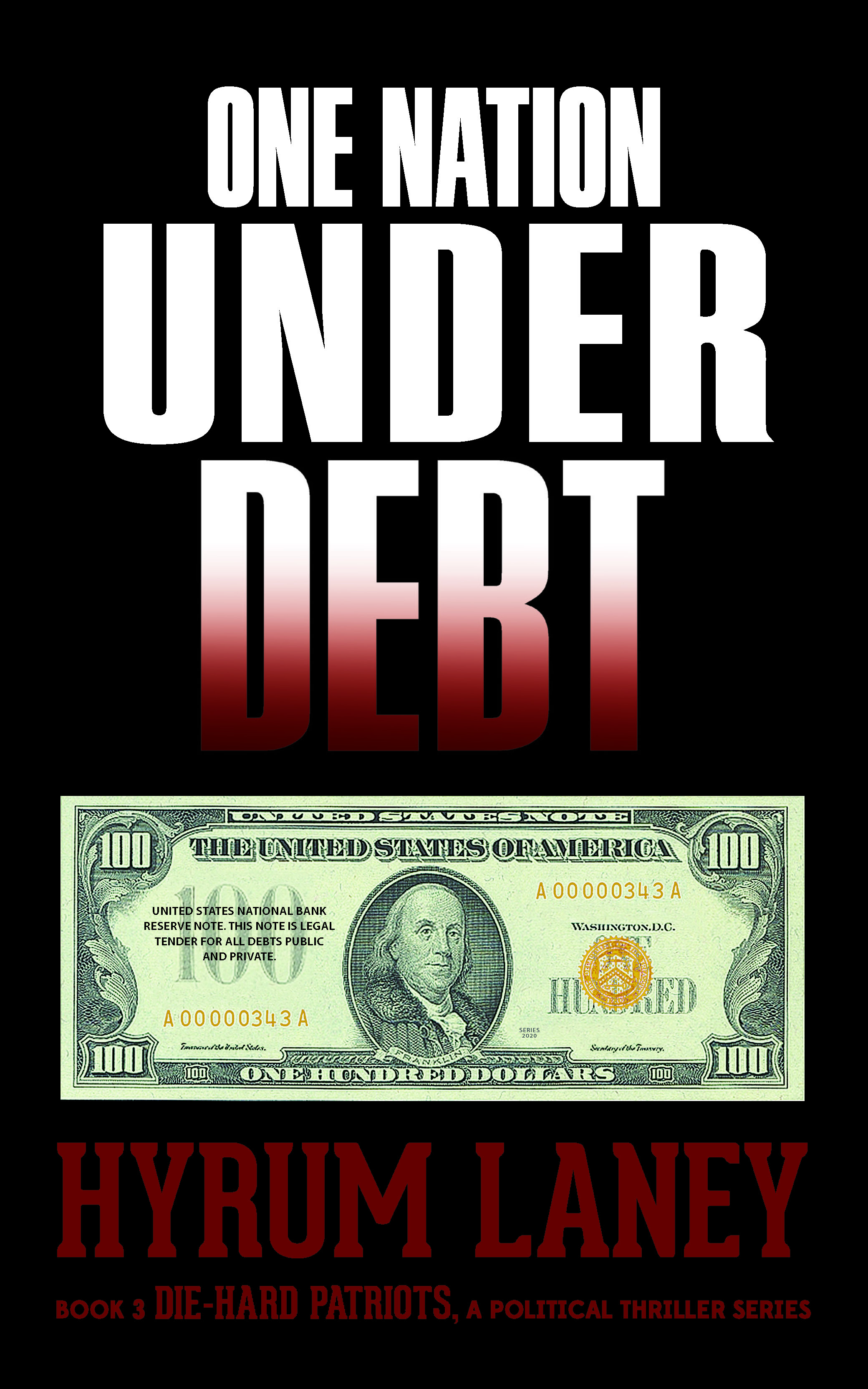
Series novels present their own problems; you want to maintain consistent branding across installments. For reference, here are the covers of the first two novels:

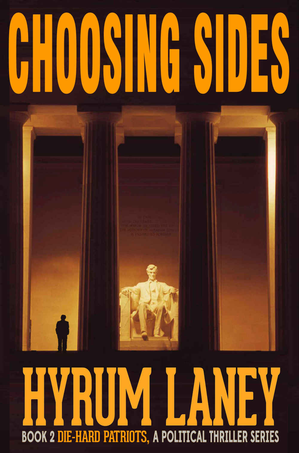
Good covers, if slightly inconsistent. Of the three, the third volume is the weakest, for a number of reasons:
- The title taking up roughly half of the cover makes it look like a nonfiction book.
- Couple that with a plain picture of currency, and it looks like a personal finance book, or a polemic against the Federal Reserve.
- In contrast to the first two volumes, in which the illustration extends out under the type, the third volume has the type completely separate from the single image element.
- Also in contrast to the first two volumes, the deep red of the byline blends into the background in thumbnail size.
Here’s what I’d do:
- Place the title on two lines, not three:
ONE NATION
UNDER DEBT
- Fill the cover with the image of the hundred-dollar bill, at an angle and with some texture. Darken it under the text, and see how that looks.
Other suggestions?