The author says:
Colleen’s rural life in Kilkenny was predictable. She loved shepherding her sheep and daydreaming by the river bend. But war has come to Tudor Ireland and all must pay a new tax to help the crown fight the rebels. A tax that will work her father to an early grave. While she mourns her father, men clamor to marry Colleen, for she is the beauty of the town. But Colleen cannot escape the conclusion that her father was cheated by the land lord. She needs proof, but no one will help her. Will she continued her search for justice, or be content to be a farmer’s wife? Colleen is a novella about an Irish country girl growing up in a man’s world and what that mean when all you have is your looks.
No.
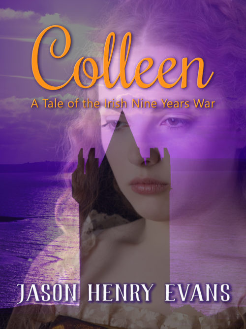
Sorry, but putting elements across a face like this never works. You could have the seaside castle showing in the background in the upper left (you could even scoot the face further to the lower right to make room), but this kind layering disparate images (with the title and subtitle impinging on her fact, to boot) is just a bad, bad idea.
Other opinions?


What our host says: we don’t do layers upon layers here. You can do a portrait of a pretty Irish lass, or you can do a background shot of a Scots-Irish-looking castle on a cliff-side; you can even do her portrait in front of a historical background the way multiple historical romance novels and women’s literature novels in general have done (if you’re good enough at cutting-and-pasting to anti-alias your subject(s) properly). What you can’t do is blend a portrait and background this way and have it work.
Hey Man, Thanks for the honest opinion! I appreciate it!
I agree with Nathan and RK. Go to Shutterstock and find a beautiful image of an Irish castle and start from there. Also, there are three different fonts here–one each for the title, subtitle, and byline. You should use two, max.
I like the title font quite a bit, although I’m worried it might look a tad too relaxed and frilly for the historical drama you describe. Not sure if orange is the best color for it either, but I think something similar with a dash more of a “drama” feel would be perfect.
As the others said, a layered image like this rarely gives a visually pleasing result. Especially when looking at the thumbnail, the castle silhouette distracts from the face, carving out a dark area that, in a face, doesn’t mean anything and is off-putting. Reversely, it’s difficult to focus on the castle because the face brightens up half of it, breaking its silhouette. Having a nice portrait of the lady with the castle actually in the background could look quite lovely, so I’d also suggest doing that.
The purple color scheme is very pretty, but maybe a bit too monochromatic. I’m sure that’s why the title is orange, but the image itself should probably have some contrast, too.
I agree that this image layering is not working. To add to the previous comments, I’d say it’s not only muddy and confusing but it lacks any sort of focus about the story. I should be able to tell something important about the story from the cover image, in this case that it’s about a young woman who has to find strength and go against society, as a woman, working to avenge her father. With the face-castle-sea, I’m not sure if she’s looking to marry a nobleman, go to America, or has lost her true love in the war. She looks more sad than defiant. Plus nothing in the images says Ireland to me, and there are lots of pics out there that suggest it without being cliche (avoid shamrocks and other overused symbols!). Seriously, that castle could be in Finland!
As an aside, the text of your description is also muddy in that it has conflicting verb tenses plus sentence structure issues. If this or a similar blurb is what you intend to use to “sell” the novella on Amazon, etc., you need to clean it up. No matter how good your final cover turns out, many readers will move on to the next title if your blurb isn’t up to quality–the blurb reflects what’s inside that cover. Likewise, if you want to snag positive 4-5 star reviews, your book’s grammar and spelling need to be clean and crisp too. If you don’t feel confidant to review and improve this on your own, you need to engage an editor or at minimum a proofreader. (I edit, etc., professionally so I’m speaking from experience with many authors!) Respect your readers!
A couple of comments…I won’t regurgitate what everyone else has already said. They’re all right.
Not every woman or man with red hair is Irish. I’m sure that’s pretty well known, but this particular face has a shape, mouth-size, etc., that seems to be very prominent in Irish-German mixed blood offspring. It’s not a very traditionally Irish face. (Now, someone will tell me that this was taken in Ireland, etc., but…it’s just not. It’s too round, the eyes and lips too small, and not enough cheekbone.)
I agree with Sirona that it’s VERY difficult to tell what this story is. When I saw the font, I instantly thought “romance.” And that’s sort of what I’m getting from it, even though you’ve identified it as a coming-of-age/woman-against-the-man’s-world story. It’s not very clear, as others already said.
Lastly–and this is personal–I kind of hate the color scheme. When I see that much purple, all I can think of is purple prose. I realize it’s an unfair thought, but…the yellow/gold on purple isn’t enough contrast, either. The three-D effect on the byline is not great, either. I’m not sure what sort of image, by itself, would convey your plotline, but castles and girl’s faces screams romance, to anyoen paying attention. It’s simply so heavily used in Historical Romance. So, I recommend that you don’t use the castle. That will most likely push readers toward your book that think that they’re getting something completely different.
Good luck. I know we’d all love to see your next iteration, assuming that there is one.
There is little point in discussing the typography when there are so many issues with the artwork. That needs to be rethought entirely from scratch.
Aside from being muddy and difficult to interpret, it says nothing whatsoever about the nature or subject of the book. Imagine seeing the image without any of the type: would you have a clue as to what the book is about?
I don’t have the strong objection to layers the others have, but this is a technique that needs to be handled with care. One important thing to watch for is unfortunate tangencies, such as the right-hand castellations on the tower and the girl’s nose.
Everyone’s already pointed out the problems with layers; even the best-composed image will look underwhelming with transparent layers because everything has half the value range it should.
Aside from that, I’m really not digging the purple-and-orange color scheme. Purple could be nice, but what you have is way too saturated; I’d probably go for just white or pale gold for the text.
I agree with most. Especially the castle-up-the-nose thing. Sorry. I had to chuckle a little about that one. Seriously though. The imagery, colour story and fonts are not working well to illustrate what the author describes. The girl is too expressionless to hint at any kind of strife, the font is a little girly and romantic, and the purple/orange combination is on the verge of direct (vibrating) opposites on the colour wheel.
If you do decide to rework things, might I also suggest that you give some thought to adding a little something other than just a flat colour/drop shadow to your title. It’s a single word, so it will generally be used quite large in order to fill the space, so a treatment of some sort wouldn’t go amiss if you are judicious. I don’t mean get all crazy with effects and bevels and glows and frou frou, but perhaps a slight texture, or gradient ramp. The solid colour/drop shadow tends to read a little “home made”
Oh, and it would be good to find a spot on the image that is relatively “un-busy” to place your sub title. The drop shadow isn’t enough to make it stand out. It’s fighting with her eyebrows and the clouds for readability. In this case, it would have been easier to read above the title, or at least above her eyebrows.
Looking forward to the next rendition, assuming there is one.