The author says:
A collection of short stories and flash fiction ranging from Fantasy to Science Fiction as well as Horror. Some of the flash fiction is memoir based from years gone by. Basically, this is an all around short story lovers book, targeted just for those people who love reading a start to finish in a short time.
Nathan says:
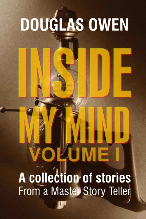
Since this is Volume II, I took a look at the cover for Volume I:
Frankly, the first cover is far superior, even though it took me a minute to figure out what that is behind the type. The type is readable and appropriate, and the entire effect is intriguing.
By contrast, Volume II’s cover is plain. The font you chose might indicate a military theme to the stories, but given that it’s not backed up by the color scheme, probably not. All that the cover really says is, “I’m so damned interesting!” — and given that most of your potential audience doesn’t already know you, that’s not much of a selling point. (Nobody’s going to see the dragon reflection in your glasses in thumbnail.)
My advice is to jettison this design entirely and mimic the first one: a semi-sci-fi image (a toy robot, maybe) in a muted but high-contrast color scheme, dominated by clear, bold text.
(And while you’re at it… give a serious edit to your cover copy. Misspellings and misused punctuation are not the way to convince anyone of your writing skills.)
Other opinons?


Yeah…unless you’re famous, look like a model, or both, it’s probably not the best idea to to make your big ol’ face the main image of your cover. (Especially for fiction, as opposed to a memoir or other highly personal nonfiction.)
Series branding is so important, and the cover of Vol. I is so much better, I would just use that as a template for Vol. II, with maybe a different color scheme on the letters of the title and a different…thingy picture in the same sepia tone.
I agree with what’s been said. The military typeface is especially off-putting.
This is sorta design-related: I suggest that you tone down the bragging. I don’t like having the author tell me I’m going to be blown away. It makes me run in the opposite direction.
Thanks everyone, I told them it wouldn’t work.
Back to the drawing board.
If you wait, you’ll get more feedback from others.
For what it’s worth, I concur that you should brand the second one much like the first, or use the same image, color-skewed in a slightly different direction. This cover doesn’t work, visually, at all. If you want to try to salvage the image, keep the sunglasses only, with the dragon image in it. Make them MUCH bigger, and have them, and the dragon, dominate the cover. Get rid of the white panels of braggadocio.
Also for what it’s worth–I, too, am put off, quite a bit, by the “you’re going to love me, I’m so wonderful” approach, either on a cover or in a book description on Amazon. OR used about the book, either; “buy this book and you’ll experience such joy…” I mean, that’s for me to decide. Not you. The “master storyteller” thing….unless somebody called YOU that, in something that we’ve all seen, lose that. And when I mean, someone else, I mean Kirkus, or the Wall Street Journal Book Review, etc. Not your cousin or your mom or your wife. “Storyteller” is one word.
Lastly, I’m also not a fan of being told that you’re going to recycle stories, as a bonus. That’s not a bonus; that’s a rerun. Tell your designers to tone it down, A LOT. This cover and this braggadocio would make me NEVER pick up this book.
Good luck. I suspect that the rest of the gang will be around sometime today to give you other ideas.
While I usually refrain from commenting on the content, Hitch is right: One of the biggest turn-offs on this cover is that it says that half the full-length stories are things the reader has already read!
When you label your book “Volume 2,” you’re establishing that your readers are expected to read Volume 1 first. Imagine how cheated you’d feel if you bought the second novel in a series and the entire first half of the novel was just a reprint of the end of the first book!
Yeah, katz–me neither, on the content, but as it was on the cover, I felt it fair game for a comment. Especially as it just leapt out at me as so peculiar–“we’re reusing the stories from the first book!” I was struck by it, and not in a good way.
I’m not sure I can add much to what everyone said… Consistency with the first volume would be good, but more than anything having the face bend with the spine of the book feels like it’s gonna distort and give a strange result. When cropped for amazon, it also won’t be cropping at the center of the face. I didn’t notice the dragon in the glasses until reading the comments (even in full screen I just read it as a regular reflection), so if a similar fantasy element is used I’d make it a lot more obvious. Splitting the cover & back in halves could be an interesting idea, but just filling them white with black text feels like a waste of space.
But the first volume is looking ok, so something similar to that would be pretty nice. I also run away fast when I see an author calling themselves a master storyteller, calling their book a masterpiece or anything like that lol.
I too liked the Volume I cover much better, and like others have said, really had to study the background image, and turn sideways, to figure out what it was. I too didn’t notice the dragon till I read what Hitch had to say, so yeah, that could probably be pumped up considerably. The font does really read “A TEAM” and the sub title, sorry to agree, is off putting. So, none of that is any more enlightening…
But, I’m left wondering… why is the template guides layer still on? Is that intentional? The warning says “Turn off guidelines for final art.” I don’t think it would really help much, because there are so many other issues with this cover, but it certainly would make it slightly less distracting to not see the page size, safety area and spine guides through the actual image.
I can’t add much to what’s already been said, except this: while splitting an image across the spine of a book might work with the physical version in some circumstances, the electronic version is (of course) only going to show the front cover on its sales page. My experience with fiction, at least, has been that electronic copies tend to outsell the physical copies these days, so it’s best to come up with a cover for the electronic version first. As such, it’s probably best to follow the example of your well-made first volume’s cover and put all of whatever image you choose on the front.