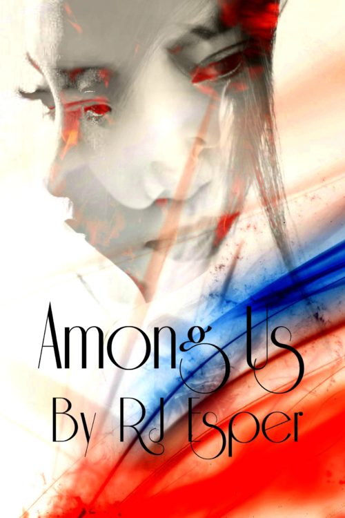
The author says:
This is a low fantasy book set in the early 2000s (think cell phones but not smart phones if that helps). The target audience is currently set at Young Adult, but that might change. This is simply a concept mock up, not anywhere near the final draft. Beyond that, I’d really like to know what specifically you love or hate or feel ambivalent about it, because it could be that the reason you hate it is because it accomplishes what I’m going for. Thank you!
Nathan says:
Well, if the reasons we hate it might be what you’re going for, then you’re deliberately going for low reader appeal and low sales. A bit counterintuitive, no?
Here’s what I see as problems:
- Can’t read the font at thumbnail size, and it’s still not easy at full size — the combination of ornate type and high contrast bright colors behind it work against readability.
- I can’t see “fantasy” in this image. Could be fantasy, could be a contemporary coming-of-age story or coping-with-divorce story, could be a fictionalized chronicle of mental illness. Nothing in what I see tells me who the story is for.
Other comments?


I like the bright colors, but I think the image is a bit too hard to “read”. The blending of the faces like this is a cool idea, however it should be more recognizable as a blend of faces at thumbnail size. It would be hard to make a guess based on this cover for the mood or setting though, and that’s probably an issue. I’m thinking drama/action based on the nostalgic facial expressions and vibrant reds.
The font is also hard to read, it could be replaced with one that’s like 20% less swirly or so lol. The font placed where it is (above both a bright and a dark area) will make it difficult to make the title readable. Perhaps things could be shifted around to have the title at the top, or less dark blue at the bottom.
The blue and red effects look neat, but they don’t particularly mean anything – is it magic, or is it just decorative? So basically, I think it’s mostly aesthetically pleasing but not nearly informative enough.
I get “Generic YA Problem Novel” from that cover, no fantasy at all. You also don’t need “By” in front of your byline–people know that a name on the cover of the book is the author’s name.
Great suggestions and responses so far. I have trouble with the composite face image. I’m not sure what face in it, or what set of eyes, to center on. Perhaps if one was more dominant–less transparent–to draw the eye in with more clarity and then the others are noticed when you look closer.
The font suggests a 20s period piece, not a near-contemporary. I like the watercolor-like slashes of color (although it looks like there might be some artifacts at full resolution?). I like your model, but you should pick just one photo to use.
While it’s not terribly informative, YA contemporary fantasy covers don’t tend to be very informative; yours has a) a girl and b) swoopy abstract shapes, so you pretty much tick all the boxes for your target audience.
1. There is absolutely nothing about the cover that suggests that the book is a fantasy novel (low, high or otherwise). Before you do anything else suggested below you need to rethink the image, which is simply confusing and uninformative.
2. The typography is nearly unreadable, especially where the title is superimposed over darker areas of the art. I might add that decorative faces such as the one you chose are usually meant for very short phrases. This might work for the title of a book, but not for the author’s name. The typeface in any case is a bad choice, since it suggests a romance more than anything else.
3. You do not need to add “by” before your name.
Honestly, I have a problem with the description and the whole
comment. If you are deliberately trying to get people to hate the cover, then you don’t need us. That means that your goal is to get people to not buy the book, because that’s exactly what will happen, if they hate or loathe or get creeped out by the cover. Any idea to the contrary, unless you’re a big name author published by Random House, with an existing following, is dead wrong.
I love helping folks that actually want their books to sell, and understand that their covers are an essential, essential, part of that equation. But deliberately trying to turn people off with the cover is rabbit-holing of the first water. Not to mention, it’s a teeny bit disrespectful of the time that folks donate here–“oh, tell me if you don’t like it, and think it’s bad, so that I can use it.” Hunh?
I’m out.
Well, if you want this to be a terrible cover (maybe hoping to fail your way to fame and fortune via some stylistic suck), you need to go study our affiliate Lousy Book Covers for all the various ways a cover can fail. So far, you’ve got mystery meat, layers upon layers, and bad font choice covered; with a little more effort, you could also get some cut and paste, readability, seizure risk, and maybe even some bringing sexy back in there. I should warn you however that if you’re trying for an Absolute Worst Cover Ever award or something that, (A) we don’t give out prizes or anything official like that, (B) you’ll be up against some incredibly talented competition for that title, and (C) chances are your cover will not draw clicks and sales to bring you fame and fortune even if it proves to deserve the title for being a truly epic failure.
My advice? Try to go for a good cover; trying to achieve intentionally what most people achieve unintentionally almost never works. (Naked Came The Stranger is the kind of exception that proves this rule, and I should point out that even that joke novel had a well-designed–albeit plagiarized–cover on it.) You have to give us an honest effort and a more specific description of what you’re trying to achieve (characters? basic plot? intended mood?) or we can’t help you.
It’s not an ugly design and the photoshop effects have been handled well, but unfortunately as people have said, it doesn’t do the job you need your book cover to do.
I’d need to know a bit more about the book to advise more specifically. ‘Low fantasy’ covers a lot of possibilities – is it urban fantasy a la Mortal Instruments for instance?
The most important thing your cover needs to do is to signal to browsers what the book is ‘like’, what genre it is. A lot of authors baulk at that a little because of course every book is unique and ‘standing out’ is a good thing’ etc. One of the rasons it’s so hard to design one’s own covr is because you’re often too close and too attached to be able to reduce your work into the nat, nuance-free little package it needs to become in cover form!
A cover is an advert for the book within to attract the kind of readers who will enjoy it. It has to attract people at thumbnail size before they’ll ever be inclined to even englarge it, meaning the overall look has to SHOUT genre and vibe.
Having a USP is good, you don’t want to make your book SO generic looking it doesn’t even register. But that should be there in the details. The primary aim should be to associate yourself with the right genre incredibly clearly.
You might not want to share too much detail on plot and ideas with us here. But I already know what my advise would be, though I can’t offer specific examples till I know more: think about what books have influenced this, what books it’s like, what genre (even micro-genre) this book fits into.
If you had to fill the blank in a generic ‘if you liked _____ you will love this book!’ reccoment card, what would you write?
There’s a rule in journalism that also applies to book covers (and book titles): Don’t Bury The Lead.
I.e. don’t be ashamed to say clearly and simply what kind of book this is. Book covers are not the place to be evasive or clever-clever or vague.
I hope you tell us more about what kind of book this is because I’d love to offer some thoughts on how to start grappling with this specific project!