Love Potion Commotion!

The author says:

Soon-to-be college student Alanna Lu Feng helps her great-aunt and -uncle with their doggy fashion design business, shooting photos of their French bulldog mascots. It’s good money and fun work—but why can’t Alanna Lu get lucky in love? Vivian and Frank Feng adore their great-niece, but they’re hiding a secret from her: Vivian is a witch! Sick of listening to her great-niece’s dating woes, Vivian concocts a plan to get her great-niece into the arms of a special someone. But can magic solve the problems of love? Turn senior fashionista Iris Apfel into a good witch, give her some talking French bulldog familiars, add a pinch of love story, and you get “Love Potion Commotion”. A fun read for fans of Hallmark movies. A lighthearted comic fantasy that will make the whole family smile.

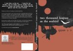
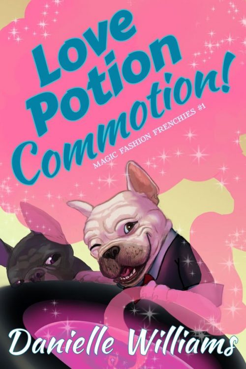
This book is live, but I’m looking to completely refresh the cover (and blurb) since I’ll be formatting it for print soon. In other words, don’t feel tied to this particular image, composition, or anything because I’m prepared to start from the ground up if needed (I did the illustration and styled the text). Here’s the two main things I’m looking for help with:

– giving it more of a Hallmark Channel vibe. I think this cover, while cute, may skew too young. – ideas on a composition or graphic element that will help me brand the rest of the series (2, possibly 3 more books are planned.) Things to note: – It’s an ensemble comedy. I’m not sure if the cover needs to reflect this, and if so how to go about that.

– This series is based around holidays (Valentine’s Day for this one; the United States’ Fourth of July for #2, Halloween for #3, and Christmas if I do a #4). That might factor into the use of color for branding the series. – I think this book lives roughly in the same space as the classic “Bewitched” TV sit-com, though it has more dogs, fewer wacky hijinks, and a larger cast.

– There’s no mystery/sleuth component, so I’m not sure if it’d be appropriate to visually style it as a “Cozy,” but I think it has a similar vibe to a cozy–light and fun.

It was tricky developing this cover concept the first time around on my own, so I’m looking forward to your help! Thank you, everyone!

Nathan says:

While there is certainly a contingent of readers who are drawn to covers with dogs, there’s a much greater contingent drawn to covers with people.  And as the dogs are more background to the human story (at least as given in your synopsis), I think relegating them to a similar background role on the cover is wise.

What you’ve got here is a comedic paranormal romance.  I point that out because, once you know how to categorize your book, you can look at how similar books are marketed, which means you know how your target readers recognize books meant for them. Here are the first non-sponsored covers that come up when I type “comedy paranormal romance” into Amazon (and it auto-completed, which means that it’s definitely a thing):

Not a lot of specific commonalities — the images alternate between photos and cartoons — but here are some things that do stand out:

  • Protagonist front and center.
  • A touch of whimsy to the font.

Your novel also has an Asian protagonist, which seems to be a good hook as it’s fairly unusual to the genre, and yet that doesn’t come through at all on the cover, so I’d play that up.

So here’s what I’d do:

  • Female Asian as the focal point.
  • Dogs in the background/to the sides.
  • Magic indicated by glitter and glows (you’ve already got some of that going on).
  • Try to indicate an Asian magic, if you can without turning it into a caricature.

Other comments?


To Catch a Bride

The author says:

TO CATCH A BRIDE is a contemporary romance set in the high-society world of Santa Barbara. The series is called Santa Barbara Billionaire Bachelors, and the target audience is women of all ages who read contemporary romance. It would appeal to the readers of Bella Andre.

Nathan says:

The main photograph certainly bullseyes the genre requirements (I hope this is a mockup, because the photo as presented here is too low-res).

I’m not so sure about the lower half. I can see what you were going for, mixing the “straight” type with a cursive font, but I don’t think they’re the right ones. The handwritten fonts I see most used in the contemporary romance genre are less measured and more free-spirited:

And my cursory examination of the genre divides the non-cursive font into “serif” and “tall sans serif” — the blocky sans serif font you use for the byline and “To” doesn’t fall into either. (It also seems that the more erotic and 50 Shades-ish the book is, the more likely it is to use a sans serif font, while the “clean” romances go more for serifs, but I’ll leave a deep examination of that design trend to others.)

Other thoughts?

The Panopticon Experiment

The author says:

The Panopticon Experiment. YA/Adult crossover. Interspecies telepathy made possible by a mutant gene. Main characters are two 17-year-olds (boy and girl, a snow leopard and an array of baddies). I wanted to avoid simpering girls and cute snow leopards. I don’t have enough money to get a cover designed for me and the ready-to-go covers aren’t suitable. It isn’t a typical YA story so the cover isn’t a typical YA design. This is a complete rough thing I knocked up myself using Canva. The image is DNA sequencing and the circular form reflects the form of a panopticon prison. The red dot is a)visible and b) represents blood.

This is the blurb I was thinking of using: For interspecies telepaths like Flo, the world seems fair and just. Humans and animals live in harmony and the world government represents all sentient beings. When a terrorist attack nearly kills her closest friend, Lonce, the world’s last snow leopard, Flo realizes that life in New Era London is not as safe as she thought. Generations after the apocalypse, a new society based on equality has emerged from the ashes of the old, yet only those with the telepathy gene may serve on the highest council. Marginalized and resentful, those lacking the gene, form a secret society – The Human Supremacy League. Its mission: restore man as the dominant species and eliminate the telepathy gene. Ten years before, the League killed Flo’s parents, and she now aims to find their killers and prevent the league from destroying the genetic bond between man and animal. But she can’t do it alone. While Lonce joins her on her quest, Seb attempts to infiltrate the HSL. He is captured and delivered into the hands of league’s chief scientist at the mysterious Panopticon. With Lonce at her side, Flo races to rescue him before her friend becomes the latest experiment.

Nathan says:

I think the first problem is glaringly obvious: If you have to explain the cover imagery, it isn’t doing its job — a cover has to be understood BEFORE a potential reader knows anything else about the story.

Whether the story is “typical” YA or not, you have to identify: Who is my target reader, and how is she used to have books targeted to her? That means that the cover may not accurately represent the contents, but that’s okay IF the cover attracts the appropriate eyeballs.

The problem here is I can tell absolutely nothing about the book from the cover.  Not just “I can’t tell it’s about a snow leopard” or “I don’t recognize the image as being DNA sequencing”; I can’t tell that it’s YA, or that it’s SF, or even that it’s fiction vs. nonfiction. To use the term found over at LBC, this cover is total “mystery meat.”

A readable title font that says “SF,” a partial image of a snow leopard head, and a color scheme that says “YA” (yes, the color scheme can convey that, and more easily than any specific imagery) — that would be a simple cover that hits the bases.

Other comments?

Hell Can Wait Forever

The author says:

This is the story of a polite and soft-spoken man removed from the consequences of his actions… or maybe not. Though his life has ended many times in many ways, a strange phenomenon he calls “temporal mental regression” forbids it to stay ended. He never lets anyone get to know him very well because anyone who does hates him and considers him sub-human and desires to inflict all the worst imaginable punishments on him. What makes him so bitterly hated is that he is a child molester; and he’s the one telling this story.

To tell the truth, I’m at a bit of a loss for what to show on this cover. Professionally made covers on books about molesters typically show either a battered-looking youngster curled up in a corner with tear-streaked eyes when told from the victim’s point of view, or a shadowy human silhouette (usually male) looming menacingly over some otherwise innocent-looking scenery when told from the perpetrator’s point of view. I’ve mostly gone with the latter arrangement for this draft, but am wide open to suggestions up to and including a complete overhaul; but my budget is quite limited, so please think twice before recommending I hire a pro to design the cover (which, according to Amazon.com, will “only” set me back $700).

Nathan says:

Well, you may not want me to recommend a professional, but…

I’m really at a loss here, because I still don’t understand the core of your book, or the audience to whom you’re trying to appeal.  Would I be right in understanding that this is a semi-sympathetic portrait of a child molester? That’s a hard sell, all right, and I agree that the standard “molester” cover showing a sad-eyed victim wouldn’t work, but I’m not sure what WOULD work. (And that’s without adding in the Groundhog’s Day aspect.) That’s one of the great benefits of working with a professional who can bounce ideas back and forth with you, and have the skills to translate the appeal of your book into visual terms.

I can tell you that your current cover simply doesn’t work — not just for YOUR book, but for ANY book. The novelty font for the title is terrible, and clashes with the byline font. The two image elements are in different styles and convey absolutely nothing to someone who doesn’t already know the novel well (which is chronologically backwards — your cover is what will draw readers to the description, not the other way around).

At this point, even type on an abstract background is better than what you have:

…because I can’t think of anything you can do except NOT try to tell anything about the story on the cover.

Other ideas?

The Heart of a Southern Man

The author says:

Life in the Wreckage of the Sexual Revolution — It is 1983 and Troy Stevenson, former college football legend and corporate executive, has it all — a rewarding career in moss-draped Verona, Georgia, a comfortable suburban home, an adoring wife, and two beautiful kids. For this coal miner’s grandson who grew up in a mobile home, life looks abundant and serene as far into the future as the eye can see. But when an employee who is romantically obsessed with him is stung by his rejection, she files a sexual harassment complaint. His world begins to crumble as word of the incident spreads like wildfire through the small Southern town. His reputation is tattered, his position in the community tarnished, and his family mistreated. Does the future now hold social and career ruin and the inability to provide for his family? Or can he prove his innocence, right the wrongs and restore his good name?

Nathan says:

The problem here is that there’s no drama. None. You’ve got four unrelated stock models who look like they’re taking headshots for their profiles on the company website — only the one of the far right looks even a little apprehensive.  Your color scheme is muted and passive. It just doesn’t look interesting.

Use shadows. Use high contrast colors. Use images that can mean rejection or betrayal — crushed flowers, turned backs, whatever. Give the person who sees this  cover a reason to want to find out about the book.

Other comments?