The author says:
Please help me decide between these two covers. Thanks.
LOG LINE Professor Jason Butler has sacred texts that bring death. An assassin stalks him. Can Jason protect his family and stay alive?
DESCRIPTION In this psychological mystery/thriller, Professor Jason Butler battles to stay alive and to protect his family. After a tumultuous past, Jason and his wife are at a turning point where everything looks wonderful. But disaster hits. Taking place on a university campus in 1986, Jason sees a terrorist assassinate a colleague who sent him sacred religious manuscripts. The manuscripts are deadly to possess, and the terrorist must reclaim them. The assassin kills with a poison called Blue Sky. To his dismay, the police pursue Jason as the prime suspect. Wherever he turns, Jason can’t escape: he can’t go to the police, he can’t find his family, he can’t return the manuscripts, and he can’t elude the assassin. Can he survive the deadly Blue Sky?
Nathan says:
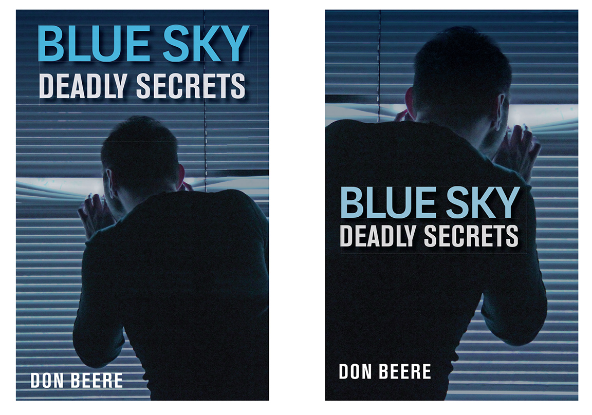
both covers are clean, efficient… and boring. Too many horizontal lines, too little variation in hue. In a lineup with other cover thumbnails, which is where most potential readers will first encounter them, there is nothing to stop their eyes from sliding without a hitch to the next thumbnail.
Angles are dynamic, and color contrast is interesting, so here is a variation encompassing both of them:
The other thing I’ll point out, which may go a bit deeper, is that your type and imagery don’t convey “ancient mystery,” which is a definite draw for people looking for the latest Da Vinci Code. Including some slight historical flavor to it, either in the image or the type, would help nail that demographic.
Other comments?
I feel like I see this problem fairly often on this site: Getting hung up on the difference between two covers that are essentially the same while missing the basic problems with both of them.
This cover is serviceably good–it’s certainly professional enough–but as Nathan said, it’s way too dull. And unfortunately I don’t think font colors and angles are going to fix it. It’s dull because it’s a boring guy looking out a boring window.
I want to focus on the ancient manuscript part. Can we get a photo of a professor-looking guy in a study poring over the manuscript, Indiana Jones-style? Or, Dan Brown-style, have the manuscript itself be the main imagery.
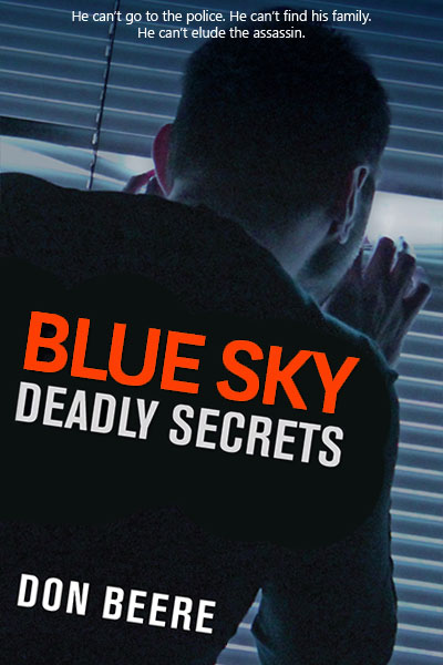
Technical issues: The photo is really grainy and there are box-shaped artifacts around the text.
Honest to crap…the first thing I thought, when I saw this cover, was that the book was about a Peeping Tom or some snoopy neighbor/Porch Package Pirate, not a thriller. Thriller? Ixnay, then, this cover is all wrong. “Unexciting” is the kindest word for it.
That’s not some erstwhile action-adventure hero–that’s a guy that’s scared, at home, hiding behind drawn blinds. Not the idea you’re trying to sell.
I don’t know what it would take to get an action-adventury, Indiana-Jones-type guy on the cover in full flight or action, but as Gwen mentioned, that’s certainly one way to go. I realize that “ancient texts” are not books, but perhaps something like this: https://depositphotos.com/9444396/stock-illustration-the-book-is-on-fire.html could be layered in with something else, to start to (forgive me) spark some action and interest.
I’d recommend that you spend some time at Amazon, doing a serious study of other books in your genre, to see how their covers are done. The rule of thumb, for books like yours, at the moment, are strong colors, a single central strong graphic of some kind (like Crucible has a key atop some symbology (n red outlines), with a strong sans-serif font, big letters. You could emulate that somewhat using the flaming book, above, or something similar. I don’t think the blind-peeper is going to get you the eyes you want.
The font usage is fine, if unremarkable, but it needs to use stronger coloration, too. That baby blue is not exciting. Thrillers and action-adventurers need red or orange, coloring that yells “DANGER, DANGER WILL ROBINSON, DANGER!” Not soothing blue.
That’s my $.02. I’d start over, I’m sorry to say. It’s nice, but it’s not doing the job at all.
Nathan’s improvement is an excellent one…but I do have to agree with Hitch and Gwen that there should be some suggestion of the ancient manuscript. At the moment, the cover makes the book look like a conventional cop or spy thriller.
The paranoia aspects of the story are coming through on the cover, but just about everything else is not. As Nathan and the other critics have noted, the horizontal lines of the blinds and the soothing blues of the color scheme make the whole picture too comfortable and low-energy to suggest this is a “thriller” of any kind. If anything, my guess from seeing the thumbnail was that this was going to be some kind of Rear Window send-up.
From reading your description, what I would probably do if designing this cover would be to show something like that ancient manuscript (whether it’s an ancient scroll like the ones on which the Bible was written, or a big yellowed page of parchment like the American Constitution, or a big leather-bound codex like the ones the early medieval Irish used while copying and preserving the ancient texts of Constantinople) sitting on a yellow-ish-orange-ish table (of stone if in an ancient setting or of polished wood if in a modern setting) overlaid with a shot of the assassin’s hands preparing some of that Blue Sky poison. If the poison’s typically injected, a syringe filled with the stuff (of course) should suffice; if applied some other way, marking a container of it with some international warning stencils or the old skull and crossbones or even a trendy (for the 1980s) “Yucky Face” sticker should do the trick. If the poison is some deadly mystical substance from the same era as the manuscript and therefore unknown to modern authorities, having some threatening-looking ancient occult inscriptions on an ancient container of it should do the trick.
Anyway, whatever variations you’re using, show the poison and the manuscript in a setting with basically a gold-to-sepia color scheme. That way, not only does a title in sky blue contrast neatly with the color scheme of the cover image, but the title also provides a little mystery in contrast with the setting. Your prospective readers will be curious as to why a novel called Blue Sky is apparently portraying archeology and [scary voice] murder most foul [/scary voice] instead of… well, a big blue sky, and will likely take a closer look. The secondary plot points about the protagonist’s family being missing and the police mistaking him for the perpetrator and his basically having nobody to help him out of his terrible situation can wait to be explained until the prospective reader checks out the back cover and/or Look Inside The Book feature.
The point of the cover here is to advertise the most gripping aspects of the story up front, sort of like how movie trailers tend to show most of the best parts of the movie while (if they’re made well) not spoiling too many plot twists. This not being a sequel, your story’s characters and genre are not firmly established in your target audience’s minds yet, and therefore the characters aren’t very intriguing to your audience. That’s why for this book, it’s better to try showing viewers a vaguely menacing image, rather how the protagonist responds to being menaced; show them the action, not the reaction, see?
I thank everyone for their thoughtful comments. This kind of feedback is invaluable. I will work with my cover designer and incorporate your feedback.