The author says:
A terrorist tracks professor Jason Butler to reclaim secret sacred texts.Can Jason conquer his inner demons in time to survive the deadly poison called Blue Sky, rescue his family, and save his life? After a tumultuous past, Jason and his wife are at a turning point where everything looks wonderful. But disaster hits. Taking place on a university campus in 1986, Jason sees a terrorist assassinate a colleague who sent him sacred religious manuscripts. The manuscripts are deadly to possess, and the terrorist must reclaim them. The assassin kills with a poison called Blue Sky. To his dismay, the police pursue Jason as the prime suspect. Wherever he turns, Jason can’t escape: he can’t go to the police, he can’t find his family, he can’t return the manuscripts, and he can’t elude the assassin. Why has his family disappeared? Will he survive the deadly Blue Sky?
[original submission and comments here]
Nathan says:
I think you’re getting closer, at least in the elements you chose. Here’s where I would concentrate my efforts:
- The ginger background, while pretty, doesn’t add anything except filing space. I’d darken it enough to really contrast with the running figure.
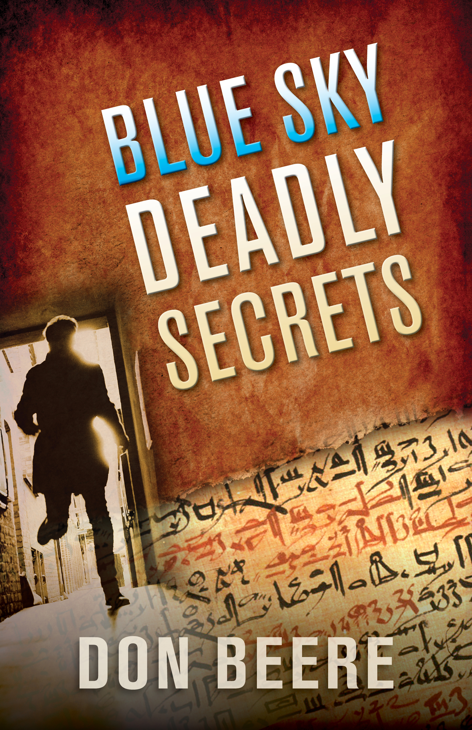
- Your description mentions “sacred religious manuscripts,” and with the definite Da Vinci Code vibe here, one would expect something Latinate, not hieratic Egyptian. Better change either the image or your description.
- In fact, I’d overlay the hieratic text lightly across the whole dark area, like so (five-minute version):
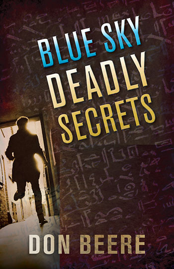
It needs a lot more work, obviously, but that’s the direction I’d go.
Other thoughts?
Nathan’s changes are all right, even if I disagree with his dislike of the original cover’s color scheme, but I would hesitate going quite so dark and quite so subtle. The MS characters are almost invisible. I think there could be more contrast without compromising the readability of the title. You don’t want the cover to cross the line into monochromatic murkiness.
One thing a cover needs to accomplish is to convey its message in a split second glance. It shouldn’t be a puzzle that the potential reader has to decipher. If they don’t get the idea in that first brief look they may pass on to the next book.
One of the only things I find vaguely jarring in both versions is that everything is on a diagonal…except your name.
By the bye, if the title of your book is actually “Blue Sky: Deadly Secrets” then include the colon on the cover.
PS
The hieroglyphics are no problem for me, either. The cover will be seen before the blurb is read. So saying that the book’s description leads one to expect something in Latin is putting the cart before the horse.
I prefer the ginger color scheme, FWIW.
Also, I think that the weight of the fonts is reversed from what it should be. I think that the heavier, stronger font should be used for the title and the skinnier, less eye-catching font should be used for the byline, unless the message here is that the author’s info is more important than the title (!).
The sans-serif is fine, but the weight is simply wrong. It looks…spindly, I guess. The “Deadly” is a slightly heavier weight than the other two lines and it discombobulates the eye.
Play with it, but consider doing what I said. Right now, the title lacks the impact it needs.
Wait a sec! The title of the book is just “Blue Sky”?
Sorry, Ron–whu? Why do you think that, or what did I say that implied that or allowed you to infer that’s what I meant?
No, I assume it’s the whole Enchilada–Blue Sky Deadly Secrets.
No?
I find your use of the discolored paper more appealing than Nathan’s suggestion. Not only does it suggest a more ancient document, but the torn in half approach ties the written characters to the suggested old age, reinforcing your idea of this being “sacred religious artifacts.” As for Hitch’s suggestion of changing the author’s name font, it wouldn’t hurt to keep it the same font style and size of the title, giving it equal weight. Other than that, I’d keep everything else the same. I think it really works.
I second Tom and Hitch about the color.
So… by “sacred texts” you meant something more on the order of the ancient Egyptian Book of the Dead than some apocryphal Gnostic piece like the Gospel of Thomas or an old Jewish guide to Kabbalah. Dusty orange-tan stone surfaces and papyrus manuscripts are definitely the right kind of imagery for this cover, then. The slightly diagonal tilt to the cover (especially the protagonist fleeing down what looks to be an alley in Cairo) also adds a nice energetic “thriller” feel to everything; all in all, definitely a massive improvement over your previous cover.
That said, the cover could still use some improvements. For starters, layering and fading images onto each other on covers is always a rather dubious method that even professional artists should think twice before employing, since it’s exceedingly difficult to do without looking like a rank amateur. If you insist on mixing the “page of sacred text” image with the shot of your protagonist fleeing out the door, I’d suggest putting the text on a dusty stone wall as in our esteemed host’s five-minute remake or (if you dare to be a bit abstract in your artwork) using a solid image (no transparencies or fading) of the papyrus page with the Egyptian scrawl on it as your wall, and be sure to have it clearly delineated from a solid image of the floor. (Floors being rather boring, that floor will also be an even more ideal place to overlay with your byline just as you’ve done here; feel free to tilt it to match the rest of the cover as Ron Miller suggests.)
A minor tweak: having an outline around your protagonist’s head also feels just a little bit wrong, especially if it’s overlapping any of that Egyptian scrawl. For best results, I’d recommend moving him just a little further through that door so that his head doesn’t overlap the lintel. Also, if you do extend the Hieratic Egyptian text up the entire cover as in our host’s example, be sure to give your title a little more weight and saturation to help it stand out from the stuff behind it.
Finally, while it’s nice of your title to provide a little sky blue to go with the orange-tan coloring of the rest of the cover, can we maybe have a little more blue somewhere? On a bright and sunny day (which is most days in Egypt, of course), the sky above Cairo is probably about as bright blue there as anywhere else on our planet. Also, I’d have to ask: does this “Blue Sky” poison that the bad guys are using in your novel look anything like what its name suggests? If so, a nice glowing vial or syringe of the stuff somewhere over to the right on your cover might add a nice bit of extra balance to the contrast between elements on your cover.
Of course, an orange-and-teal color wash on book covers and movie posters is getting to be so common these days it’s almost a cliche, but part of the reason cover and poster artists use it so much is because it works. It’s the same with movies and the like showing containers of brightly-colored (and sometimes glowing) liquids behind guys in white lab coats to indicate that, as our esteemed host used to say in his movie reviews “…there’s SCIENCE going on here!” (That works pretty well for MAGIC too.) Of course it’s kinda cliched, and real scientific chemicals and equipment tend to be less colorful, but movie directors and producers use brighter coloring in containers full of strange liquids because it works at cluing the audience that the characters are engaged in chemistry and/or alchemy; in fact, as far back as Robert Louis Stevenson’s Dr. Jekyll & Mr. Hyde, novelists have been describing chemists and medicine men messing with multicolored chemicals to clue their readers to what’s going on. Therefore, there’s no reason why you shouldn’t do the same; if this “Blue Sky” poison can in any way be imagined to look like a blue sky, you definitely should put it on your cover in some form.