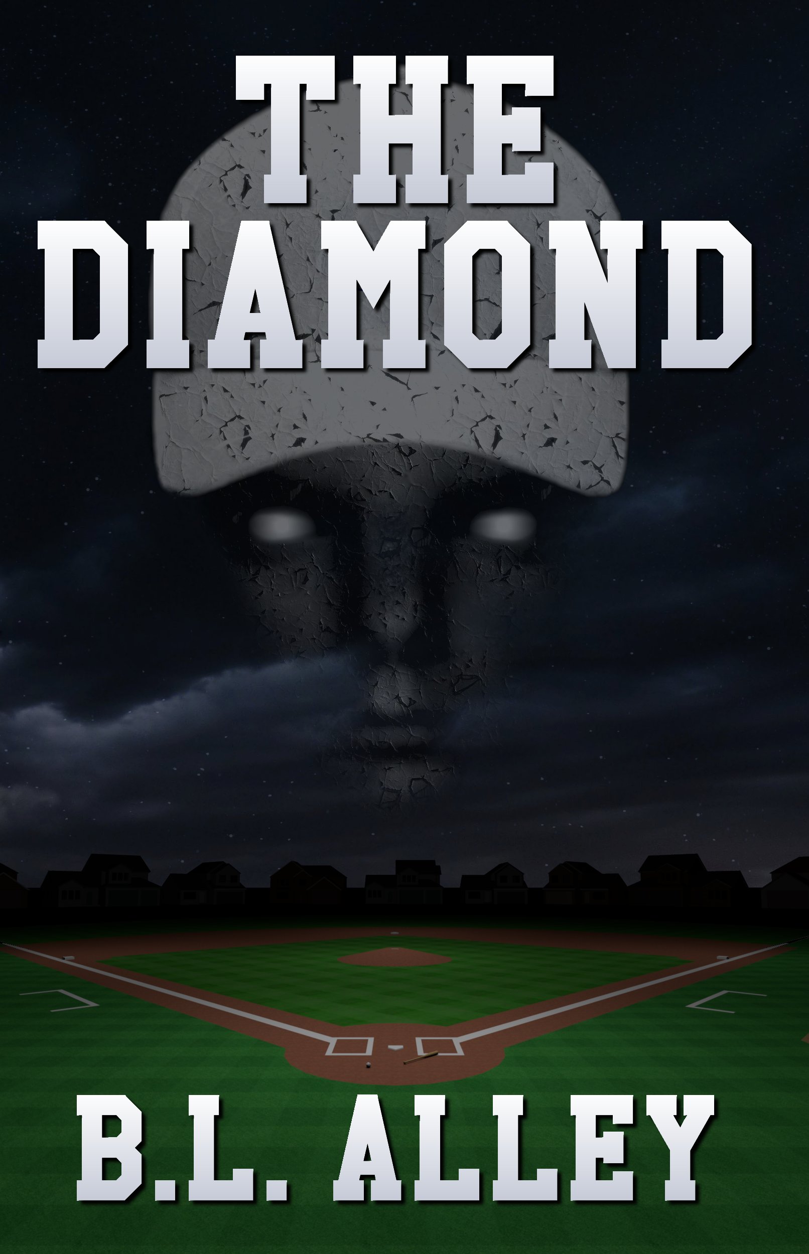
The Spectra Unearthed [resubmit]

The author says:

This is my other idea (with improvements from the comments).

Book description: YA fantasy: An exiled princess must unite six elemental clans to overcome the ancient society that destroyed her family. Her clan’s abilities are nature-based, including shape-shifting. This book deals mostly with her relationship with three other girls, and is about her gaining the courage to fight back.

[original submission and comments here]

Nathan says:

I think the biggest problem here is that it still lacks magic.  From the thumbnail, both the bird and the scrollwork behind the byline (both of which are only marginally magical in themselves) are invisible; what you have left is a possibly historical woman.  Is it a historical romance? A historical drama?  You’re missing the signifiers that tell the fantasy-reading audience, “This book is for YOU.”

In the comments to the original submission, Shelley made an example cover which nails those signifiers squarely. There is NO WAY that anyone could mistake which genre that is, which is just about the first thing that a cover needs to convey.

(Looking closer: Something’s weird about the woman’s jaw. She looks like she’s entering a watermelon-seed-spitting contest.)

Other comments?

The Powers Cataclysmic [resubmit]

The author says:

Fantasy meets Science Fiction in this action packed Superhero novel. His life would forever change in ‘The Powers Cataclysmic.’

Over twenty thousand years into the future, humankind, Earth, and the entire universe witnessed a catastrophic event that forced most existence across all universes to evolve into the highest dimensions and beyond. After this shift, all sapient beings could fly and have cataclysmic, super cosmic powers, godlike existence, and use even their hair, garments, and energy as extensions of their bodies. Unfortunately, there were those who lusted to dominate over all others as beyond omnipotence was not enough for them.

Over thirty thousand years after that event, Thrastara Navarras turned twenty-two years old. Months passed, and he still had yet to taste the beginning of his adult level powers, and hopes his friends and his mentor Arveias can help him to unleash his powers despite his trust issues and history of personal trauma. He also hoped Kalavria would notice him and that she would at least tolerate his existence. His fate would forever change when a stranger named Arrak killed two of his friends. While thirsting for revenge he is confronted by Exorcists, including Dr. Johnas Moorekase and Dr. Sephras Kainesen. Johnas warns Thrastara he is infested by demons may be a candidate to be Lord Neraios’s next vessel as the Antichristos. The Lord of Brilliance and Darkness could use someone like Thrastara or one of his long lost siblings to gain even more powers. Family secrets will be revealed along the way. Will Thrastara be able to set aside his deep hatred for the maligned Exorcists, or will he succumb to his hunter Arrak, or ultimately his own inner demons? Within the infinite sized dimensions and beyond, from Earth to Mars and beyond, many questions will be answered in ‘The Powers Cataclysmic,’ which is the first book in the Katastrophica series, a series unafraid to mock itself.

Content: Contains the concept of higher dimensions in a more fantasy oriented sense, extraterrestrials, angels, demons, the supernatural, superheroes, content people may find objectionable, religious references and concepts, over the top superpowers, language, references to and instances of smoking, drugs, alcohol, and some sexual contact.

Genre: Fantasy Sub genres: Superhero Fantasy Fiction (Prose), Science Fantasy, Science Fiction, Speculative Fiction

Target Demographic: General Fantasy/Adult (same group that reads series like ‘The Wheel of Time’ and ‘The Chronicles of Amber.’) and Superhero Fiction of all kinds (comics, novels, etc), fans of action anime. Secondary: New Adult, YA I’m aware that science fiction deals with the future, not fantasy. However, superhero fiction is somewhere in the middle, like science fantasy, which is what I’d like to convey.

[original submission and comments here]

Nathan says:

AAAGH! Too much!

Seriously. Angled fonts, beveled fonts, drop-shadowed fonts… The artwork is ornate enough. Adding bling to the type just makes it harder to read.

And with all the added sound and fury in the art, the thumbnail just becomes “I think maybe there’s a figure in there…”  Remember, since 95% of your potential readership will first encounter the book as a thumbnail at Amazon or some other ebook site, your thumbnail has to set the first hook and get them to click through.

I would chop the artwork like so:

…and then use strong font treatments that clearly separate the text from the background and make it easily readable.

(Also: Your blurb is still TL;DR.)

Other comments?

Enduring Pride

The author says:

A murder mystery in a military setting, the story takes place in the present, but relies on flashbacks, 25 years in the past. The story is written for adults, most likely 35-yo and over, and would be rated R.

The cover concept is a first-pass result.

Raymond Allen was the Commanding Officer of D-Company, and he had the responsibility of molding the minds and bodies of the freshmen cadets under his command. But something went wrong, and he lost sight of his future plans – to fly fighter jets in the Air Force – becoming a sadistic leader instead; consumed by the corrupting influence of absolute power over the lives of his young charges. The freshmen suffered; their numbers steadily dwindling and their futures disappearing. Until they finally took matters into their own hands, kidnapping Ray Allen and leaving him in the dense, piney woods of south-central Texas, never to be heard from again. A quarter of a century passed, the events of that fateful night intentionally forgotten, until suddenly re-emerging into the present with the discovery of human remains just south of the school’s campus. They had survived once before by relying on the indivisibility of the bond between them, forged by common misery and hardship. But had their past deeds finally caught up with them? As each layer is peeled opened and exposed, as each piece of evidence is unearthed, will their determination, their resolve, their lifelong friendships be enough to get through it this time? Will their pride endure once again?

Nathan says:

You’ve thrown a lot of elements together, but you don’t seem comfortable with how they relate to each other.

The most striking covers have one overarching focal element, and make clear to the viewer that everything else is subordinate to that.  In this case, the best candidate is the solder-and-flag combo: make it big enough that the stars run off the cover on the left, and the soldier’s left arm runs off the right.

Tighten the leading (the between-lines space) on the title, so that it’s more of a unit.

A personal rule-of-thumb is “never use more than one silhouette on a cover.” Maybe you should find an old photo print or Polaroid of two friends together — let bleached-out colors and general wear convey that this is a photograph of the past.

Switch out the font for subtitle and byline; it’s so lifeless it sucks the life out of the stuff around it.

Other sugggestions?


Telepath Emergence [resubmit]

The author says:

Second test of concept, previously submitted under the title Ravaged Worlds. Changed it to give more emphasis on the type of story it truly is.

Keisha Rose has a curse. She’s an empath, able to feel the emotions of everyone around her, overwhelming her, forcing the young woman to live a life of isolation. When a race of alien telepaths invade her colony world, they do so by projecting overpowering waves of despair. They quickly capture Keisha, and unwittingly unlock her full telepathic potential. Keisha Rose must not only come to grips with her own curse, but must now deal with the fact that the fate of all humanity now rests on her ability to control her mental powers and use them against the invading “Mind Assassins.” This is the first book of a trilogy. The novel is science fiction.

The submitted cover is a test of concept.

[original submission and comments here]

Nathan says:

It certainly works better than your original submission. So does the new title inasmuch as it related better to the book described, although it somehow seems pointedly inelegant. I’d play around with combining words from your book title and series title to see if you can find one that flows more trippingly from the tongue.

I like the idea of the rest; here’s how I would look at refining it:

  • The star pattern isn’t recognizable as such from the thumbnail. I’d add at least a few bright twinklers than can see seen from a distance.
  • I don’t think we need to see the whole face. If you crop it at the bottom of the nose, then the focus will be even more on the eyes.
  • I don’t think the completely monochromatic skin works. I’d add at least a little tint.
  • Play with that font. Yes, it conveys “science fiction,” but it’s also harder to read than it needs to be, and it’s more than a little bit ugly.

Other comments?

The Spectra Unearthed

The author says:

Book description: YA fantasy: An exiled princess must unite six elemental clans to overcome the ancient society that destroyed her family. Her clan’s abilities are nature-based, including shape-shifting.

Nathan says:

The image’s file name as sent is “Unearthed idea 1.JPG,” so I assume that this is still at the concept stage, ad we shouldn’t criticize rough edges, yes?

Thought #1: The title blends into the background — the hue may contrast, but the light/dark values are too similar.  And the inconsistent drop shadow doesn’t help. Make it POP.

Thought #2: There’s a lot of unused space above the title. If you’re planning to use that for the series title and a blurb or tagline, fine. Otherwise…

Thought #3: The model’s stance is too much “unthreatening hippie chick” and too little “strong young woman standing up to adversity.

I assume that, because of the unfinished state, the animals roughed in around the border are placeholders.

Other thoughts?