The author says:
This is the story of a polite and soft-spoken man removed from the consequences of his actions… or maybe not. Though his life has ended many times in many ways, a strange phenomenon he calls “temporal mental regression” forbids it to stay ended. He never lets anyone get to know him very well because anyone who does hates him and considers him sub-human and desires to inflict all the worst imaginable punishments on him. What makes him so bitterly hated is that he is a child molester; and he’s the one telling this story.
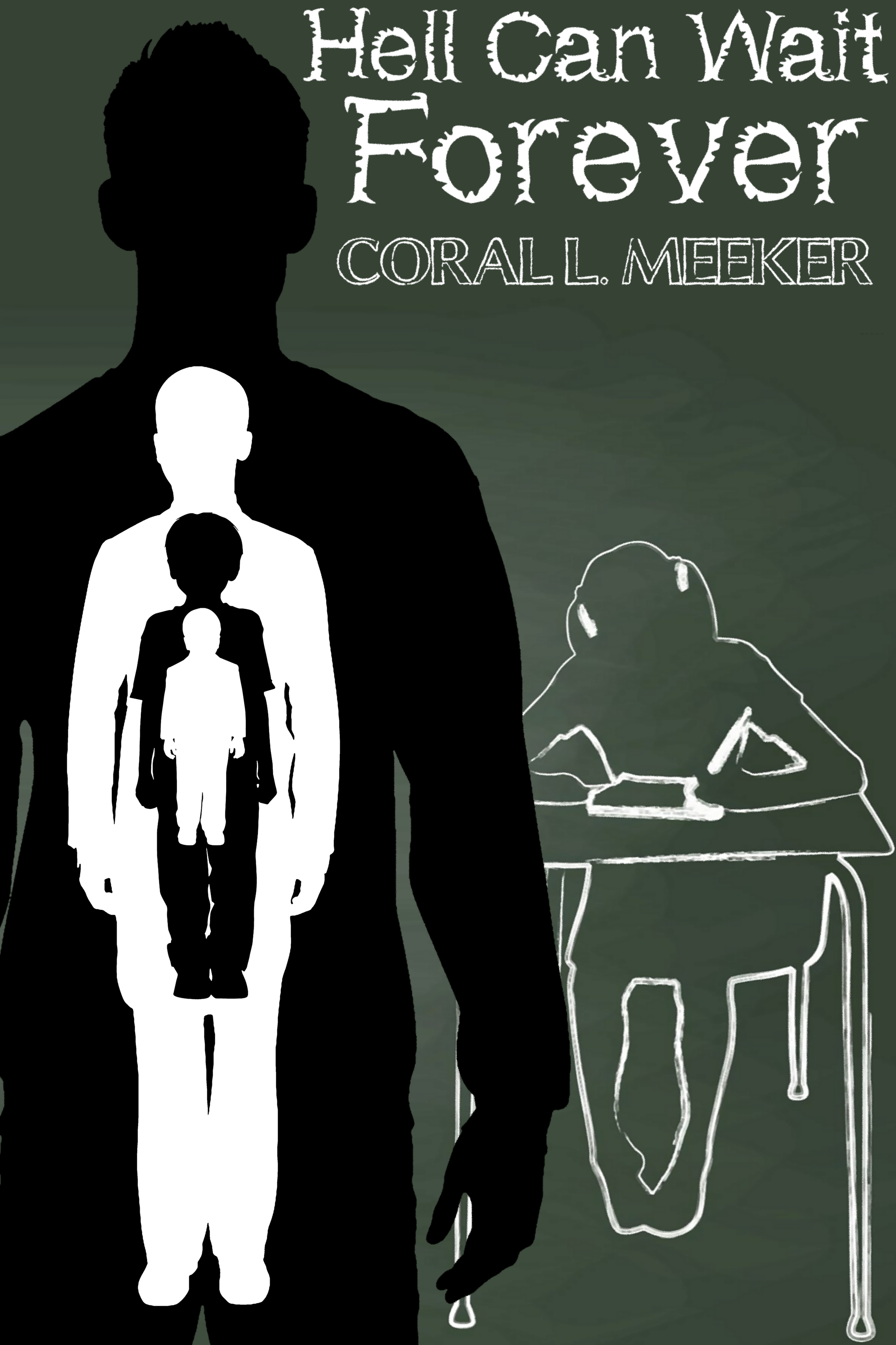
To tell the truth, I’m at a bit of a loss for what to show on this cover. Professionally made covers on books about molesters typically show either a battered-looking youngster curled up in a corner with tear-streaked eyes when told from the victim’s point of view, or a shadowy human silhouette (usually male) looming menacingly over some otherwise innocent-looking scenery when told from the perpetrator’s point of view. I’ve mostly gone with the latter arrangement for this draft, but am wide open to suggestions up to and including a complete overhaul; but my budget is quite limited, so please think twice before recommending I hire a pro to design the cover (which, according to Amazon.com, will “only” set me back $700).
Nathan says:
Well, you may not want me to recommend a professional, but…
I’m really at a loss here, because I still don’t understand the core of your book, or the audience to whom you’re trying to appeal. Would I be right in understanding that this is a semi-sympathetic portrait of a child molester? That’s a hard sell, all right, and I agree that the standard “molester” cover showing a sad-eyed victim wouldn’t work, but I’m not sure what WOULD work. (And that’s without adding in the Groundhog’s Day aspect.) That’s one of the great benefits of working with a professional who can bounce ideas back and forth with you, and have the skills to translate the appeal of your book into visual terms.
I can tell you that your current cover simply doesn’t work — not just for YOUR book, but for ANY book. The novelty font for the title is terrible, and clashes with the byline font. The two image elements are in different styles and convey absolutely nothing to someone who doesn’t already know the novel well (which is chronologically backwards — your cover is what will draw readers to the description, not the other way around).
At this point, even type on an abstract background is better than what you have:
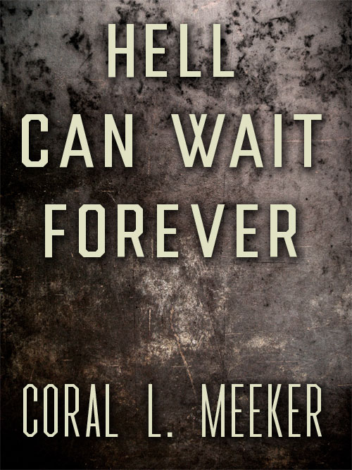
…because I can’t think of anything you can do except NOT try to tell anything about the story on the cover.
Other ideas?