The author says:
Magda stands in the moonlit cemetery waiting for the spell to work, for her lover to return. But what’s done can’t be undone, and Magda will learn she should have left him in the ground. When twins Avery and Chloe Parsons receive a cryptic letter and a sinister-looking book filled with illegible scrawls from their grandmother, they set out for Prague to check on her. Drawn to a cracked crystal ball in a curiosity shop, Chloe discovers it harbors the spirit of their grandmother, who tells them a horrific tale of lust, naïveté, betrayal, and… demons. Armed with a book of dark magick they can’t read and a cracked crystal ball, the twins must stop Magda’s resurrected lover before he releases an unstoppable force that will consume the human world.
Across continents and nearly a century, follow the adventures of three strong-willed women: one seduced by evil, one struggling to withstand the lure of power, and one trying to save her family—and the world.
Nathan says:
I have absolutely no criticisms of this. It’s professional, it points to the appropriate genre… It’s fine.
Anyone say anything different?
I pretty much like it, too, and it is certainly beautifully rendered. I would like to make a suggestion or two, however…
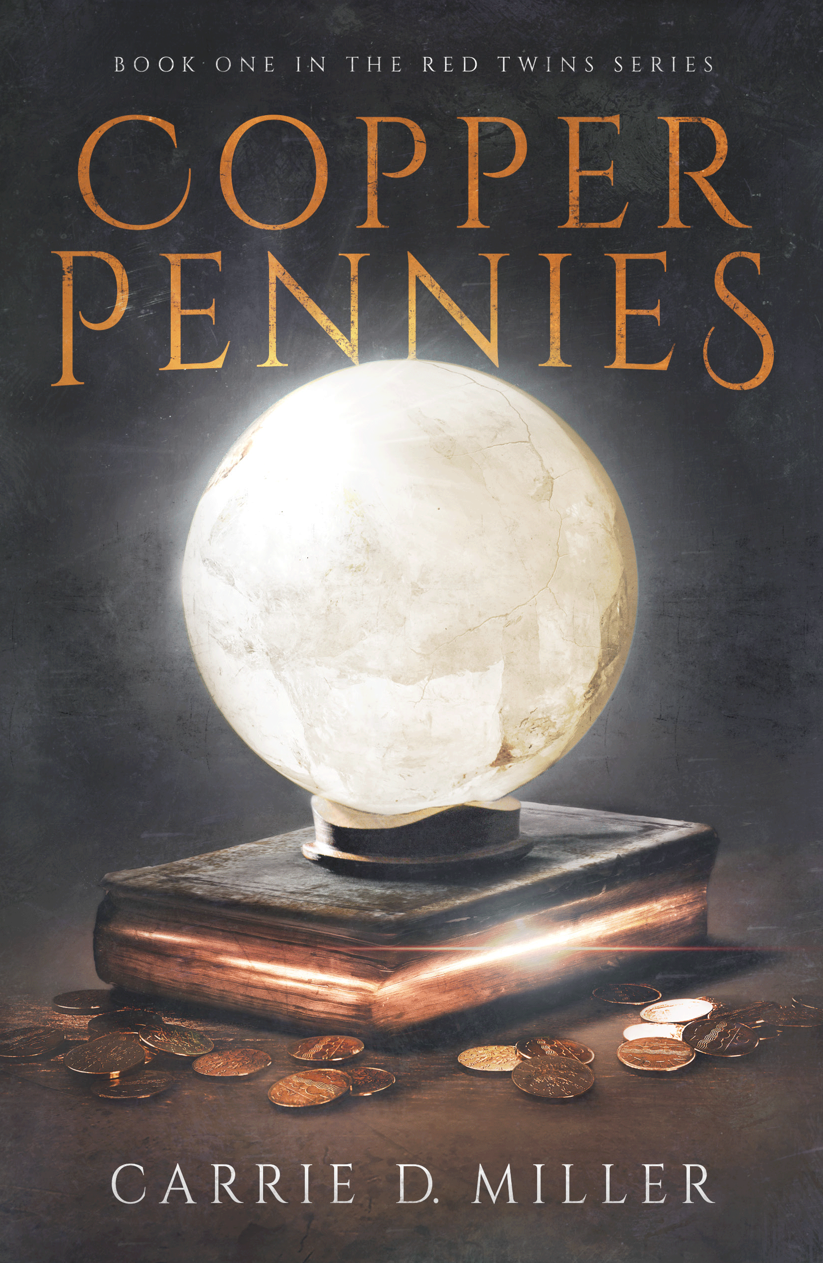
First, a minor comment: I think that the title is too tangent with the orb. It should definitely overlap it or definitely be separated from it.
While I realize that a cracked crystal ball is important to the story, I really didn’t know what that was on the cover until I read the description. At the moment is dead center in the cover…and is pretty much a blank circle. The eye goes directly to it but there is not much there. I think it needs a little more payoff for the attention it gets.
Perhaps if the ball were to appear to be more like transparent crystal with cracks running through it, it would read better. (Frankly, until I read the description I thought it was made of marble or travertine.) Making it less opaque might enable you to include some sort of relevant image within it. I wish that there was some hint in the cover image to the fact that the story is a “horrific tale of lust, naïveté, betrayal, and… demons” and perhaps this might be a way to convey that, even if subtly.
It does, as Nathan said, point toward a genre but perhaps a little too broadly. I think it also needs to say something more specific about this particular book—what sets it apart from all of the other books in the same genre?
I think this is fantastic, even if I don’t understand how the pennies fit in. It could perhaps look more sinister to suggest the horror and demons.
Your blurb is riveting, but I did get confused at the end when you mention “three women.” I had assumed Avery was a man. If they’re identical twins, I’d mention that. If not, say “the sisters set out…”
Oh! Thanks for this, Elizabeth. “I had assumed Avery was a man.” That hadn’t dawned on me. I’ll change it to “the sisters set out…”
I like the cover a lot. The only thing that bothers me is the background is made grey instead of black by too much lighting/fog. If you increased the contrast a tad to bring more blackness to the background, it may also answer Ron’s issue of not recognizing the sphere as a crystal ball. (FYI, I didn’t have that problem.) It also will make the title and author’s name pop a little more.
It rocks. The art is great. The type treatment is great. I say don’t change anything.
The only thing I’m maybe less enthusiastic about is the title. It’s a little underwhelming.
This looks like a cracked crystal ball
https://sc01.alicdn.com/kf/HTB1XgBMLXXXXXasXVXXq6xXFXXXw/Pure-Ice-Crack-Crystal-Glass-Ball-Clear.jpg_300x300.jpg
What I see in the cover looks like an opaque stone sphere. Even the lighting on it appears to be external (it’s lit from the left and is even casting a shadow) making it seem even less like crystal.
It is also pretty much a completely blank circle that dominates the cover…but is entirely uninformative (no one knows the significance until they read the blurb…but they have to get that far first).
As I said in my original post, the genre looks right but there needs to be something more specific about this book. A picture of a crystal ball and some pennies scattered about is simply too ambiguous. If the story really is a “horrific tale of lust, naïveté, betrayal, and… demons” then get this across in the cover because there is no sense of that now. Since the eye goes directly to that dominant glowing circle use it to your advantage and put something there. Just the hint of something demonic or evil would do the trick. Even a claw or tentacle hanging out of those glowing pages in the book would be more informative than what we have now.
I realize that the cover is impressively rendered…there is no argument about that…but it can’t stand on that alone.
Like others, I didn’t know it was a crystal ball until I read the description. I thought it was the moon, tbh.
I also didn’t catch the bit of magic leaking out of the pages of the book. Since the title has the word copper in it, and I saw these shiny pages before I saw the pennies, I thought the book pages were copper brushed and just reflecting light. Because of those two things, I completely missed the whole magic aspect entirely.
The style of the art is perfect for the genre.
Unusual, it actually look good also in thumbnail!