The author says:
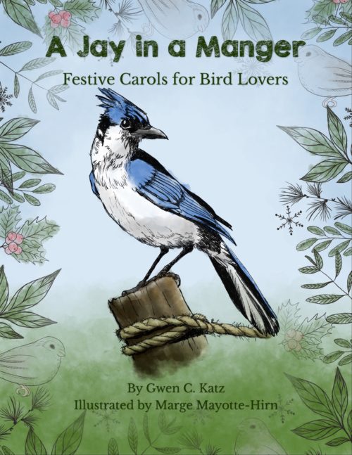
Sing and color along with Christmas carols dedicated to 16 beloved North American birds. From “Silent Flight” to “Mockin’ Around the Christmas Tree,” these birding carols are sure to put a smile on your face.
Nathan says:
NEEDS MORE CHRISTMAS.
Seriously — from the thumbnail, the Christmas vibe is entirely absent, and even at full size you don’t notice the holly berries unless you’re really looking. Put some bold greens and reds in the framing planets.
Also, it looks a little unbalanced, top to bottom. I’m assuming that the illustration was done old-school, which means that the jay can’t easily be pushed lower on the page; if that’s the case, I’d suggest moving the subtitle to the space under the jay, with the bylines pushed even lower; then you can also enlarge the title.
Other comments?


Yup. Zero Christmas!
The art in and of itself is nice, but the bird and the post it is sitting on appear to be floating against the background. They need to be integrated into the rest of the picture better. Extending the post a little and having some of the foliage clearly overlapping it would do the trick.
And then the addition of something seasonal…snow being the obvious choice.
(I am not sure what exactly is supposed to be going on with the little, identical, icon-like birds scattered around but they look very much out of place. Indeed, now that I look at the cover more closely, so do the plants, which all appear to be pasted in—especially since so many of them are too obviously the same plant repeated. Since the jay is rendered so realistically it might be better to render the entire cover the same way so that the art is consistent in appearance throughout.)
Love the ART!!!
I haven’t posted a mock up here in a while so thought–why not…lol
https://imgur.com/a/tmgWZC9
I was too lazy to add in all the leaves and flowers or reproduce your dappling which I really loved. I think you need a font with a fun Christmassy vibe in a Christmas color. (plaid might be really cool for this) (gold trim would also probably be really cool for this)
put some of your leaves and flowers in the text and by the bird to tie all the art together. Some music notes would be a fun way to say this a song book. You could sprinkle in some song notes by the greenery or floating around the bird. There’s lots of free clipart of music notes (like these) that you could use, but your artist could probably draw them in for you
Love how you handled the title!
thanks.
Fun with plaid
https://imgur.com/a/zBXQORh
I really like this last suggestion!
There is an awful lot of blank area around the bird, though. Maybe the author might want fill it with snowflakes? Or a mixture of snowflakes and white music notes? That would cheer it up even more as well as emphasize the winter/Xmas theme.
I liked his original art but was to lazy to replace it… I’d for sure add in those details but I wouldn’t use the same picture over and over and I wouldn’t use any other type of bird. Change up the size of the leaves and turning them a bit.
Snowflakes would look cool, Musical instruments, gold bells, that sort of thing you see decorating wreaths.
I loved the texture he had but was to lazy to reproduce that either…lol
I’d also consider my future books, if any, in this series, before finalizing any design to make sure I could have them all look like a set
I have the sneaking suspicion than Gwen and Marge are female.
So… this is kinda the literary version of those frivolous “dogs barking the Christmas classics” albums? Yes, I’d have to agree with our esteemed host: if anything, the color scheme makes this look more like an Easter-themed book in the thumbnail, and even at full size those holly leaves and berries are all but invisible while the snowflakes look more like sprigs of pine needles than anything remotely Winter-ish, let alone Christmas-y. Even with the obvious word-play in the title, my first guess would have been that this was one of those “fan fiction about one of the ‘forgotten’ characters of the Nativity” books for children combined with one of those academic books (which very nearly nobody actually reads) contending things like “Yeah, pop culture has gotten the date all wrong for millennia and Jesus was actually probably born sometime around Spring of 6 B.C.”
While a blue jay certainly can’t help being blue, that’s no reason for the greens and (especially) reds on the rest of this cover to be so horribly washed out. Neither do we need to be seeing any other kinds of plants besides holly and evergreens. In short, this book being a little Christmas-themed frivolous fun for Audubon Society enthusiasts, to hell with historical and scientific accuracy; deck the foreign-to-Israel aviary with some boughs of artistically-licensed out-of-region dark-green-leaved-and-bright-red-berried holly already! A few silvery snowflakes and some golden tinsel and candy canes and maybe some red-with-white-trim faux fur in the background wouldn’t hurt either.
In summary, more Christmas, please.
Everybody else mentioned what needs doing, but I have one comment–please move the eyeball of that one icon bird to the right of the word “manger.” It looks like a period after the title, particularly in thumbnail.
Savoy managed the fonts quite nicely, so I needn’t kibitz on that.