The author says:
An underground detective agency is assigned by the Mexico City’s police chief to find the murderer of her daughter and other five women. A hardboiled novel set in 1993’s Mexico. In line with the works of Dashiell Hammett. Also, the novel is written in spanish.
Nathan says:
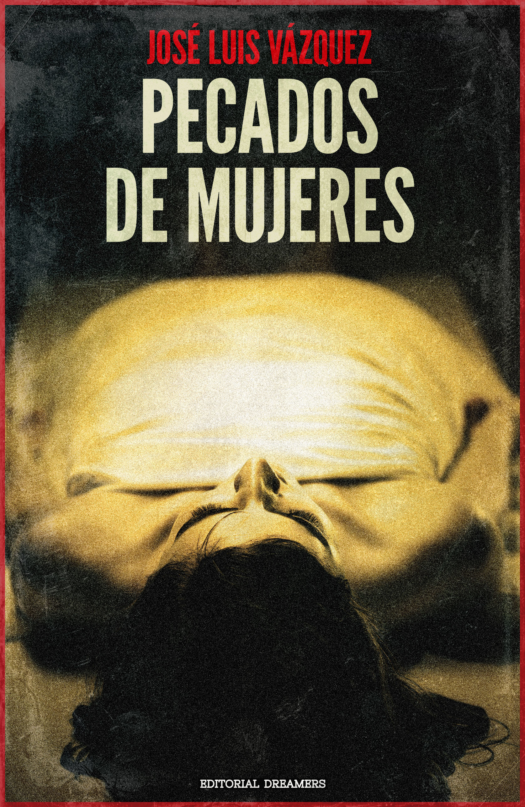
I don’t think this cover concept nails what you want. For one thing, the image is confusing in thumbnail (I thought I was looking at a caricature of a bald man with a Fu Manchu mustache). The full-sized image does convey murder, but it lacks any indication of “hardboiled.”
In my experience, hardboiled detective novels (at least, those not written by authors who are already such a strong brand that all they need is their names on the covers) usually show the detective on the cover, not the victim (or, in this case, one of the victims).
Other comments?
the picture is a bit hard to make out. It might be salvageable with some different type treatment. I’d lose the red border.
I’d put the grunge effect just over the picture and not the type.
I’d resize the type, using a bolder font. putting author on the bottom. making the font bigger for title and justifying it left (probably but would need to see that to be sure) bringing the text down to cover just a bit of the white sheet to incorporate the words into the art (you might need some stroke or shadow there) but more importantly to lead the eye between the two texts- author name and title– hence making the art more recognizable at a glance.
I agree that the photo is much too obscure. It is difficult to make out what is going on at full size—at thumbnail size the large yellow mass of the sheet utterly dominates the cover. To add its problems, it really doesn’t convey any sense of the kind of book you have described.
I think that before you worry too much about how the type is handled you need to reconsider the image entirely.
As Nathan suggests, you might do well to take a look at what has been done in the past for hardboiled detective novels and what is being done today. For instance, you might want to browse through some of the covers on Elmore Leonard’s books or those of some of these authors
https://crimereads.com/the-best-noir-fiction-of-2018/
I think it’s good overall, but I think everyone else is right that the photo is a little hard to make out, especially at thumbnail.
What’s “Editorial Dreamers” about?
I’m not sure if I can answer that, but “Editorial Dreamers” is a publishing house that I created. I used to publish magazines and books as other publishers do, but now I only edit my books and the books of my friends and publish them on Google Play for free.
I’m your reading demographic, albeit in English. I’m a huge fan of noir, even cusp-noir like the latest Longmire.
Unlike the “good old days” of Black Mask, there isn’t a single look to Noir or hardboiled detective novels. I do agree that on the whole, using an image that conveys the detective rather than the victim is stronger/more popular. (Altho the good old days of the chalk outlines, ahhh, I miss ’em.)
I didn’t get Noir or Hardboiled from this at all. I wasn’t even sure it was a murder mystery. The image COULD be a sleeping woman in a sheet, or a body getting ready to be cremated, or just someone who died. Murder is a different thing altogether. I agree that in thumbnail, I too saw the chubby Fu Manchu man. So, that’s not a winner.
And while I have MAD respect for Savoy’s cover design skills, I’m not sure her suggestions will fix it. When I think about the extraordinary beauty of Mexico City and all the image options you’d have to use, I kind of feel as though you’re wasting all that potential. Sure, you don’t want bright murals, etc., (although Coyote Sings isn’t muted or dull by any stretch) but there are a lot of other graphic architectural shots that you could use to create the setting.
If you look at some of the covers on that link that Ron gave you, you’ll notice that for this genre, they’re STARK. Your image is grungy, but not stark. Look at Mosely’s cover; Craig Johnson, Val McDermid. All stark. I think you need that for your cover.
Good luck. I’d love to see the revamp!
I too was having trouble making out the picture in thumbnail; with the washed-out beige coloring on everything, it looked like a crumpled-up wad of discarded bedsheets. I don’t know whether people do things differently in Mexico, but this is why when we want a picture of a dead gal in the morgue here in the USA, we typically show the almost-universally-recognized picture of her feet with a little tag on one of them. Assuming you still prefer to show the victim rather than the detective, that would be the picture to show on your cover here as well.
When doing things “in line with” (or “in the style of” as we say here in the USA) classic writers like Dashiell Hammett, something one obviously ought to do is study the covers of the inspiring author for ideas on how to design your own. Here are three links to three of Dashiell Hammett’s classic pulp novel covers. Note the two different pictures split by the title and byline on each of these covers, the dark and stark contrast in the coloring, and the vaguely lurid nature of the imagery. Other than making the title somewhat bigger and more prominent than the byline for your cover (since your name is obviously not so well known as Dashiell Hammett’s so far), you probably should have a cover like one of these for your novel as well: maybe a shot of the detective in the upper image, and a shot of the dead gal in the morgue (i.e. her feet with a tag on one of them as mentioned) in the lower one.
In short, when in Rome, do like the Romans; and when you’re writing in the style of Dashiell Hammett, design your covers in that style as well.
As a follow up of this cover:
I haven’t published this book yet, but I heavily modified the cover of the first book in the series. The cover went from this, to this one.
I think is kind of generic and is far from those of my other books that try to attract young readers and otakus of all ages, but it does the job.
Thank you for all your comments, they were really useful.