The author says:
From Book 1: Terra Vonn is fighting to survive in a destroyed world, surrounded by unspeakable horror . . . and things are about to get much worse. After witnessing the vicious murder of her mother, Terra has a singular focus—exacting revenge on the killers. But before she can complete her plans, savagery intervenes and she is cast alone into a brutal post-apocalyptic world. Terra’s journey south is filled with horror. But she finally makes it to a southern clan and what she thought was safety. Instead, she finds treachery and deceit. Book two follows Terra as she battles packs of killers determined to destroy the remnants of civilization.
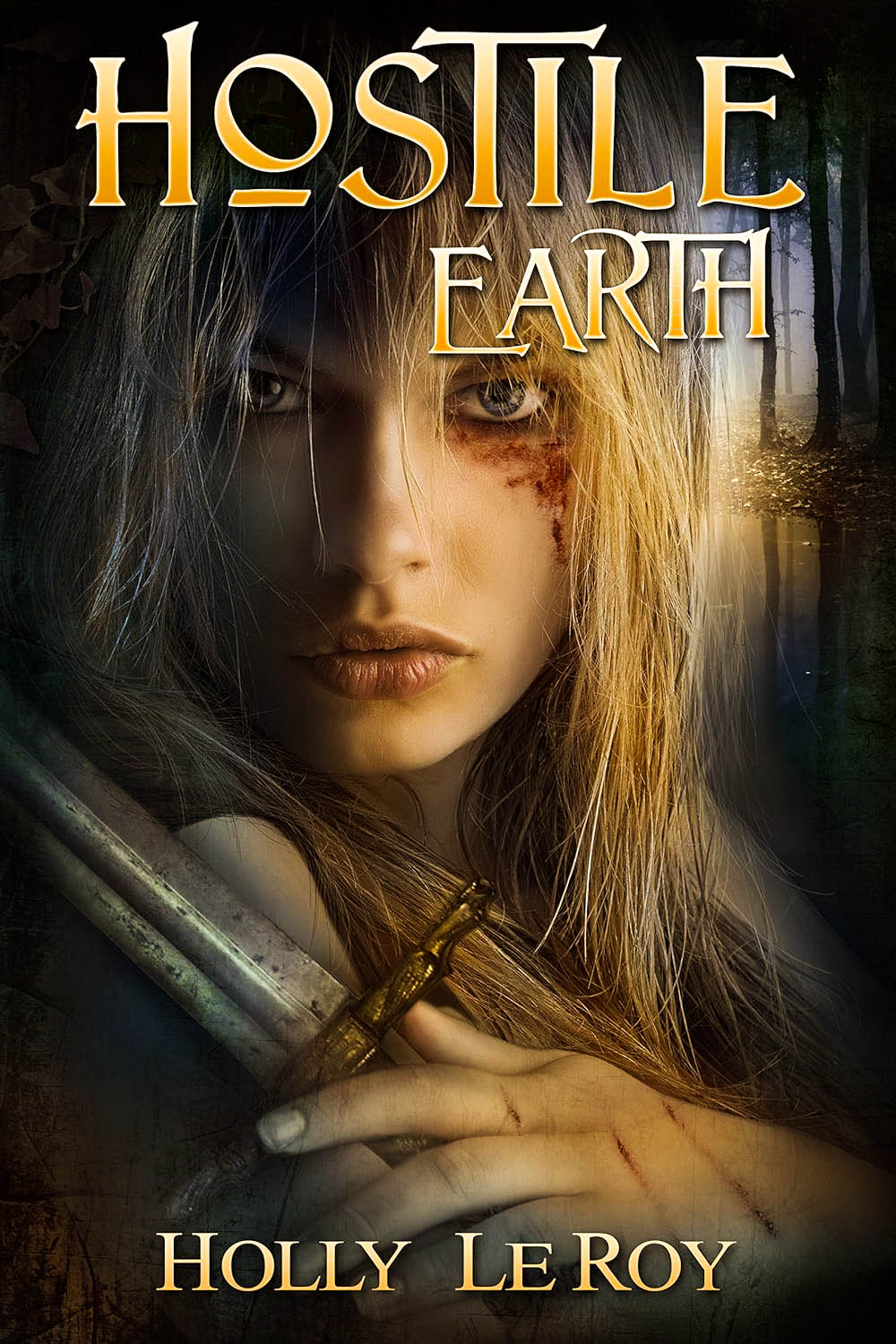
Nathan says:
A little bit of tweaking here would reap huge dividends.
- The word “Earth” gets lost in the thumbnail. Move the girl’s head down so that “Earth” lies across a contrasting shadow so it stands out.
- I don’t know how much control you have on the artwork (i.e., whether it’s composed of stock elements, or whether the artist works for you and can change things), but the sword is easy to overlook. As it conveys danger and action, I think it needs to be more immediately noticeable. If you can turn it upward so it crosses the girl’s dark cheek, it will both be more prominent and stand out more because of the contrast.
- The color scheme seems a little warm for “post-apocalyptic” (especially with that typeface). I’d suggest looking at some other post-apoc covers (and movie posters), and experiment with some variations that give a starker color scheme.
Other comments?
Even just lightening the sword would go a long way.
https://www.dropbox.com/scl/fi/51pqp1slm55ukrwr65slk/Cover.png?rlkey=cph4fltl9phsskx7fzi7d68oq&st=0v6ondex&dl=0
Not much I can add to Nathan’s comments except to second them.
The typeface (in combination with the image) made me think more immediately of heroic fantasy.
adding some lighting would bring the sword out.
https://imgur.com/a/KCMiKsL
(and then I see Tracy already suggested it….lol)
switching title to bottom would help with the top heaviness of it.
In my case, the first impression I got from this cover was that it was for something in the dark fantasy genre; which was perhaps accurate, though obviously somewhat imprecise if I’m reading the summary right. So this is a post-apocalyptic dark fantasy in sort of the way Mad Max was a post-apocalyptic western? I mean, even if there aren’t any mythical creatures or magic spells being cast or anything like that, a horses-and-swordsmen story set in a socially-and-technologically-regressed-to-medieval-era future can be every bit as much a kind of medieval fantasy as one in the actual medieval past. (The 2008 movie Doomsday, which included a memorable scene of the protagonist being forced to fight in a medieval-style tournament the savage antagonists arranged in a castle-turned-museum they’d reoccupied and refurbished as their new base of operations dipped into this particular genre a bit.)
If that’s the case, having a gal with a sword—the latter preferably a bit more prominently displayed as my colleagues are telling you—in the foreground is fine, but shouldn’t the background be a little more… y’know… post-apocalyptic? A forest—even one with colors so muted it might as well be sepia-toned—suggests this to be set in actual medieval times (in late Autumn when the leaves turn brown). If you want fans of post-apocalyptic literature as well as dark fantasy buying your book, I’d recommend swapping out the rather rural background in favor of a ruined city or a lone long-neglected gas station or even just a paved road with an abandoned car or any such small sign that this story is set somewhere that used to be a lot more civilized; e.g. in the aforementioned Doomsday movie, one of more telling (and amusing) aspects of the “tournament” scene was that prominently displayed in the background of many shots while the protagonist was doing battle with medieval weapons was a sign near one of the castle’s doors advertising it to be the entrance to the former museum’s gift shop.
Any small clue like that would suffice; the point is to broaden the appeal of your book and its story. Dark fantasy fans probably won’t mind mixing genres a bit (“So, Game of Thrones in a post-apocalyptic future? Cool!”) and neither will fans of post-apocalyptic stuff (“So, Mad Max, but with knights and shield maidens rather than punks and scags? Cool!”) as long as they get their fill of their preferred genre’s tropes. Speaking of Mad Max, it’s worth remembering that the first movie in that series (released in 1979) was set just before the apocalypse the other movies followed, which might be why many of the posters (and dust jackets for the VHS tapes) for that movie featured somewhat brighter and “warmer” colors than those for the other entries; if your story starts that way (and your summary hints that it does), I recommend sticking with the current palette for this cover, but then switching to something a bit dustier and grimier for the sequel’s cover.