The author says:
The Powers Cataclysmic
It’s over fifty thousand years into the future. Science, technology, and magic have evolved. Just about everyone can fly by sheer power. Humanity and other sapient races evolved into an infinite dimensional existence within a renewed universe. People use every part of their body, especially their hair and glowing clothing to store and project their powers.
On a reconstructed Earth, a somewhat paranoid man named Thrastara Navarra was a year out of college, and unlike the others, he has yet to realize his adulthood set of powers. Despite infinite life spans by yesteryears standards, there has been an increase in deaths among the people. Dr. Johnas Moorekase knows Thrastara and others like him called Eschaton Potentials are being targeted for their dangerous latent powers, for Lord Neraios is searching for a new vessel to merge with, which could bring about the final Apocalypse. When Johnas meets Thrastara, he rejects Johnas’s offer of help, for Johnas belongs to a group of maligned, heavily clad and long bearded Exorcists and Thrastara doesnt trust them and their god Azzana. It wasn’t until Thrastara loses people he cared about and a family secret when he takes Johnas’s offer for help seriously, for someone he should fear has been in pursuit of the Eschaton Potentials. Arrak and the demonic hordes might be Thrastara’s immediate threat, but his greatest threat lies with the demons from within and from within the realms beyond all dimensions, time, and space. After running out of options, Thrastara has no other choice than to join some of his friends and family, and follow Johnas and his allies to the truth. Will Thrastara finally awaken into true reality?
Please note the genre is Fantasy. The sub genre is science fantasy and superheroes, with an action anime style influence. I’m trying to create superheroes that are relatable and “human” at heart, yet are also exist on a super-cosmic scale. Even the average citizen in the book is powerful. However, people can’t will their problems away because everyone fears each other and everyone neutralizes one another (except the beings beyond dimensions, for the most part, which is the next stage people strive for). People still have to use strategy, politics, diplomacy, and form alliances to win. The battles are usually part of the payoffs. There are also powers that be that set limits what certain people can do at certain times.
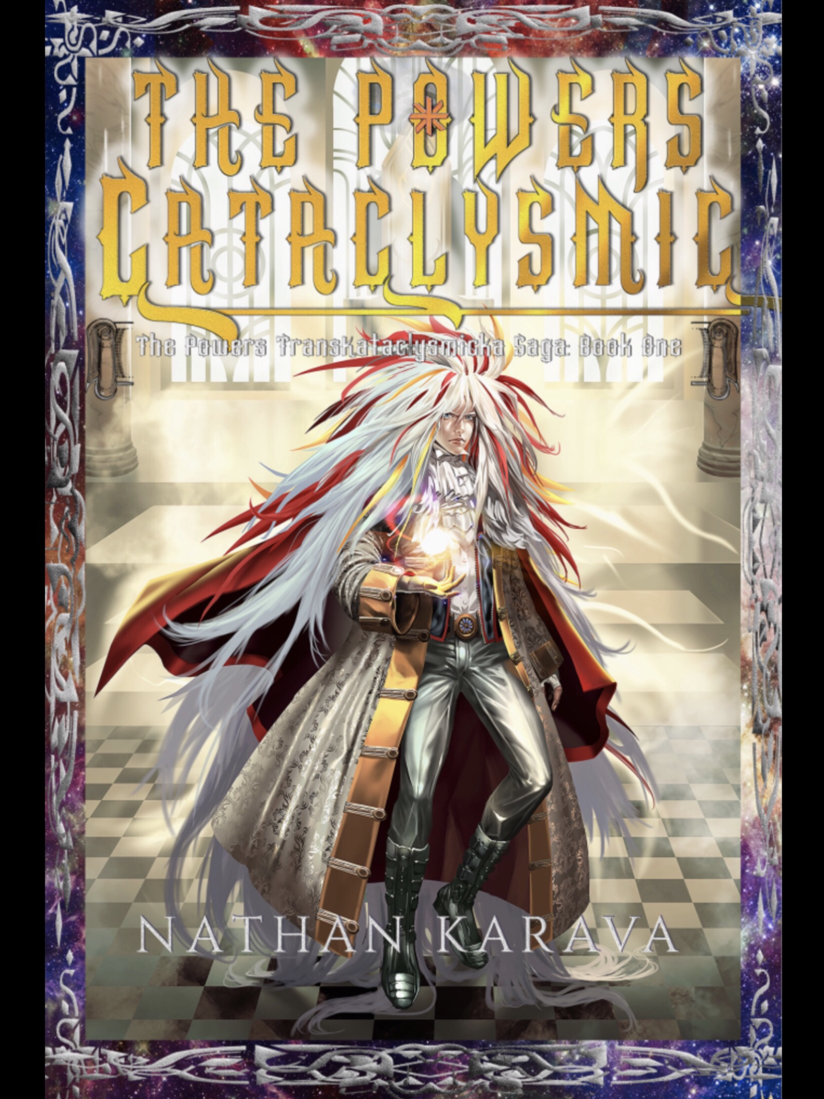
Yeah, I wanted to try something ambitious, and I’ve been working on this for years. Please note this book is in the developmental stages, so much can change. For the cover, the most effort was applied by an artist to the illustration. The reason I went for such a character is to convey how the future might be different (hair evolved to become prehensile, which explains Thrastara’s hair on the cover). 150K words I plan on self-publishing. Sorry for the long explanation. I am the author of the book. Books that might be similar are the Amber Chronicles, the Neuromancer, the Wheel of Time, Star Wars, superhero novels.
Nathan says:
[Note: The contact form I use is one of the only ones which allows users to upload an attachment, i.e., an image. The trade-off is that it doesn’t retain paragraph breaks, so I end up making my best guess when I post.]
First up: Yes, your elevator pitch is waaay too long. You need to focus on what kind of novel it is and why a fan of the genre would want to read it. It’s the same thing you need to do with the cover, but with words instead of design.
Second: All of the problems with the cover are accentuated in the thumbnail: Not only is all the text unreadable, but the figure becomes an indistinct blot of colors. Even at 500 pixels wide, all of the text is hard to read, and while the figure is clearer, all that the reader can understand from looking is “anime influence, maybe fantasy” — there’s nothing inherently interesting about someone just standing there (floating there). Look to your anime inspirations: How can the cover be dynamic? How can it show conflict? What can be visible and attractive at thumbnail size?
I hate to send you/your illustrator back to the drawing board, as the illustration was obviously time-consuming, but you need to (a) figure out your elevator pitch and decide on what elements of the story and setting would be the most attractive to your target audience, and then (b) decide how to portray those attractive elements by illustration and design.
Other comments?
I will say the base concept isn’t awful. Central figure is the way to go for this, but central figure doing something. The design of the guy is stylistically complex enough to give the anime vibe, though almost more of a David Bowie – rock ballad vibe, but the existing color scheme would need to be against a contrasting dark background and probably zoomed into torso or even facial close-up distance. The border adds nothing useful and provides distraction from other detail, it is best disposed of. The title text at least needs contrasting colors behind, but readability will be an issue regardless. The byline is invisible. Sorry I don’t have better, It’s a busy time.
https://imgur.com/a/sHbOOqD
you need to show the power being cataclysmic. Show things exploding! cut down on all the extra borders and simplify. Highlight the magic. I recommend changing the name of the series to something pronounceable
The illustration is nice but I would say that overall the cover is a bit too much. You would probably benefit from paring down all of the decorative elements, which really add nothing but instead make the cover hard to read. The border is unnecessary, the title typeface is much too ornate (with the little star added to the O in Powers for no reason I can see), and a tagline that is not only also in a decorative typeface but in a color that makes it merge into the background. I think that before you go any further you need to drastically simplify this cover.
Thanks so much for the feedback and replies,everyone, as I appreciate constructive criticism. I agree the borders are a bit much (though the vertical black bars are not a part of the cover. I uploaded my photo from my iPad photo library). I really like the fonts and debris on the alternative cover mock-up. I’ll try to incorporate those elements when I notify my designer.
Rough summary of the idea: What I want to immediately evoke is the concept of angelic (not in a do-gooder, perfect people sort of way) superheroes with action anime influences facing off against powerful forces (though many of the other heroes have facial hair).
The main character of the novel is in his early twenties. The people I hope will read my book are adults as young as 19/20 (and younger readers) who enjoy superhero fiction, anime, manga, comic books, movies (like the Avengers and the Matrix), video games, action novels with fantasy sci fi elements, in any combination, male and female. Basically, action-adventure fiction enthusiasts.
The central character could as easily be a harbinger of destruction as he is a herald of deliverance. Everyone in the book lives in the future, in higher dimensional states of power, including enemies and demons, so the people in that time might look different, especially when magic and advanced tech come into play. So I think magic, future tech, and the supernatural elements might be built into the image. I might have the designer darken the background a little and have the MC do something with his idle arm. Maybe preparing to blast an enemy out of view. What if some of the debris on the mock-up cover also “morphs” into little stars and galaxies? But yes, above all, I think the cover needs explosive elements. Just throwing around some ideas. Thanks so much for the feedback.
Hmm.. this cover doesn’t convey angelicness at all. And honestly, I don’t think you can convey that idea without wings and a halo. Because the character is obviously not a ‘normal’ human getting the idea of angelicness across will be really difficult, if not impossible. A superhero could have wings, a glowing sword, be in space, etc. All the regular visual cues to angelicness can be mistaken for a superhero power especially in this anime art form. If you need it clear, then I think you need a tagline that tells the reader clearly he is an angel.
I think you’d do better to use a tagline to state he is an angel and show the setting a bit instead of trying to convey something that is likely to be misunderstood by an uniformed reader. Hints of the type of world this is behind him would likely pull more interested glances, for instance futuristic buildings or modern day building, medieval buildings, etc. Some sort of hint that tells a reader at a glance if this story is something they’d like.
I should have clarified. By angelic, I meant in terms of the fact of the enemies he is facing in the book, but now I find that term superfluous. I’m currently thinking of a tag line that would allude to the setting and the kind of enemies he’s facing. Thanks for the feedback.
I think the figure is kickass and I want to keep him, but I agree that the lack of contrast is really sinking the cover (I didn’t even see that there was a subtitle until I looked at it at full resolution). I think punching up the contrast a million times and introducing a dominant palette color would do the trick.
Savoy’s edit is a great start. Can we get some chiaroscuro-style lighting, where the figure is glowing brightly on a very dark background that reflects something about the setting (outer space, desolate ruins, menacing monsters, futuristic city, whichever)? Then the yellow title will pop and look great.
I want to preface this by saying that I guess there’s something about anime that definitely doesn’t appeal to me in a book, because I would have said that I’m a target demographic for a vast Space Opera but this cover is really turning me off. Granted, I’m a lot older than the targeted reader. That’s my caveat for my inbound comments. That being the case, the graphic image of the character is probably fine. (FWIW…to me, it makes the book look as though it’s targeted to a much, MUCH younger audience than what was stated. If I saw this on the cover, I wouldn’t pick it up, because that would be my operating assumption, that it was a MG Reader. Again, though…I’m
oldmature–but I genuinely like both cartoons and most anime. Can’t quite explain my reaction to this.)The title font is overwhelming. It would be fine with a less flashy graphic–the only reason it’s not so noticeable now is because the pale coloration is making the title get lost on the cover design.
The tagline or subtitle font is ALSO ornate, and as others have said, utterly unreadable. The titling font you used for the byline is fine, but you need balance in fonts, and right now, you don’t have that.
Lastly–I’ve noticed that yes, your original description was overly long, but, in responding to the comments, you’ve continued to explain the plot. Remember that you can’t do that to people viewing your cover. You can’t stand in every bookstore in the country, or magically in a browser when someone sees your cover, saying “well, I did this because I’m trying to make you understand that this is an angelic-sorta super-human that lives essentially forever, has super-powered hair that can walk, is influenced by anime, who battles…” Right? You are making the classic author mistake–trying to tell your story ON the cover. That’s not the cover’s job, and you’re overburdening it. Your cover’s job isn’t to tell the story. It’s not to tell the reader that you were influenced by angels, or anime (really) or any of that.
Your cover is clickbait–period. (I know, NO author wants to hear that.)
Nothing more, nothing less. It doesn’t matter if it’s great art or lousy, for that matter. The only thing your cover is supposed to do is get the person to CLICK. Click through the search results, or the ads, or this or that, to get to the book’s sales page. Then the cover’s job is done, totally. The description then takes over, hopefully convincing the prospective buyer to look inside the book–then the LookInside takes over, and hopefully, convinces the person to buy. (Alternatively, it convinces them to ry the sample, and the sample convinces them to buy.)
Your cover’s job is not to tell prospective readers 99% of what you said in your original submission. All it’s supposed to do is say “this book will appeal to fans of Space Opera,” and “click here.” It wouldn’t matter if your cover was an image of a monkey sipping a daquiri on a beach–just as long as they click. HOPEFULLY, that may make it easier for you to conceive the cover.
I’m definitely getting that “David Bowie as the Goblin King Jareth” vibe from your central figure, but like your summary, your cover is too complex without being very informative. That the character in question was some kind of magical being and that this was therefore some kind of fantasy, I was able to discern from the thumbnail. What I was not able to discern from the thumbnail was literally everything else; until I read the summary, I wasn’t even certain whether the character was male or female, since men and women alike have been known to dress and wear their hair in the styles depicted here.
One way I might be able to help you with this is first to compress your summary. From what I could comprehend about the plot, this seems to be a story about a distant future in which human knowledge and technology are so advanced as to be nearly indistinguishable from magic. The protagonist of this story is the one (or possibly one of several) who’s going to advance us to the next level, at which what we can do with our knowledge and technology is completely indistinguishable from magic; have I got that right?
You mention Star Wars as one of the works similar to your own (and probably an inspiration for it), and I can see the parallels: Thrastara Navarra sounds a lot like Luke Skywalker (previously untapped latent powers, several loved ones doomed to be killed, a family secret, and reluctance to answer the call of adventure), while Dr. Johnas Moorekase sounds a lot like Obi-Wan Kenobi (member of a despised and disreputable religious order, outcast from mainstream society, mentors the youngster to help him reach his full potential, and opposes an evil rival order that commits atrocities against his young apprentice’s loved ones). Incidentally, I should warn you that whether the villainous Arrak or Lord Neraios characters you mention in passing are parallel to Darth Vader (or maybe Emperor Palpatine), you’d probably do better not to have one of them turn out to be Thrastara Navarra’s father; readers will almost surely see that “twist” coming from a mile away. Also, neither of them should be revealed to have “fathered” him through magic or science, which was basically the Star Wars prequel trilogy’s plot twist concerning Anakin Skywalker’s origins.
More to the point, it strikes me that a Jedi in training is evidently much easier to depict on a cover than an Eschaton Potential; is it really absolutely necessary for Thrastara Navarra (or anyone else in his world, for that matter) to be dressed and groomed in such a Rococo style? Granted, if everyone had prehensile hair, I suppose we’d wash it and keep it clean as much as we do with our hands right now; but that still doesn’t account for the guy’s wearing the male equivalent of a million-dollar Victorian ballroom hoop skirt! He couldn’t be wearing a simple toga, or a martial arts suit, or a quasi-military uniform, or coveralls, or y’know anything simpler and easier to make out in the thumbnail than what he’s wearing now?
Aside from his clothes, the depiction might also be more readily accessible in thumbnail if we could see the character from closer up, and if he were more obviously doing something. Right now, he’s simply hovering there and holding what appears to be some kind of glowing ball of energy; a pleasant image, but it’s rather passive, and nothing fantasy readers haven’t seen a wizard guy doing on the covers of something like a thousand other fantasy novels. If this story is supposed to involve a lot of action, why not show him flinging that glowing sphere right at the “camera” while snarling or clenching his teeth in defiance or yelling something at his foe?
Another possibility if the “action” you’re promoting is more cerebral than physical: why not show him casually using that prehensile hair of his? I mean, if I had a nice big mane of prehensile hair like that, I’d probably use it all the time to carry my groceries, to hold my drink while getting food at a buffet, to grab things from the back seat while driving my car, and to hold my luggage at the airport while using my hands to get my keys/wallet/boarding pass/passport/etc. out of my pockets. Presumably, people in the distant future as portrayed in your story have different everyday activities from ours, but I’m sure they’d still find plenty of mundane uses like that for their prehensile hair even then.
Bottom line: you need to scale back your cover’s complexity, and scale up its visual accessibility. Drawing everything in such luxurious detail certainly helps a cover look professional, but detail is no substitute for dynamics. Prospective readers need to be able to see something happening and have some idea of what that something is while looking at the thumbnail before they’ll take a closer look at all your artistic extravagance.
Yeah. I have an idea of how to scale back the complexity. I’ll have much of the background darkened. I also hope to have the character changed somewhat on the cover. Maybe have him look a little older. I’ll have his inactive arm shoot a blast at the “camera” to the center right side of the cover. The coats are like that so people can store more of their powers in the book.
As for the story background, average humans and sapient beings already live in a higher plane version of the universe and Earth, so magic and technology are virtually indistinguishable. Eschaton Potentials and Exorcists are able to help others awaken into higher dimensions of reality, after they have been helped by Exorcists like Johnas. However, Eschaton Potentials also have a sinister purpose for Neraios, who is actually a chaotic form of the uncreated deity in the book’s mythology, who is beyond all planes of existence. I’ll just say The Eschaton is an Antichrist type of character. It’s not Arrak. Arrak wants to destroy the EPS to prevent an Armageddon like scenario, while most Exorcists think that thought process is extreme.
I know I can’t put most of that on the cover, elevator pitch, or blurb so I’ll choose the best elements for each.
Arrak and Neraios aren’t Thrastara’s father. Though Neraios had a hand in Thrastara’s creation/birth it was somewhat “normal” other than…oops…I’m telling too much.
Thanks for the advice.