The author says:
Book description: YA fantasy: An exiled princess must unite six elemental clans to overcome the ancient society that destroyed her family. Her clan’s abilities are nature-based, including shape-shifting.
Nathan says:
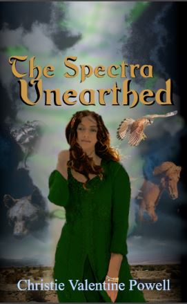
The image’s file name as sent is “Unearthed idea 1.JPG,” so I assume that this is still at the concept stage, ad we shouldn’t criticize rough edges, yes?
Thought #1: The title blends into the background — the hue may contrast, but the light/dark values are too similar. And the inconsistent drop shadow doesn’t help. Make it POP.
Thought #2: There’s a lot of unused space above the title. If you’re planning to use that for the series title and a blurb or tagline, fine. Otherwise…
Thought #3: The model’s stance is too much “unthreatening hippie chick” and too little “strong young woman standing up to adversity.
I assume that, because of the unfinished state, the animals roughed in around the border are placeholders.
Other thoughts?
Any tips on fixing up the animals around the border?
Well…
Several things to talk about, in no particular order…
The overall impression is of murkiness. There is too little contrast in color and value (light/darkness). The colors of the girl’s outfit and the girl herself seem flat.
I wish that whatever the images surrounding the girl are were larger. The fact that I can’t tell what they are at the size of the sample underscores what I mean. Apparently, they’re animals, but they are simply floating around the girl, with no apparent connection to her. In fact, she seems to be pretty much blissfully unaware that anything at all is going on.
Part of this disconnection is something Nathan mentions: the girl’s pose. It looks more like something from a fashion magazine than something that might suggest a princess capable of overcoming adversity.
One very important consideration is that there is no real sense of fantasy or that the girl is herself a shape-shifter. I think you should work at getting both of those ideas across.
And as Nathan says, you could make better use of the space available for the title
everything about this is all wrong for the genre. this cover need magic. It needs SPARKLE!! It need purple or orange but bright colors! It needs a pretty girl and atmosphere. Take a look at Patricia Brigs novels. It needs that.
Now I want to paly with this…
I made you a present
https://imgur.com/a/tNWJcgf
this was made from free pictures so you can keep it. (it’s sized for eboook standard.)
SOOOOOOOOOOOOOOOOOOO much better than the muddy original, Shel. Well done.
Wow, thanks. Can I ask what font you used?
I have a second idea that I think is working a lot better than the first one, but I will definitely keep this in mind.
Rumble Sans for the title with a little bit of a bevel on it to give it those sharper edges. And Augustus for author name but any roman serif font would do for that. The swash isn’t part of the font set but again any simple underline would work, something to ‘soften’ the text and add that hint of romance.
It’s super hard to make out what’s going on, even at full size. It looks like there are filters on the girl and the background, which is causing a lot of the problem. Also, it just doesn’t have a distinctive palette–there aren’t really any colors in the composition that jump out at you.
“Girl surrounded by magical animals” is a fine concept, but we need a fantasy girl–this looks like a modern girl. And the animals do need to look more magical in some way.
We could also use bolder colors on the title, and of course a bolder byline font.
The others have already gone over a lot that’s wrong with this cover: the murkiness (which will only be exacerbated on older electronic readers a lot of people are still using that show everything in grayscale), the rather drab and limited color scheme, and the dubious layout. (Rule of thumb: when they’re floating free over the cover image with no boxes or bars behind them, I recommend placing the centered title and byline at roughly the same distance from the respective top and bottom of the cover as they are from the sides; your byline’s fairly well positioned, but your title is hanging far too low and needs to be shunted more to the top. If you’ve got any taglines to add, they should go under your title instead of above it) Moreover, this cover at “full size” is still awfully small; not quite three times as high and wide as the thumbnail by my reckoning.
My usual general advice, of course, is to have a look at what kind of imagery other things with a story similar to yours use on their covers and advertising posters and the like. In this case, the closest thing that comes to mind is an old children’s show (from my childhood, specifically) called BraveStarr. It featured a hero who, though not a “shifter” in contemporary parlance, drew his powers from a number of animal motifs. Of course, it’s a kids’ cartoon and more science fiction than fantasy (though it did include some vaguely magical and mystical stuff in the “cowboy” part of its “space cowboy” themes), so definitely not an exact match; however, I did find some box cover art to a video game adaptation of it remarkably similar to what you seem to be trying to do on this book’s cover.
That said, it strikes me that maybe you’re limiting yourself too much by focusing too much on your protagonist’s powers and not enough on her personality, social background, and what exactly she’ll be doing with those powers. While that video game box art is decent for its time (the late 1980s), I find a certain “movie poster” made for the series to have aged better and to be far more inspiring to this day even though it shows none of the character’s animal motifs, preferring to surround him with a montage of his friends and enemies, and with some detailed background imagery showing the retro-futuristic world in which the general story is set. It may be that by focusing too much on showing some of the animals your protagonist can become, you’re likewise limiting yourself to using imagery that’s something less than compelling to prospective readers.
This is to say maybe you need to “think outside the box” a little more and reconsider whether your protagonist’s shifter abilities are really this story’s main selling point. You mention something about “six elemental clans” in your summary; you’re sure this story isn’t really about the protagonist’s talent for diplomacy and forging alliances between these clans, with her shifter abilities being more of a gimmick that just happens to serve this purpose well? Does nobody else in this story get any attention or do anything important besides her?
If this story really is mostly just about the protagonist’s powers, Shelley Savoy’s sample cover is probably the way to go and you should use it or something a lot like it for your book’s cover. If there’s more to your story than that, however, I’d recommend trying alternate covers based on some of these alternate points of interest. Try looking to her potential allies, love interests, friends, enemies, and/or interesting aspects of the world in which her story is set and see if any of these things grab your attention; if they do, they might just be able to capture prospective readers’ interest as well if you put them on your cover.
Everybody else has spoken to this pretty thoroughly, but the fact that you asked for instructions or help on fixing the animals around the edge worries me–because you shouldn’t fix this, you need to start over.
Please go look at YA books, in this genre, (fantasy princesses saving the world via various powers) and look at what they look like. They are anything but murky in color, and they show specific things, like Savoy said–magic, bright colors, specific fonts, etc.
You should read this article: https://www.creativindie.com/8-cover-design-secrets-publishers-use-to-manipulate-readers-into-buying-books/ before you try your next iteration. Read the whole thing and pay close attention to what Derek tells you, particularly around YA.
With all due respect, you need to start over. Also, please, don’t use that font. There are quite literally thousands out there now that you can use, and that one is clunky and not going to be noticed.
Thanks, I will scrap this idea and work on another.