The author says:
This is my other idea (with improvements from the comments).
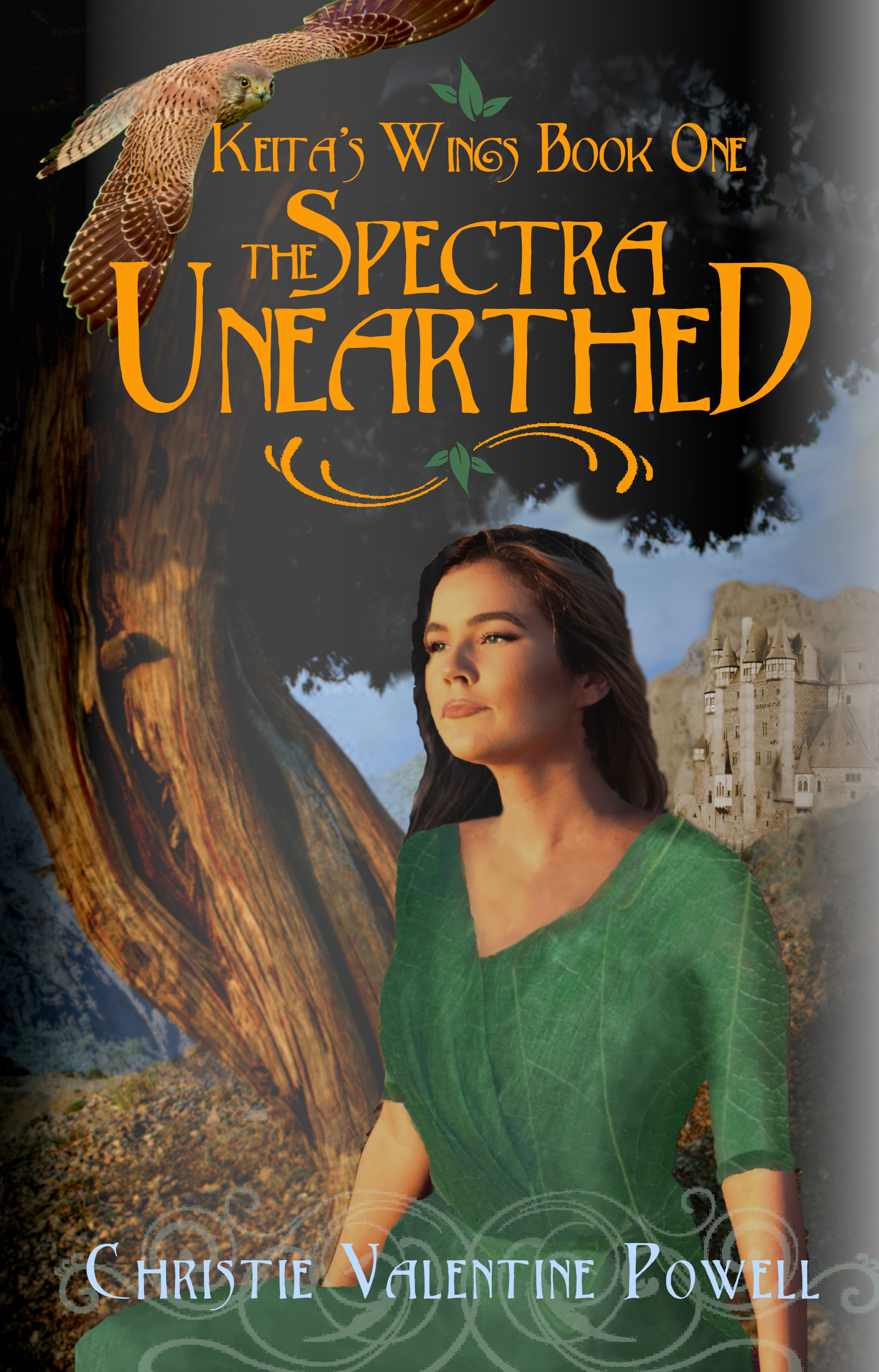
Book description: YA fantasy: An exiled princess must unite six elemental clans to overcome the ancient society that destroyed her family. Her clan’s abilities are nature-based, including shape-shifting. This book deals mostly with her relationship with three other girls, and is about her gaining the courage to fight back.
[original submission and comments here]
Nathan says:
I think the biggest problem here is that it still lacks magic. From the thumbnail, both the bird and the scrollwork behind the byline (both of which are only marginally magical in themselves) are invisible; what you have left is a possibly historical woman. Is it a historical romance? A historical drama? You’re missing the signifiers that tell the fantasy-reading audience, “This book is for YOU.”
In the comments to the original submission, Shelley made an example cover which nails those signifiers squarely. There is NO WAY that anyone could mistake which genre that is, which is just about the first thing that a cover needs to convey.
(Looking closer: Something’s weird about the woman’s jaw. She looks like she’s entering a watermelon-seed-spitting contest.)
Other comments?
Well, it is certainly an improvement! The overall composition, in fact, is very nice!
It does, however, as Nathan points out, lack magic. To someone not knowing anything about the book, it could be about a girl living in some contemporary European country.
I think that the swirlies around your name are superfluous. They add nothing to the cover while at the same time obscuring the girl. (At first glance it looks as though she is rising from a cloud of smoke.)
The background looks too unsaturated and greyish. Even the sky is a greyish blue. Perhaps you are trying to achieve a kind of atmospheric perspective, but the tree is much too close for that. She is obviously sitting nearly under it: give it the same level of contrast and saturation she has. One result is that she will not look as though she (and the owl) were pasted into the scene. Having dark darks in the tree will also provide more contrast for the title.
In fact, the cover art overall really lacks any significant contrast or color saturation: there are no really light lights and no really dark darks—except for that single mass of her hair. Take a look at your cover in greyscale to see what I mean. The tone is very monotonous overall, except for that one spot of black that is her hair.
I don’t know what the veiny texture is. If it is supposed to be part of her dress it should follow the curves of her body. And speaking of her dress, it needs to be a little less flat-looking.
I would eliminate the shadow running up the left side of the cover and the light area running up the right side. Again, these are gratuitous flourishes that add nothing to the cover.
Here is a cover I did a year or two ago. It shares many similar features with yours: a foreground figure, a background tree and a castle in the distance. Color and value contrasts were used to make all of the elements pop out—especially the title and author’s name.
I forgot to include the link to the cover I mentioned.
https://i.gr-assets.com/images/S/compressed.photo.goodreads.com/books/1501618535l/35895883._SX318_.jpg
Try adding some motes and a glowy bits around the bird. maybe throw some clouds over that castle to hid the unblended edges there. She does have a bit of weird expression but I can live wit it…lol
I like the decorative flourishes; the one under the name isn’t centered though. It might look nice brightened a bit too. or maybe instead put a magical effect in her lap.
Over all I like this a lot and with some small tweaks it would really shine.
https://imgur.com/a/3Vawanu
some tiny tweaks. the right side is too dark because I was trying to get rid of that weird light line. that side should be darker, not lighter. also parts of the castle behind her should be a shadowed. That castle needs more work but it would come out best if you did it on the castle layers. it’d be easier to just replace it, which I did in the second one I fixed her hair and the weird skin there. I also added some shadow to her dress (actually her body where the dress falls) to make it a bit more real looking but its the magic that the cover really needed.
If you need help doing any of these effects just drop me a note.
That expression just really doesn’t work for me. She kind of looks as though she’s either pouting, with the corners of her mouth turned down, like a mouth clamped together, or she’s holding in gas. I mean it.
Ignore everything else; make a circle of your hands and just look at her expression. You know how Aunt Milly looks at the family picnic, when she’s told you not to take her picture, but she sees you out of the corner of her eye, doing it anyway? So she doesn’t jerk away, but her mouth shows her annoyance? YUP, there it is.
Not to mention, the neck angle is odd, simply odd.
I honestly think Savoy’s Mockup ROCKED. If I were you, I’d reach out to her, truly. I simply feel that this isn’t doing it for you. I will say you are crushing it with the type treatment, which is great. A bit on the Celtic/Medieval side, more than magical, but close enough.
Good luck.
I second Hitch’s suggestion that you approach Shelly directly.
I hope this is a very, very rough draft, because that is some rocky cut and pasting, especially the drawn-on dress.
But assuming the final version is going to be greatly cleaned up, the problem is still what everyone is saying: That it could just be a girl who goes hawking, nothing shapeshiftery at all.
The traditional “close-up face that’s human on one side and animal on the other” would be one option that would work better.
I do like the type treatment, though.
Shelly’s re-do is, as usual, excellent and full of good ideas!
I still very much dislike the swirlies under the author’s name. They are gratuitous, add nothing to the cover and are a real distraction (why draw so much attention to the author’s name?). They are also ambiguous. At first glance they look like part of the girl’s dress or as though she might be immersed in or rising from some sort of tangled web. Since they serve no purpose and are distracting, I think that the cover would do very much better without them.
This would be a very good time to apply the dictum “Less is more.” Simply adding visual elements to a cover because they are available rarely makes a cover more effective. If you want to add effects that convey a sense of fantasy, add them where they are really important: to the figure or her immediate surroundings, as Shelly did with her sparklies. The latter are part and parcel of a complete scene and consequently add to it. They are not simply added in gratuitously and with no relation to the rest of the art.
Sorry, Shelley, for leaving out that second e. My bad.
R
The different elements of the cover don’t really seem to match, with some being photos and some illustrations. The leave garment she is wearing doesn’t flow with her body. And as others have mentioned, there isn’t much contrast to it at all.
My favorite layout element is actually that tree (minus the oddly low resolution soil bit at the bottom) just for framing purposes, but it doesn’t really convey much about the book. If I just saw the cover, I would think it was meant to be some sort of historical fiction or perhaps a quiet fantasy about a girl and her hawk. I definitely wouldn’t think 6 clans or shape-shifting.
On her expression, I’d add to other comments that her gaze is pretty much in the least desirable direction. People tend to ‘follow the eyes’ of an image they look at, so they gaze where the model gazes. A model looking strait at the reader is intense and provides connection. A model looking up or down can draw attention to a title or author name. A model looking at a key element can help set genre or a clue as to what is inside the book. But just looking off the page seems to say “nothing to see here. move on.”
You make some really good points, Jennifer! The author might, for instance, bring the hawk down–enlarging it at the same time to scale—and make the girl interact with it (as in the woman and the fox in the example I posted earlier). That wouldn’t solve the problem of not conveying anything much about the fantasy nature of the story, but it would make the cover art a little less piecemeal.
The cover looks decent in its thumbnail, and it’s a definite improvement over the previous iteration, but a lot of flaws reveal themselves upon a closer look. As others have already mentioned, a lot of the imagery seems to be cut-and-pasted from disparate sources, and the protagonist’s physical pose and facial expression are extremely ambiguous. Where the cover designer in the previous post on this site had a problem with being too ornate (in everything), you seem to have the very opposite problem of your cover’s being too subtle: while your protagonist’s dress (on much closer examination) appears to be oddly organic (as in made from some kind of giant leaf), there’s absolutely nothing else on the cover to suggest any kind of magic at all; if not for having critiqued your previous cover, I could easily have mistaken this for being the cover of some kind of high-brow historical romance.
With a little further refinement, the gal’s expression can be fixed and the cut-and-paste graphics can be seamlessly integrated. What this cover mainly needs, though, is something that loudly proclaims “THERE’S MAGIC IN THIS STORY” rather than just vaguely hinting at it the way the girl’s giant-leaf-dress does. The magic in this story being mainly something to do with shape-shifting, having some feathers growing out of the gal’s back as in one of Savoy’s previous suggested revisions might help, but might also be a little too subtle by itself; like that giant-leaf-wrapping dress, casual browsers may just think the gal is wearing an extravagantly expensive dress made of feathers that the royal taxidermist tailored for her.
What really makes anything on these covers look magical is energy, which is generally portrayed using oddly-colored glows, fiery blazes, jagged crackles of lightning, or starry sparkles of light. All of Savoy’s suggested covers have used either lightning or sparkles, and I heartily recommend following her examples. At the same time, don’t overlook the possibility of blazes or glows: if your protagonist is going to be getting rather violent when “gaining the courage to fight back” against the people who murdered her entire family (and I frankly can’t imagine any peaceable alternative), glowing eyes and a fiery nimbus as in a previous submission to this site featuring a baleful polymorph bent on revenge might serve you well.
Whichever you choose, though, give us some energy on this cover, both magical and physical: make the gal look angry or at least defiant, and not just mildly miffed at the people who slaughtered her family like animals. Make it look like Princess Shape-Shifter there is about to blast you with her magic and maul you with her claws or talons. Go for some clenched teeth, a curled lip, and/or her raising a hand or fist (blazing, crackling, glowing, or sparkling with energy as prescribed) against her evil foes.
In short: more magic and violence, please.
Here is a thought or two…
Every visual element in a cover has to contribute to the overall effect and impact of the cover. If it doesn’t do that, it only detracts. Everything has to contribute because a cover has to convey its main message—what sort of book it is, what it might be about, its idea or theme—in just a momentary glance.
At the same time, all of the visual elements need to be related, they cannot just be there. They need to perform as a team, as a gestalt.
So while it is important to make sure that there are visual elements that get across the idea of, say, fantasy on a book that is a fantasy, it is just as important that they are not simply placed on the cover as independent elements. Otherwise you just end up with a kind of visual catalog of fantasy images but not something that comes together as a unified whole.
For instance, a cover might have images of an elf, a dragon, a sword and a cauldron but that is all it would be: a collection of images, like a page in an album. But an elf using a sword to defend his cauldron from a dragon is not only much more interesting, it suggests that there is a story.
So it is important to not only include fantasy elements but elements that work together.
NAAAATHANNNN:
Are you awake in there? Got covers?
I could try submitting a cover, since I just recently started selling premades, but I don’t know if I want my delusions of grandeur shattered just yet. 😉
We will be gentle.
It ain’t me. Nothing has been submitted in a few weeks. I guess everyone’s trying to cram in the last of their summer fun.
Crap, seriously? Dude, it’s a MADHOUSE at my shop. That makes no damn sense. It’s always been slow in summers–until CS went tango-uniform. Sine then, it’s nuts even in the summer.
Jennifer–submit one. What’s the worst that could happen? 🙂
Did a bit earlier, hope it went through. I picked the one of my covers I’m the least satisfied with. I don’t think it’s bad, per se, just feel like I missed the Urban Fantasy mark on it, but I’m not quite sure what’s throwing it off for me.
Alrighty! Can’t wait to see it.