The author says:
Hostaged in the hands of technology, the seski beings have long forgotten their cultural values and an integral part of their history. In an attempt to reclaim their lost past, an expedition force makes use of dimensional portals to outrace the light and land on a human habited planet, Iven, to stargaze into the afterimages of their planet – 300 years in the past. Some missteps and the seski beings’ identity are compromised before the human inhabitants. The human beings are intrigued by the discovery of a new sentient race but threatened by the intrusion, creating hostility between the locals and the expedition. Meanwhile, the seski expedition is intrigued by the cultural values of the humans but threatened by their hostilities. The humans try to defend their own in a preemptive strike, while the seskies try to defend their own and recapture the human culture through an aggressive one. The 33rd Century Wars commence.
Nathan says:
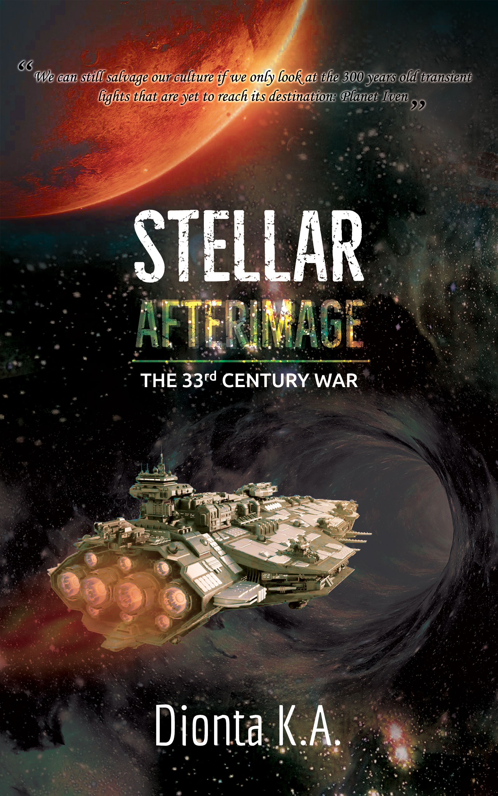
Here’s the first thing I saw:
The cover is full of terrific elements for a perfectly serviceable (if slightly generic) SF cover, but the layout needs work, as everything is unbalanced. The text treatment on “Afterimage” is also a bit of a problem — I can read “Stellar” in thumbnail (just barely), but “Afterimage” is a complete loss.
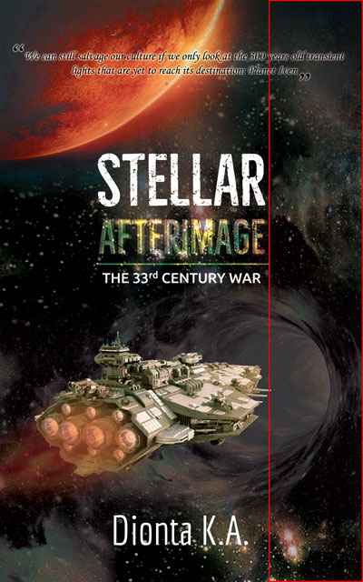
Here’s the five-minute version of where I would go with the layout:
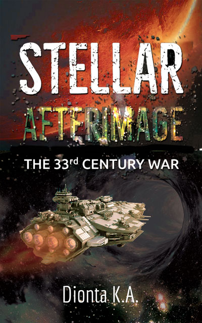
The byline seems, well.. having the surname be initials only comes across as too precious.
Other comments?