The author says:
Fantasy meets Science Fiction in this action packed Superhero novel. His life would forever change in ‘The Powers Cataclysmic.’
Over twenty thousand years into the future, humankind, Earth, and the entire universe witnessed a catastrophic event that forced most existence across all universes to evolve into the highest dimensions and beyond. After this shift, all sapient beings could fly and have cataclysmic, super cosmic powers, godlike existence, and use even their hair, garments, and energy as extensions of their bodies. Unfortunately, there were those who lusted to dominate over all others as beyond omnipotence was not enough for them.
Over thirty thousand years after that event, Thrastara Navarras turned twenty-two years old. Months passed, and he still had yet to taste the beginning of his adult level powers, and hopes his friends and his mentor Arveias can help him to unleash his powers despite his trust issues and history of personal trauma. He also hoped Kalavria would notice him and that she would at least tolerate his existence. His fate would forever change when a stranger named Arrak killed two of his friends. While thirsting for revenge he is confronted by Exorcists, including Dr. Johnas Moorekase and Dr. Sephras Kainesen. Johnas warns Thrastara he is infested by demons may be a candidate to be Lord Neraios’s next vessel as the Antichristos. The Lord of Brilliance and Darkness could use someone like Thrastara or one of his long lost siblings to gain even more powers. Family secrets will be revealed along the way. Will Thrastara be able to set aside his deep hatred for the maligned Exorcists, or will he succumb to his hunter Arrak, or ultimately his own inner demons? Within the infinite sized dimensions and beyond, from Earth to Mars and beyond, many questions will be answered in ‘The Powers Cataclysmic,’ which is the first book in the Katastrophica series, a series unafraid to mock itself.
Content: Contains the concept of higher dimensions in a more fantasy oriented sense, extraterrestrials, angels, demons, the supernatural, superheroes, content people may find objectionable, religious references and concepts, over the top superpowers, language, references to and instances of smoking, drugs, alcohol, and some sexual contact.
Genre: Fantasy Sub genres: Superhero Fantasy Fiction (Prose), Science Fantasy, Science Fiction, Speculative Fiction
Target Demographic: General Fantasy/Adult (same group that reads series like ‘The Wheel of Time’ and ‘The Chronicles of Amber.’) and Superhero Fiction of all kinds (comics, novels, etc), fans of action anime. Secondary: New Adult, YA I’m aware that science fiction deals with the future, not fantasy. However, superhero fiction is somewhere in the middle, like science fantasy, which is what I’d like to convey.
[original submission and comments here]
Nathan says:
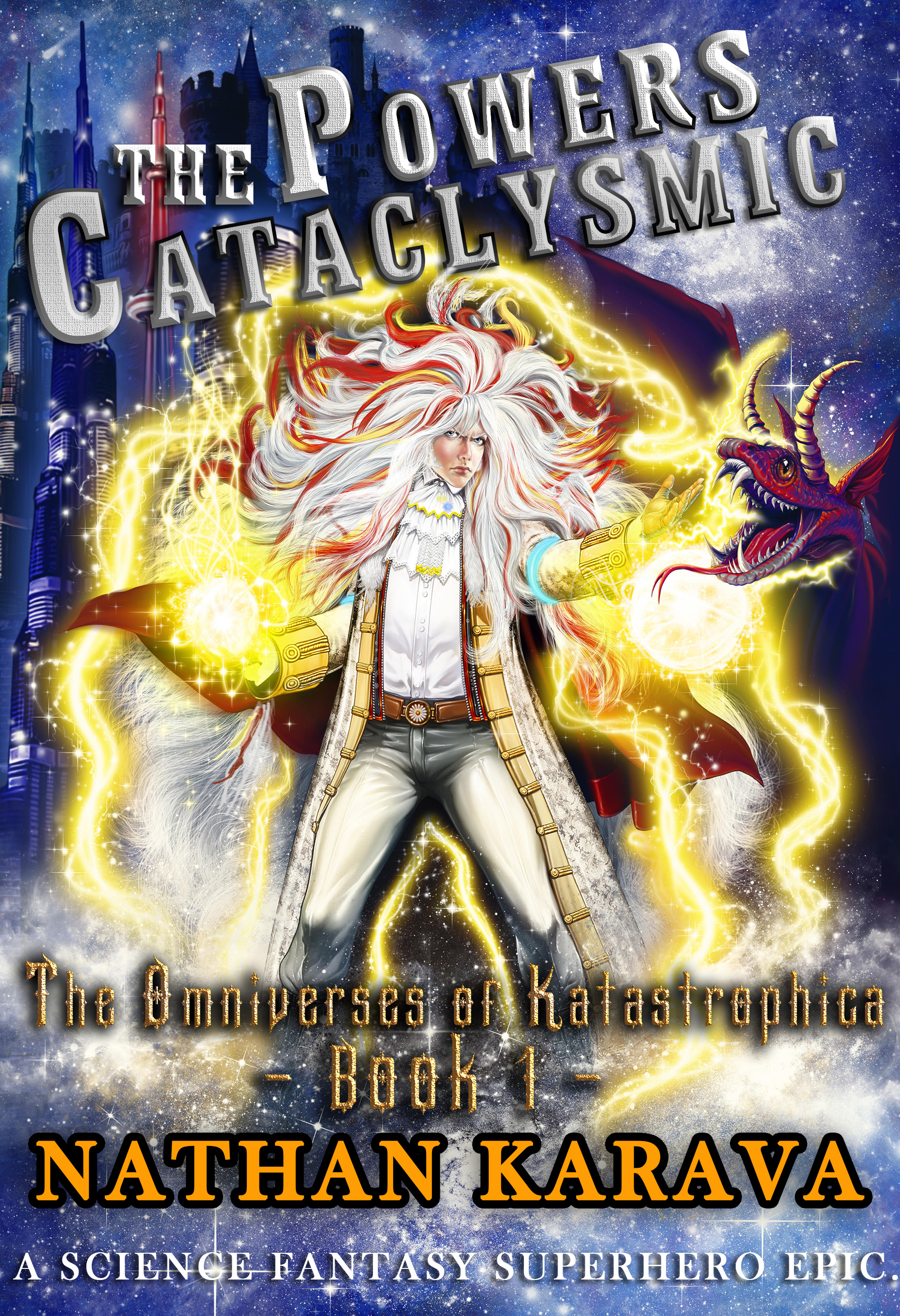
AAAGH! Too much!
Seriously. Angled fonts, beveled fonts, drop-shadowed fonts… The artwork is ornate enough. Adding bling to the type just makes it harder to read.
And with all the added sound and fury in the art, the thumbnail just becomes “I think maybe there’s a figure in there…” Remember, since 95% of your potential readership will first encounter the book as a thumbnail at Amazon or some other ebook site, your thumbnail has to set the first hook and get them to click through.
I would chop the artwork like so:
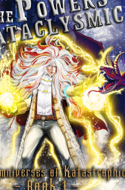
…and then use strong font treatments that clearly separate the text from the background and make it easily readable.
(Also: Your blurb is still TL;DR.)
Other comments?
I agree! This cover needs to be drastically streamlined.
First, there is far too much going on in the artwork. Even Nathan’s suggested cropping, which is a great improvement, doesn’t simplify the art enough. That photo-bombing dragon really needs to be integrated into the art…or left out entirely. At the moment it just looks tacked on.
Second, the type is almost unreadable. Just because Photoshop lets you add beveling and drop shadows doesn’t mean you have to use them.
Would a more uniform and less saturated color scheme help with simplifying the cover?
Also, I definitely have to work on shortening the blurb. My book is still in the developmental editing phase, so maybe I should wait before worrying about the cover design right now. Thanks for the feedback.
Nothing says Photoshop newbie more than using the bevel/emboss effects on text. Definitely nix it.
Here I tried to shave your blurb down from 298 words to 196 words i hope this helps you out.
Book one of the Katastrophica series, a series unafraid to mock itself.
I would suggest shortening your blurb even further. 150-200 words is more than enough and yours comes in at just under 200. A blurb should be a teaser, not a synopsis.
I would also very strongly suggest that your blurb be triple-checked for spelling, grammar and sense. It is going to be the very first example anyone is going to see of your writing and it needs to make a good initial impression.
I cannot second what Nathan and everyone else has said strongly enough. That cover is simply obscenely overdone. You ever see a woman at a party, wearing flashy clothing, jewelry, her hair’s done out to there, her makeup is bright flashy eyes, red lips, and you’re just…bleackkkk? That’s what this cover does. It makes me want to run screaming into the night.
That central figure is SO overdone already, he should be on a simple black cover with SIMPLE fonts. There is no need at all to foofify the font, or do all the things that you’ve done here. Lose the city behind the flashy person, lose the dragon, lose that gold glow. It’s enough as it is.
Lose the Photoshop filters for sparkle, snowflakes, and all that stuff.
Just put this guy on a SIMPLE colored background–black, white, something that won’t make the eyes bleed and then, use a simple sans serif font. It needs a LOT of toning down. (Do you have a cover designer working on this, or are you doing it?)
The blurb, to misuse the term, again (a blurb is actually praise about your book from another published author. It’s not a description but it’s fallen into the vernacular, unfortunately) is everything that everyone here is telling you. It’s also overkill to the nth degree. You have serious tense and grammar issues, but this isn’t Critique-my-description-com, either. But yes, you really need some serious editing on that. It’s horribly confusing, not merely overly-long, too and in it, you have failed to make anyone CARE about your character, poor little higher-dimension being that doesn’t have super-powers yet. (See what I mean?) You need to make people remotely interested in your character, make him remotely likable or something.
Good luck.
Hi. Thanks for the replies. I changed much of the features of the artwork the artist did for me, while simplifying the fonts based on the suggestions.
Here is the link:
https://i.postimg.cc/KcQSCDv5/138058-1-Modified-4-G-TPC-COVER-1-AB.png
It does look a lot better
This revised cover is much better, and my suggestions are for that specific one. I believe the color choices of the fonts need tweaking. First, the author’s name is too dark, and gets lost in the artwork at its present location. Second, the title is too bright red for the more subdued tone of the artwork. Maybe you should darken it a shade or two, as well as raise it up a tad so it doesn’t entangle with the character’s hair. For the artwork, the ground between the legs looks weird, not matching the ground outside of the legs. It looks like the character is straddling a rock for some strange purpose.
For the cover you submitted, our esteemed host’s “Too much!” is an understatement. Basically, were it to be released to the public, that cover would get the busybusybusy and random imagery tags over on Lousy Book Covers. The latest revision you’ve shown us with this post is better for being simpler, but I think the white background is a mistake; your white-clad and white-haired character is in danger of being absorbed right into it.
The dark background on your submitted cover wasn’t the problem; the problem was that all the bright crackles and sparkles around him were drowning out your protagonist (especially in the thumbnail). I know you want to make him look powerful, but the two sparkly balls of energy he’s apparently about to hurl at the fourth wall are quite sufficient for establishing that; anything more is overkill. My recommendation: go ahead and clear away the stars and energy ripples from around your character, but keep the dark background.
As to the imagery in that dark background, you should avoid fading images into each other the way you did on your submitted cover; that earns you the layers upon layers tag over on Lousy Book Covers. That doesn’t mean your background necessarily needs to be blank as in your latest revision, however. While fading skyscrapers into medieval castles doesn’t work, a background showing medieval parapets integrated into skyscrapers at night (maybe something like the Eyrie Building from Gargoyles) would be an excellent way to hint at the combining-fantasy-with-science-fiction-tropes strangeness of the distant future in which your protagonist dwells (and medieval fantasy imagery combined with more contemporary science fiction imagery of skyscrapers by night has worked very nicely on at least one book cover I can recall).
To summarize: your main job at this point is to simplify, simplify, simplify. I’ve focused mainly on what your cover’s imagery needs; others have focused on the title and byline fonts (for which one or at most two fonts should be quite sufficient) and summary (which will need to be a lot shorter on your sales page). Your mandate for all these elements is to make them simple enough to ensure they’ll be immediately accessible to your target audience when browsing through thumbnails at online retailers and visiting your sales page.
The second version is infinitely better than the first! Good job! You have simplified the cover art and made it far less elaborate and confusing. The first version was literally a crazy quilt of colors, shapes and ideas. You’ve now given the cover much more focus.
You have successfully eliminated all of the extraneous details that really added nothing at all to the cover: the background structures, the mass of sparkles, the star fields and galaxies…even the dragon which was little more than a disembodied head peeking in from the right margin. (If you want to include the dragon it should be made much more an integral part of the cover.)
Be careful, though, about not letting the cover get too monochromatic: you don’t necessarily want to lose all of the brightness and saturation you had in the first version. For that reason, you might want to consider going with a dark background rather than a light one. That would give some contrast to the lightning and fireballs (or whatever those are).
One thing that a book cover should not be is a kind of visual puzzle for the potential reader to figure out. It has to convey its message—the nature of the book—in the briefest glance. Even though Mies van der Rohe was speaking about architecture when he said that “Less is more,” this applies just as much to book cover design.
Another big improvement is your handling of the type. The title and subtitle/taglines are much easier to read. (Remember that both the art and the text need to be comprehensible at all sizes.) I would only close up the space between “The Powers” and “Cataclysmic” and work on the color for your name. Right now there is not enough contrast where it passes over the darkest part of the background.
—————–
Even though your blurb is a WIP, you should be careful to pay very close attention to grammar, punctuation and sense. It will be, after all, the very first example anyone is going to see of your writing and it needs to be letter-perfect. It’s exactly like making sure that you are well-groomed before going in for a job interview.
I concur. MUCH MUCH MUCH better. Now, I can really see and enjoy that central figure. Well done–but yes, work on the font coloring and locations.
I’d consider not using SOOO many colors. Again, you have a magnificent central figure. you really don’t need to gild the lily with a bajillionty font colors.
I see the issues with the placement at the bottom–consider using a bar there. Add the bar to the cover, say, black (so that the darker sooty foot area then blends into the bar, right?) and use good old WHITE TEXT in the black bar. Simplicity and contrast are your friend.
The revision is much better. I continue to really like the figure. But I still want to see the same two changes I wanted in the first draft–one, I want him on a dark background so he shows up better, and two, I want one dominant palette color instead of the text being brown AND red AND blue.
Thanks for the feedback, everyone. I am posting two more mockups with simplicity in mind. The suggestions to darken the background were also taken into account. Am I getting closer to the mark? Thanks again.
https://i.postimg.cc/2yrGyvfL/138058-1-Modified-New-5-03-04.png
https://i.postimg.cc/KYTD5QGg/138058-1-Modified-New-5-03-05.png
Thanks for the feedback, everyone. I am posting two more mockups with simplicity in mind. The suggestions to darken the background were also taken into account. Am I getting closer to the mark?
Let me know what you think.
Thanks again.
https://i.postimg.cc/2yrGyvfL/138058-1-Modified-New-5-03-04.png
https://i.postimg.cc/KYTD5QGg/138058-1-Modified-New-5-03-05.png
I think that second one rocks!
I love the coloring on the 2nd one. I would urge you to consider that like the colors, gilding the lily, etc. you really don’t need such a foofy font, but if you’re determined to use it, could you allow it to breathe, please?
Having the two lines basically touch makes it VERY hard to read. The Cataclysmic is overly-kerned, too spread out.
I recommend that you allow “Cataclysmic” to be less spread out and a teeny bit smaller, so that it’s not touching “The Powers” above it. I like your instinct to make it go the entire width of the cover, but in this instance, it’s not working.
If you do that, I’d say it’s nearly there. FWIW, I prefer the version with the black background behind the author name–as that makes it more readable, but…dealer’s choice.
Oops. Double post. My bad.
I hope you also shorten your book blurb too