The author says:
[Note: No new synopsis was submitted, so I assume it’s the same.]
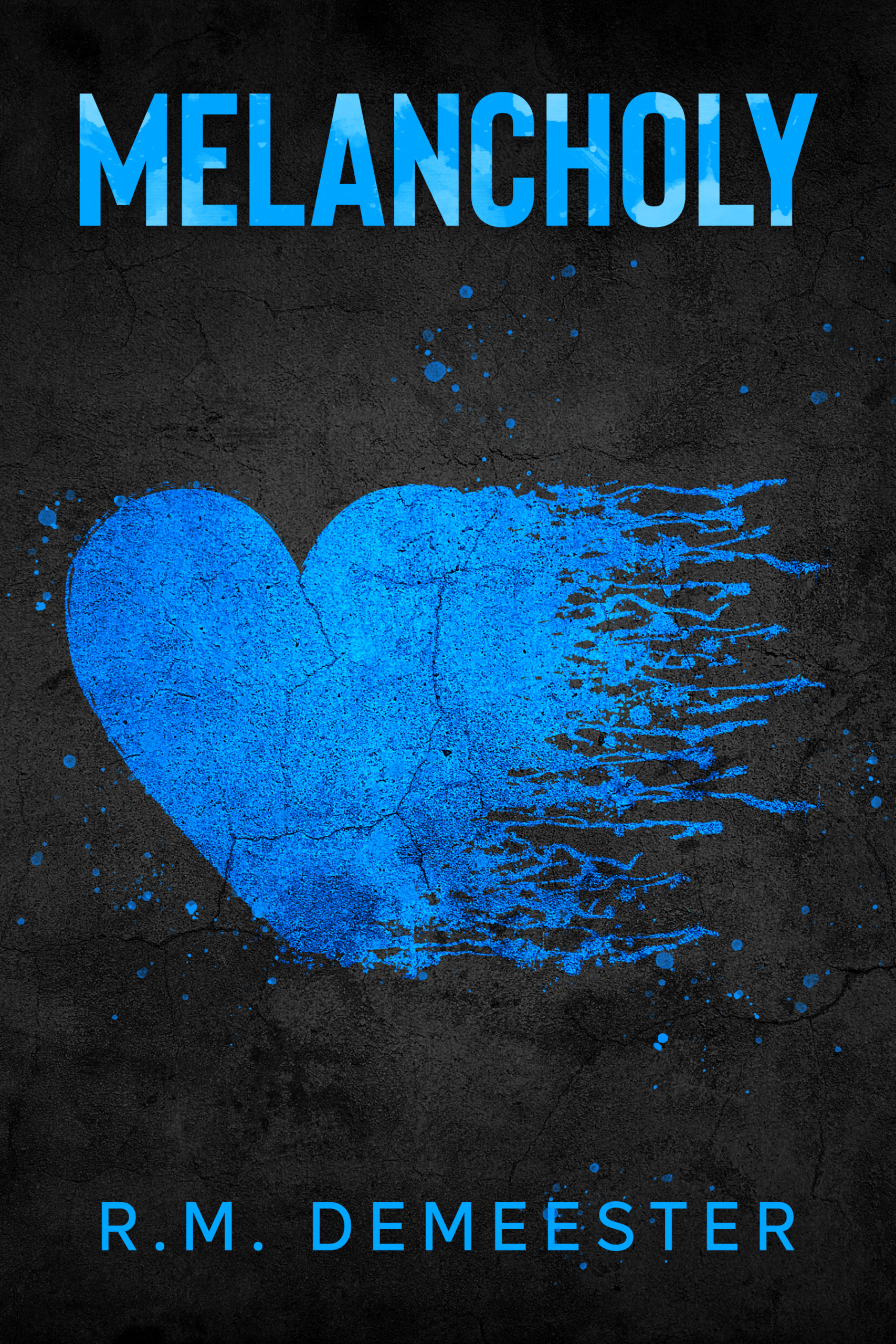
Two strangers both have one thing in common, they lost a partner to death. Brett Miller, a widow with a ten-year-old daughter, has spent the last two years grieving the death of his wife Natasha. The heartbreak and the devastation don’t seem to end, when he loses his job, and his relationship with his daughter continues to disintegrate. He tries to keep everything together, but isn’t sure he has it in him. Victoria Bell’s boyfriend of two years died unexpectedly, leaving her alone to raise their infant daughter. With the help of her sister, she learns to live again. But an unexpected foe from her past puts a wrench in her new beginning and she fears staying in the realm of heartbreak forever. Can Brett and Victoria break free from melancholy?
[original submission and comments here]
Nathan says:
Without a new synopsis, the former criticisms are in play: “How do the stories of Brett and Victoria relate? Is this a romance? Are they neighbors who platonically help each other through their crises? Do they become each other’s arch-nemesis? I’m trying to find the core of the story here and what readers it’s meant to appeal to, because that will matter which way we go on this cover.”
The typography is more professional this time around, but it still tells us NOTHING about the book. The cover could be anything from a collection of poetry to a memoir of depression to…