The author says:
Dauntless Hearts is a sweet standalone Regency romance written in the archaic language of 19th-century Britain. This novel explores themes of ambition, bigotry, love, developing maturity, and courage in the face of adversity, all in a richly realised historical setting with well-rounded characters. If you love Jane Austen and Georgette Heyer, you will adore Dauntless Hearts.
Nathan says:
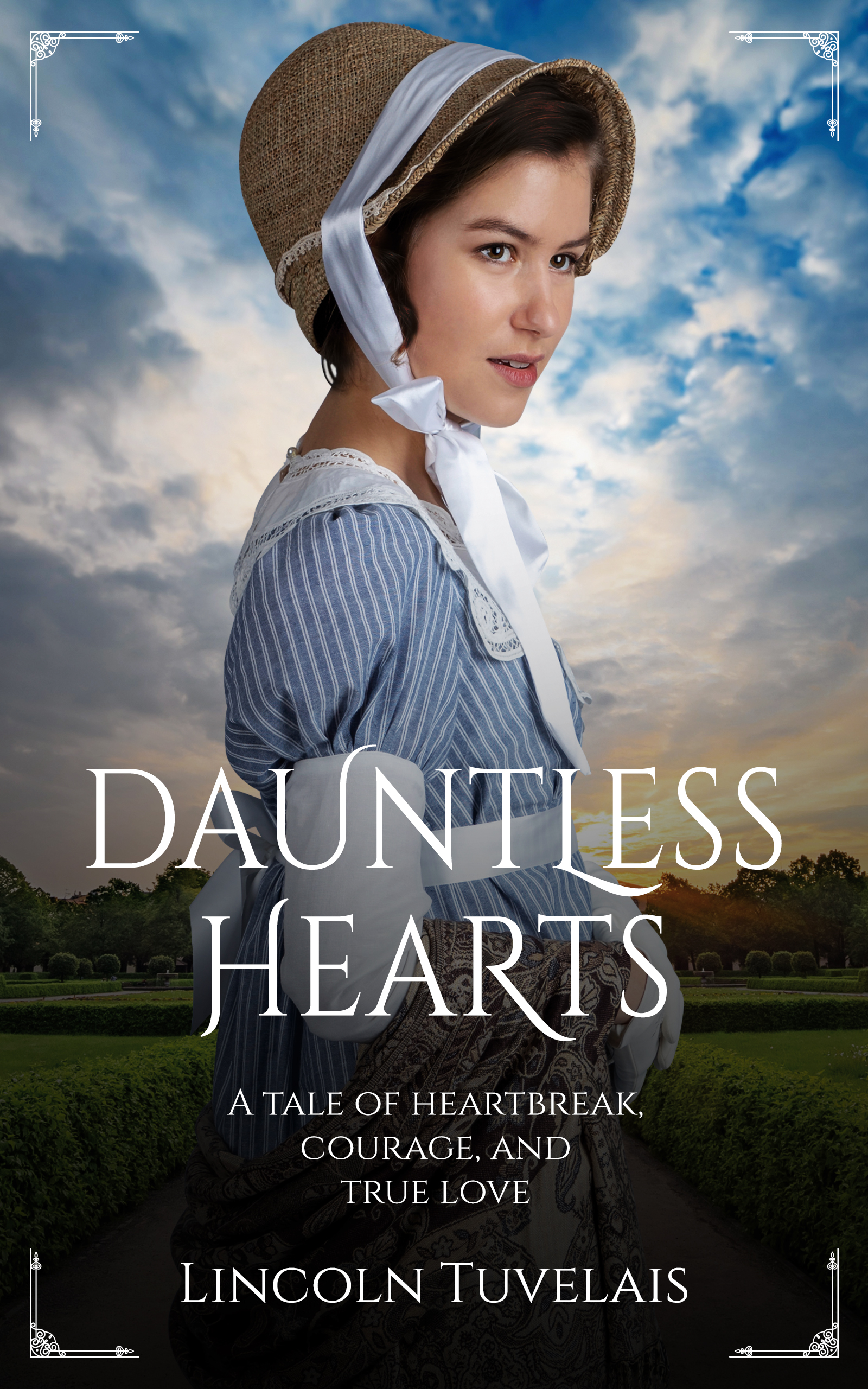
I have absolutely no problem with the technical aspects of the cover. That said, don’t most Regency romance covers feature a couple, rather than a woman alone? It could go a long way toward flagging your target audience.
Also, I looked you up and know that you’re female, but “Lincoln” isn’t a name that people assume belongs to a woman, and almost all romance writers use a name that instantly says “female” (including some male writers that I know — Angelica Hart, I’m looking at you). I’m not saying that you HAVE to change your byline, I’m just saying that it’s worth considering.
Where does the cover even hint at the themes you describe? Where does it suggest “ambition, bigotry, love, developing maturity, and courage in the face of adversity, all in a richly realised historical setting with well-rounded characters”?
It’s just a pretty girl.
This is not only uninformative, there is really nothing to set this book apart from hundreds of other period romances. What makes your book different? Why should someone stop and take a look at it? You may want to attract a target audience…that is all well and good…but you also want to suggest why your book is unique.
Since it’s my suggestion that the cover be rethought entirely from scratch any detailed critique of this one would be pretty much moot.
I don’t know design, but I DO know romances, and I can tell you that having a book cover that hits the same notes as the competition, so to speak, isn’t necessarily a bad thing. Romance writers as a group like…a certain consistency of presentation. We like to know what we’re getting.
The problem here is that this cover is hitting the wrong notes. Everything about it, from the bucolic background to the big sky to the stripy cotton dress positively shouts “Inspirational romance set in 19th-century Nebraska (or thereabouts).” Which, again, is not a bad thing, and if the author has written an inspirational romance set on the prairie that just happens to be set during the Regency, she’s nailed the look. But there are none of the usual signifiers of Regency romance here, and the risk is that a reader will pick it up based on the cover shot expecting Janette Oke and be shocked and astounded to get Julia Quinn instead.
(Nothing wrong with either Oke or Quinn, but their readerships don’t always overlap.)
It is technically well put together,besides perhaps the woman not matching the lighting of the sky.
But something about the close up of the girl, coupled with the tagline, makes it give off a prairie western vibe of hardship on the frontier.
While you can do regency romances with just a woman, especially if they are clean romance and not steamy, most of the ones out there feature a more distant shot of a gowned woman. Usually behind then us an eye candy mansion, gazebo, folly, or other architecture piece hinting of the era.
I’d recommend revising the concept of it if you can, though this will work – it’s definitely not an embarrassing or bad cover, it just doesn’t quite hit the niche genre and is puzzling.
However, I think the weak point here is actually the blurb. The cover is well done enough a regency romance reader might look, even if the first impression is confusing on genre. But the blurb doesn’t connect me to the character at all – it sounds more like a pitch of why a teacher should give the book to her class.
The line about “archaic” 19th century English is strange. Regency readers tend to expect the vocabulary and style of writing to be more formal. Also, unless its “anti-Catholic bigotry” you might want to be specific. It’s better to follow a character and set the stakes than to simple summarize the “themes” of the book.
Hell, even if it is anti-Catholic bigotry, there should be some specification. Is it misogyny? Anti-Catholic bigotry? Something else? If it’s race, I’d strongly suggest some hint of that on the cover. Or whatever other type of bigotry.
Not every Regency reader is interested in every “anti-this” plotline. And leaving it hinted at, but not explained enough so that the reader knows what they’re getting upfront could backfire. I mean, let’s face it–not every reader getting into an escapist fantasy wants to fall into a plotline that deals with societal problems. Dealing with societal problems is why the reader wants the escapist fantasy in the first place! Making sure that the readers that do click to buy or try the book are your targeted niche audience. And that’s part of the cover’s job.
I too immediately thought this was American prairie settler. Not UK Regency, so…maybe it’s the material of the bonnet? Or…I don’t know, but there is clearly something misleading about the image, that 3 of us didn’t instantly think “Regency.”
I don’t have any problem with the fonts used. And yes, other than lighting that only the cover nerd herd here would notice, the composition is pretty solid.
I just looked up Jane Austen on Amazon and almost all her covers are of a single female (Mansfield Park is of the top half of the woman’s head off the cover), or of a house. I believe Lincoln here is either paying homage to the Amazon covers or copying them.
When I first looked at the cover, I thought, as Jennifer says, Little House on the Prairie.
True–but Jane there has name recognition. You could put a puppy on the cover and she’d still sell. 🙂
She might gain new market segments.
Wah-wah-wah-waaaahhhhh…cue the trombone slide here.
Seriously, I think most Regency readers cut their wee Regency teeth on Austen, but you do have a point.
Two things, one this looks more like an Amish Romance then I Regency one. Her outfit, the bonnet, all scream Amish. It does look sweet though. I would definitely feel like I was getting a clean / sweet romance with this cover. Second, the model looks pregnant. I don’t know if that was intentional or not.
Her bonnet and dress are definitely NOT Amish, but it does carry that “clean and wholesome frontier romance” vibe.
I agree…but I then I live in an area with a large Amish/Mennonite community. I would think that anyone who is not particularly familiar with the sects might be forgiven for immediately thinking “Amish”—exactly as Mary did.
As a Mexican who has never had contact with an Amish (and possibly will never happen because I don’t know if there are such communities here) I had the same impression as Mary.
If for some reason you want to stick with this cover image, it needs some work.
There is a lack of contrast and saturation that lends a grayish dullness to the image. For instance, there are no true whites anywhere. The lower part of the figure needs to be separated more from the background. At the moment she tends to merge into the dark area at the bottom: she looks as though she is rising out of the ground. Make her definitely in the foreground.
The corner brackets add nothing.
The title could easily be larger.
All that being said, I would still hope you might consider a different image entirely since I see nothing that suggests “themes of ambition, bigotry, love, developing maturity, and courage in the face of adversity…” The present cover is bland and generic…and bland and generic is, I would hope, not the impression of your book you want to give potential readers.
One more thought: The title is “Dauntless Hearts”…but there is only one person on the cover. The plural in the title might go well with another figure added.
I don’t mind your cover, but I’d call it Dauntless Heart, therefore it focuses on the main character and her strength, her loves, her romance, her story. Therefore you don’t have to change the cover. I did think it was Amish though at first. Alas I’m not in Brittan it may speak to people from there more. I like your cover. I’m not sure you need the decorative corners though. It draws the eye downward instead of in the middle.
Another comment. I sort of agree with the feminine author name. You could call yourself Linn or Lynn . Still you, still cool.
Also the hat throws me off a bit, but I can live with it. I’d read it more if it was a girl power and love story. That’s why I liked changing the title. I think like Little Women or Jane Ayre.
You’re 90% of the way there in that you’ve got a slick-looking cover that clearly signals ‘historical romance’ – the problem is that particularly in the romance genre/s/, that final 10% is all-important!
Romance readers know exactly what they’re interested in and can spot it at a glance. This cover doesn’t communicate your setting/genre at a glance so potential readers are going to skip past.
The tropes that separate the sub-genres of Romance covers are fiddly and nuanced so I’ve broken down what precisely is letting you down here (https://www.kathrynrosamiller.com/post/cover-advice-dauntless-hearts), and how you can correct course to get your elements working more successfully to communicate your book.
BTW, I thought that was a very concise and excellent critique, of the cover. I was going leave a comment, so stating, on your site/blog, but I was prompted to “join,” although it doesn’t say WHAT I was joining, so…after two attempts, I gave up. Too obstructive and I’m not keen on joining more…whatever it was trying to make me join. Sites? Services? Social media crap (Gods forbid), or whatever… Sorry! But for those reading this note, the critique is excellently done.