 The author says:
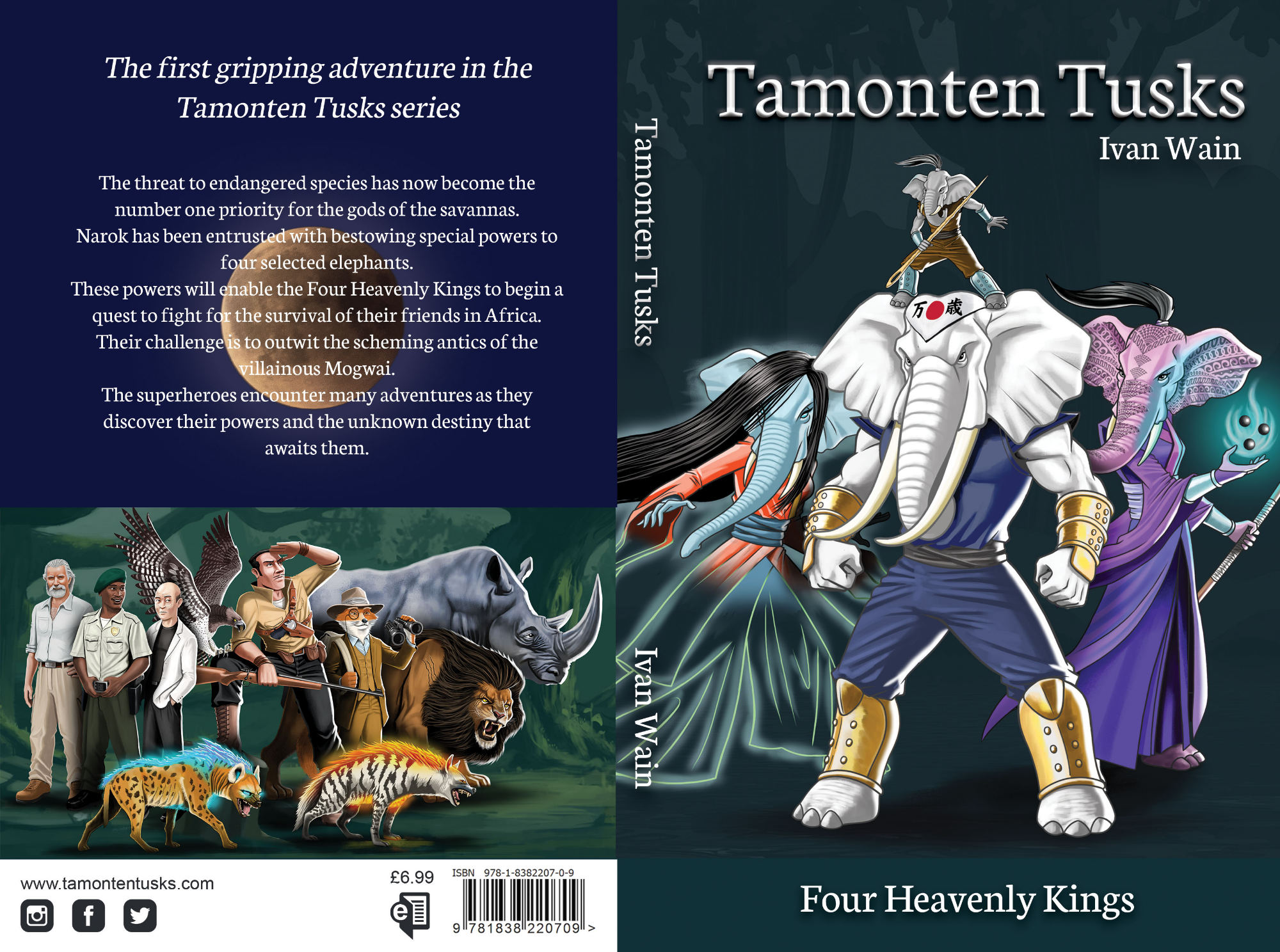
Tamonten Tusks is a fantasy fiction adventure featuring 4 anthropomorphic elephants who are given special powers by one of the gods of the savannas. Their quest is to fight for the survival of endangered species and fulfilling their destiny they encounter many challenges and enemies.
Nathan says:
The artwork is fine for the genre. I think you could improve the layout.
- No need for the tacked-on space at the bottom. No one will be upset if there are words across someone’s shins.
- Use a stronger title font, and make it clear which is the book title and which is the series title.
Here’s a five-minute redo:
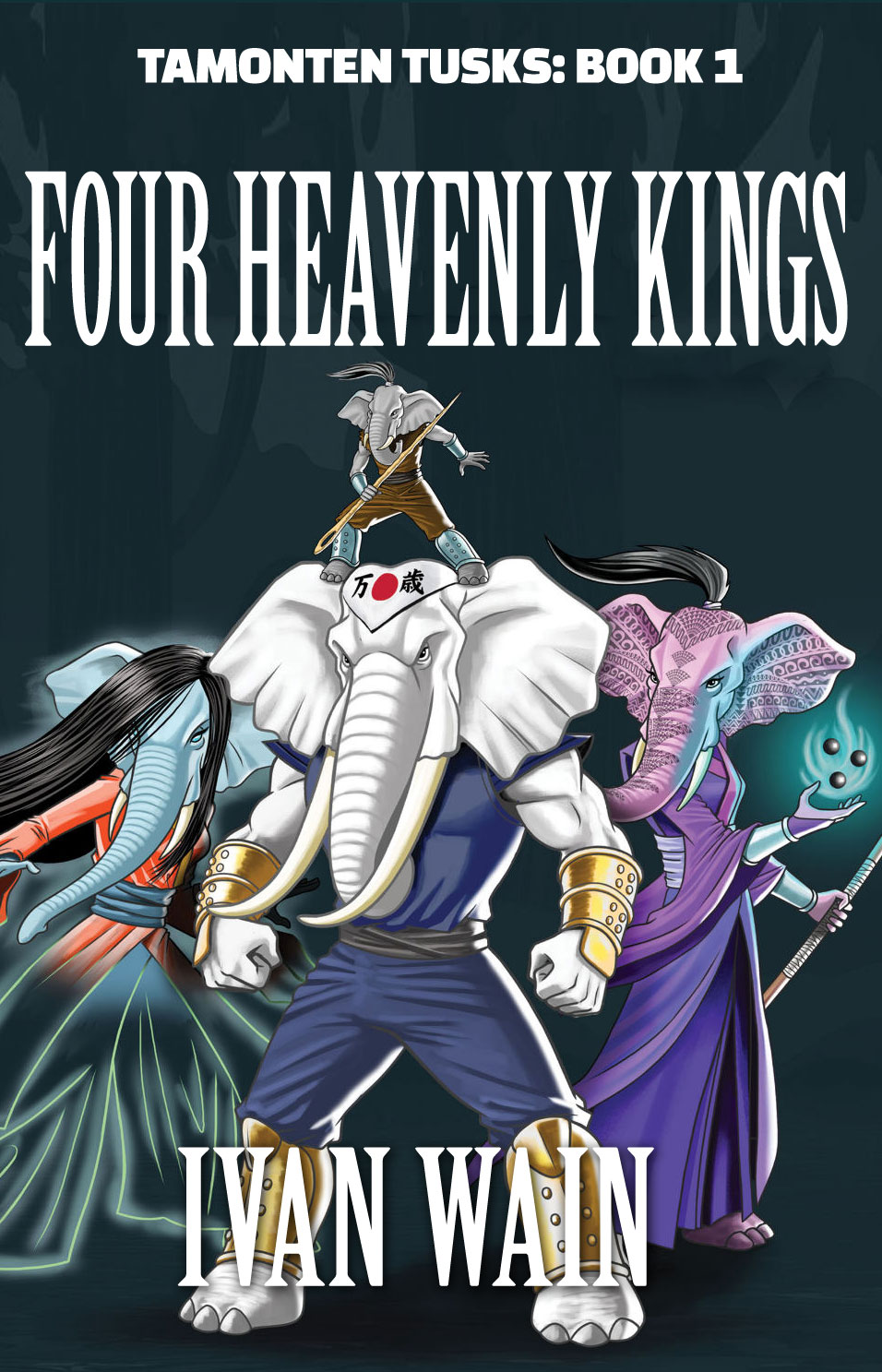 (I’m not happy with my choice of fonts, and maybe the series title should go in the big letters with the book title beneath it, but hey, five minutes.)
Other comments?
I agree with Nathan: the only real problem with the cover is the weak typography.
I might add that the overall background color is a little deadly—especially since it appears to be absolutely flat, with the figures floating over it. It was only after enlarging the image to full screen that I was able to see that the characters are casting shadows and that there is a hint of something in the background behind them. The back cover art works much better in this respect.
I’d recommend taking out the moon on the back,9or moving it) making the back all one color or putting a simple lighter green color(like the green of the sky in the image beneath it). I’d also work on the text placement in that top line to give it some pizzazz.
I’m not against adding to the picture but make it look purposeful by choosing a cool contrasting color and then the text on it. like this.(excuse the incorrect aspect ratio)the gold might be fun to use as the text color. it might be fun to add some rivets to it too like on the gloves and boots.
https://imgur.com/a/MDWl9vt
you could play with the size of the band and switch author name and series info
If your the illustrator you should for sure put your name on this!!(not on the front unless the there are illustrations inside but for sure on the back.)
PS, Ron, you should be proud of me as I resisted adding sparkles and I really wanted to….lol
Bless your little heart! I know it must have been a real temptation!
oh, YEAH, I like that. The pink may not be his cuppa, but overall, VAST improvment and reeks “pro” all over it.
Love this artwork, the elephants? SO cool. I keep wondering if there’s gonna be a “Thunder, Thunder, ThunderTrunks are GO!” moment….mostly, I truly like this. I have the same nits as everyone else, but honestly, this cover is a delight compared to what I’ve seen lately.
I do have one additional comment, about the art. The location of the black hair, on the blue (female?) elephant, on the left, is an optical illusion. It appears to be somehow just flowing off the main, central elephant and I keep thinking that it’s a cape or something–and then I have to look and look again, to see the blue elephant.
IF the artist can, I would suggest moving her head a bit, lower or something, so that the black hair doesn’t look to be somehow “flowing” off the ear of the main white elephant. I can’t explain it better than that, but her location blends her into the background in a not-great (IMHO) way.
You have a good illustration for the genre, but as it is it looks like you’re trying to fit the text into the spaces left over from the drawing. Make sure the typography and the image are a part of the same design, nothing wrong with overlaying text over some of the drawing. I don’t know about the bevel but at least make the title bigger.
The hair on the elephant looks fine to me, as does the background, though I didn’t realize it was a forest until someone else mentioned it.