The author says:
[Note: No new synopsis was submitted, so I assume it’s the same.]
Two strangers both have one thing in common, they lost a partner to death. Brett Miller, a widow with a ten-year-old daughter, has spent the last two years grieving the death of his wife Natasha. The heartbreak and the devastation don’t seem to end, when he loses his job, and his relationship with his daughter continues to disintegrate. He tries to keep everything together, but isn’t sure he has it in him. Victoria Bell’s boyfriend of two years died unexpectedly, leaving her alone to raise their infant daughter. With the help of her sister, she learns to live again. But an unexpected foe from her past puts a wrench in her new beginning and she fears staying in the realm of heartbreak forever. Can Brett and Victoria break free from melancholy?
[original submission and comments here]
Nathan says:
Without a new synopsis, the former criticisms are in play: “How do the stories of Brett and Victoria relate? Is this a romance? Are they neighbors who platonically help each other through their crises? Do they become each other’s arch-nemesis? I’m trying to find the core of the story here and what readers it’s meant to appeal to, because that will matter which way we go on this cover.”
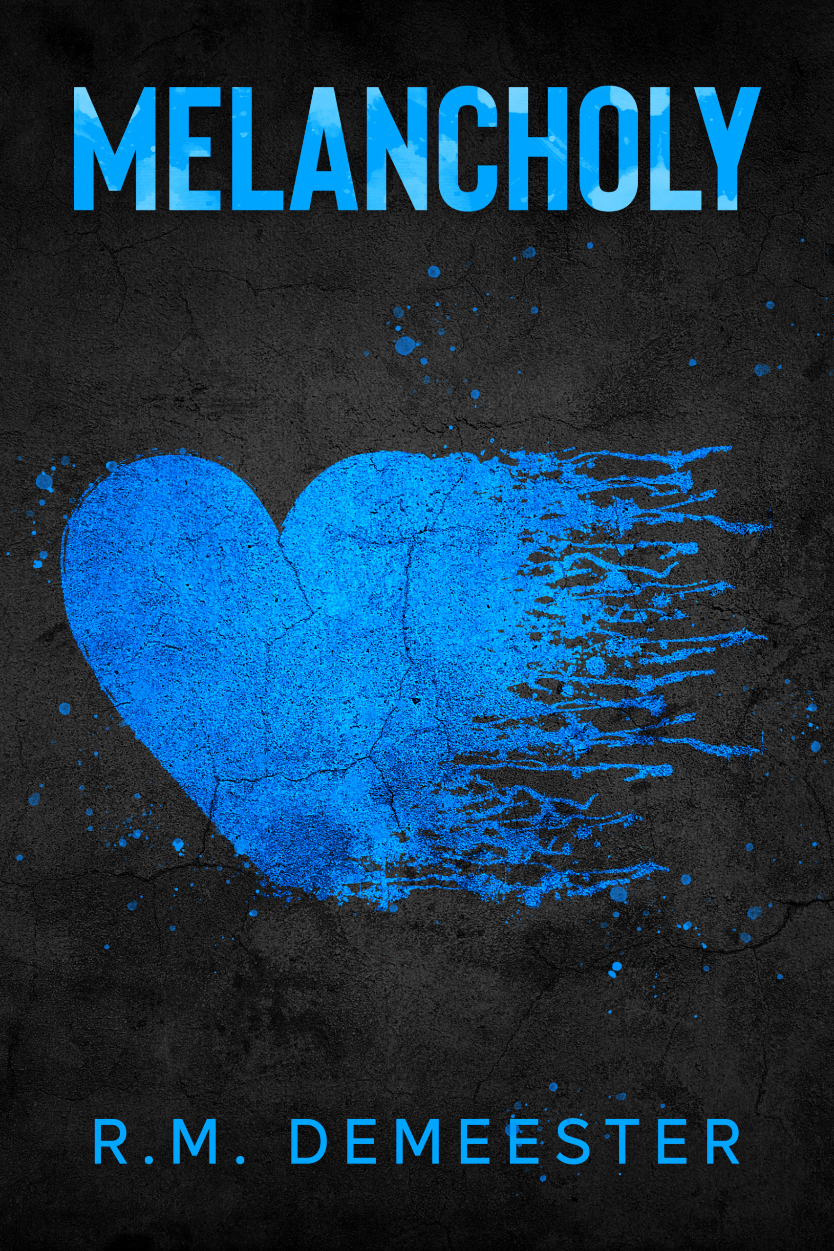
The typography is more professional this time around, but it still tells us NOTHING about the book. The cover could be anything from a collection of poetry to a memoir of depression to…
I agree with Nathan. Other than looking sad, there is really nothing about the cover the suggests the specific nature, theme or subject of the book. The cover needs to be much more focused. It can still be symbolic/minimalist, but needs to convey more about this particular book, what it’s about, what sets it apart, what makes it different.
I think the problem isn’t just the cover, it’s also necessary to change the blurb. The cover and blurb, in most cases, need to complement each other, but all I see is an image that does cause melancholy because of the color scheme but that tells me absolutely nothing about the story. The same happens with the blurb, instead of presenting the central point of the story, it only describes some elements.
What works for me when writing my blurbs is to describe the first two chapters a bit, that is, the setting of the story.
I think that by modifying the blurb you’ll have better ideas for the cover. Good luck.
I don’t mind your cover. I like the blue. I’m not sure you want to do this, but could you add a word to your title. Like Breaking Melencholy. Fighting Melencholy. Trouble and Melencholy. I just feel the title is too sad and does not speak to me. If you are going to find your buyers then add to the title or make the cover more exciting. I know it’s sad, but hopefully there is hope in the end. Maybe call it Hope and Melencholy. I buy it then. Otherwise it may seem too sad for me. I know it’s lit fiction but, a more detailed title may help if you like the cover, which I do.
You know, it’s a shame. I really, genuinely, like that graphic. And I very much like the blue, too, like Kristen. The problem that I see is, just like the first cover, while it’s a great graphic, that heart is your boat anchor, too. (More on that at the end of this comment.)
Damned if that heart tells me anything about the book. Dunno if it’s romance, self-help, LitFic…I just don’t know what to expect here and I don’t think that I’d stop and check. Yes, I like the graphic but…I think without knowing anything else, my hunch would be, when browsing “Romance.” That would be my take and I’d keep going. My secondary hunch would be “LitFic” and ditto.
I wish I had some inspired idea to make it work. I have a question, that might help us all–what’s the category of fiction that this would sell in? If I went to Amazon and was looking to buy this very book–where would I go? If memory serves, this is meant to be LitFic, right? Literary Fiction? LitFic or Women’s Fiction, or..?
As I said about the last submission, then…there’s no “set” cover. No set fonts. No graphics specific to the genre, for lack of a better word for it. When I look at LitFic on Amazon, I see a bunch of other covers that don’t say bupkus, either, about what to expect, so…that being the case, you’re probably fine with it. (Of course, most of those covers either have publishers and agents behind them, or history and impact, like “The Outsiders,” for example, or “1984.”)
The only thing I’ve been able to come up with, at all, (and it ain’t much) would be two darker silhouettes, vaguely shaped, NOT sharp, behind the heart, on opposite sides. Now, the problem with that is, people might assume it’s romance, but…maybe not. It would have to be done just right, to at least say to the prospective audience “two people, broken heart(s).” I don’t know what other symbol you can use, for a story in which the two protags never even meet; they’re simply parallel tales in your fictional universe. Perhaps two cloudy, amorphous dark blue silhouettes that are facing away from each other?
The problem is, no matter what you do, with two people or silhouettes and a heart…the assumption is always going to be romance. That’s the challenge. And damned if I see how to overcome that. That broken or shredded heart will definitely tie them together, visually. That’s why I said, I like the graphic–but it’s your boat anchor. I don’t see what you can do that won’t scream “romance!” to the prospective audience, even if you don’t add silhouettes to the cover.
Sorry, wish I had something better for you. I really do.