The author says:
Rogue 13 is a contemporary fiction novel set in Las Vegas Nevada. It is targeted for adult readers with an affinity for action romance thrillers. An FBI agent on an undercover operation is sold out exposing her op, blowing her cover, and leaving her at the mercy of the dangerous individuals she has been investigating. A former black-ops agent the intelligence world believes was neutralized long ago immerges from the safety of his obscurity to aid her escape. Labeled as a rogue agent with her own agenda by her superiors, and falling into the crosshairs of the intelligence underworld, the two unite their unique skillsets in a fight to clear their names amongst a world intent on silencing them.
Nathan says:
My usual aim with submitted covers is “keep them from embarrassing themselves.” I don’t think this is an embarrassing cover, but at best it’s completely unremarkable. If it were handed to me at this stage, I’d try a series of tweaks:
- The typeface isn’t very strong, especially for thrillers. I’d play with a thicker, taller font and see how much I can edge it behind the heads while still being readable.
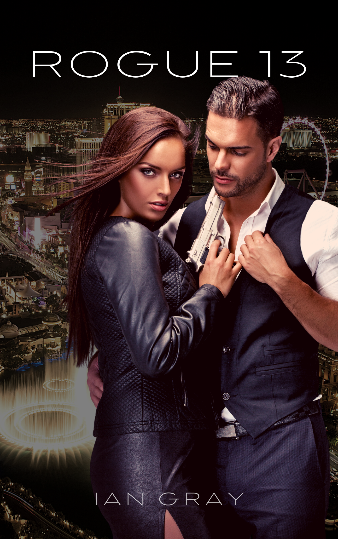
- The foreground color scheme is awfully warm. I’d play with different tints and levels of contrast until I got something that said “danger.”
- Speaking of danger, the only dangerous part is the gun, which vanishes at thumbnail size. I’d pay special attention when playing with the color above that I made the gun stand out.
Other comments?
One of the things a cover needs to do is set its book apart from all of the others on the same page or same shelf. Does this cover do that? I don’t think so.
Another thing it struggles to do is suggest anything about what this book’s theme, subject or idea is. While there is a hint of spies, crime or some such thing, it is much too generic and much too vague. You need to zero in a little more.
Nathan is perfectly correct in saying that a real week point is the typography. It is not only weak, it is tucked into the top and bottom of the cover like an afterthought.
The background simply looks vague, murky and grey…and contributes nothing at all to the cover. I would imagine that the intention was to suggest the Los Vegas setting…but I think only a resident would recognize it…and even then only after scrutinizing the cover carefully. Since you make a point of the book’s setting you might want to consider making it a more important part of the cover.
Speaking of danger, the position of the gun directly under the guy’s chin looks pretty precarious…especially since she has her finger on the trigger (something a real FBI agent would be careful to not do).
As someone who shoots and who served in the military, in intelligence, as it happens, that stance with the weapon would put me off picking it up. I’m not trying to be mean-spirited when I say it SCREAMS “no research here!” Now..it may not be fair to judge the book(‘s research) by the cover, but, there you go. Nobody who’s ever handled a weapon, outside of the clowns in Hollyweird, would ever stand like that. It’s simply not done. It’s not cool and it’s damned sure not safe.
And no..it doesn’t imply that this couple is “too hot to handle,” which is a retort I received when I said something similar to another author with a similarly-posed cover.
Is there another pose with these two that could replace what’s here?
I’d also agree with Ron’s comment that the text looks like an afterthought. I’d reduce the size of the couple, show more immediately-recognizable LV landmarks and find a better location for the titling text and byline. In thumbnail, it simply looks like your basic contemporary romance.
Ron,
Thank you so much for your insight and feedback! A couple quick follow up questions if you would be gracious enough:
1. When I’ve used larger typefaces it separates the title and puts Rogue above 13, as a reader would this look bad, or detract from the cover?
2. For the genre I’m targeting, Would a better pose from the models be suitable, or would it be better to abandon the models for silhouettes and imagery i.e the russian by james patterson
Again, thank you so much for offering your time and insight!
Uh, yeah… no. First, that couple looks to be rendered, albeit better than most of the rendered characters who get the “pseudohumans” tag over on Lousy Book Covers. Second, other than the appalling disregard for gun safety rules, their pose is awfully generic and unremarkable for a cloak-and-dagger spy novel. Third, that is absolutely no way to hold a gun while embracing a guy if you aren’t secretly being paid to kill him and imminently intending to splatter his brains all over the ceiling.
Cliched as it may be, if you want a little pizzazz to your cover, I recommend going with a “Sean Connery Is About To Shoot You” pose on your cover instead. If you want to keep the romantic angle in your cover image, be aware there’s also a version of that pose for couples; and though the example shown at the link I just gave you has the guy pointing the gun (while the gal swoons in his arm), there’s no reason why it couldn’t be the gal doing so instead. Throw in some better lettering as per the advice of Hitch and Miller here, and you should be good to go.
RK,
Thank you so much for your advice and insight!
I did not really think about it when i first saw the cover, but after reading the comments the position of the gun is not a good one. Even if you had it holstered at the side with her hand on it, it may speak volumes. I like the characters, but feel maybe the background could be more brighter or colorful, like the lights at night in Vegas more. Maybe fool with vibrance or hue saturation on your Photoshop for the back layer or background. You can add red or blue with the sliders as a highlight. Also if you don’t want to change the background, maybe have her wearing a maroon jacket. It’s called contrast in Graphic Design Terms. You can change it with I think the hue saturation or vibrance slider if you first make a selection around the jacket, so you don’t have to change the picture. It seems like the background and the foreground are too similar in tone. I like the couple together. You may be able to photoshop the gun out of her hands as well and put it in a holster on her hip with her hand on it. Maybe make the gun big. Also you can ask your illustrator to color over the gun and add to the illustration. The type needs to be a bit more pronounced. Maybe just Bold it. I sort of like the font. A few things to change. Hope this helps. You’ve got some good ideas there.
I should also point out, that if this cover remains with he weapon, you shan’t be able to advertise it on Amazon; the cover won’t meet their anti-weapon stance on advertising.
You can put it on the cover; you simply can’t advertise it with Amazon Marketing Services. Doesn’t matter that they have hundreds of thousands of books that feature weapons, prominently, or that Amazon Prime has tens of thousands of movies that feature gun-toting heroes and heroines, bygod, you can’t advertise that on Amazon, unless…you’re Amazon itself. Then it’s perfectly okay! (sigh).
So, that’s a practical consideration.
Hitch, Thank you so much for taking the time to offer great advice and critique in your responses! I posed the same question in Ron’s post: For the genre I’m targeting: would it be better to abandon the “models” in favor of silhouettes and imagery i.e. the russian by james patterson? Again, thank you so much for offering your time and feedback!
Hi, Ian:
I think that silhouettes–the kind you can typically buy–are pretty problematic. They tend to be exceedingly flat, no movement, no excitement. For some nicer ones that break that mold (of course, custom-done with custom models!), see Bonnie McBird’s Sherlock Holmes Pastiches, starting with Art in the Blood: https://www.amazon.com/Art-Blood-Sherlock-Holmes-Adventure-ebook/dp/B00YGDLAFG/ then Unquiet Spirits: https://www.amazon.com/gp/product/B06XRH1FQ9 and then view books 3+4. (Four has a cover up, it’s a pre-order coming out in about 6 weeks, not that I preordered it or anything, cough cough.)
But what they did her her books, and it really works, is used those older background maps behind them and gave them depth and movement and…more. Just “more” than your usual crappy flat black silhouette.
I particularly like Book 2’s cover. The upcoming Book 4 has two people silhouetted and even though they are not running or fighting, there’s a real feeling of “action” around them. Book 3 uses a weapon (again, don’t miss that whole “Amazon hates guns” thing you got going there…)
If you can afford a decent Fiverr, to do better silhouettes like this, I’d go for it and I’d kerplunk some highly-recognizable LV landmarks behind them–one of the most-recognizable cities in the world. Evne if it’s just that corny cowboy sign…it would convey the idea. I would not use the Ferris Wheel, as that’s easy to confuse, these days, with other cities. Also note the rather clever usage of contrast, throughout.
I hope that helps. I’ve seen some silhouettes, other than these, that are well done, but lord, they are few and far between. I think that the magic is getting just the right silhouette and being very, very VERY bloody clever with the backdrops.
Hi-hi!
I agree the background needs to be brighter and the title & byline need to be taller/bolder so as to be legible in online retailers’ thumbnails. Try Bebas. Also, I liked the targeting crosshairs over the O in ROGUE on your original cover and think it would still work on a tall O, esp. if you faded it (the O not the crosshairs) out from the rest of the word.
I also agree that the woman is dangerously mishandling the weapon, but because this happens a lot (A LOT, SO MUCH) in moves and tv, I believe readers will be more likely to forgive you this, assuming you’ve written it accurately inside. It does currently kind of disappear into the man’s shirt, though.
I’m here to echo the comments about the gun. It would be a pretty poor reflection of her firearm training as an agent to have her finger on the trigger, but that can be probably be forgiven by most readers. The fact that she’s about to spaghetti his brains is less acceptable.
I get that she’s undercover, bu still, she’s FBI, so what about a badge around her neck or on her lower jacket, hip, or waist/belt line? It would make it less generic, if you agree with others statements about that. If we’re talking classic poses, what about back to back, her with the gun, him with crossed arms or similar? If face to face/embracing, the gun could be in a thigh holster, if the shot were zoomed out, but I can see the appeal of keeping them at this distance/size.
If you strike the gun altogether, I think an FBI badge might be THE thing that keeps it clear and less generic, signifying that she’s an agent.
I wouldn’t have thought of the contrast/warmth issues other suggest about the colors, but I get it. I also knew it was Vegas from the description, but agree that I’m not sure it would’ve hit me from just the cover – consider adding color, even though I like the warmth, and maybe add an image of dice, a craps layout/slot wheels in a semi-transparent layer between the couple and the cityscape, or something else Vegas, as long as it’s not IP of a mega-corp who owns Vegas property.
This is the first time I’ve been to this site or ever thought about book covers, so apologies if I’m giving obvious, hackneyed, or ridiculous suggestions. I got sucked into an Internet wormhole and ended up here and find it interesting.
Welcome to CoverCritics, BT! From one of the other folks who was sucked in by the wormhole. 🙂 If you haven’t yet met CC.com’s sister (brother?) site, LousyBookCovers.com , that’s fun too, although not quite as “public service-y.” 🙂
I think the term you’re looking for is “conjoined co-parasitic twin.”
No, I’m pretty sure it was “evil conjoined co-parasitic twin.” Yes, yes, that sounds like it.
(@BT Bryant: this site, CC.com, is where we all come to repent our sins and do penance, after enjoying LousyBookCovers.com . It’s how we make contrition.)
H