Cooties

The author says:

OK, so this is a pretty standard plot for a romantic comedy: schoolboy meets schoolgirl, schoolgirl likes schoolboy, schoolboy likes her back. Romance ensues, but they face some major hurdles to their getting together, as not everybody around them at their school and at home approves of their relationship. Will their love be able to overcome these obstacles, or was it never meant to be?

Twist: uh, did I mention these schoolkids are ELEMENTARY schoolkids, or that they’re, like, ten? (“But going on eleven!” they’ll tell anyone who looks askance at them and asks just how old they are when they say they’re dating.)

Target audience: anyone who likes “puppy love” romantic comedies like Melody (1971) or Little Manhattan (2005) or Moonrise Kingdom (2012).

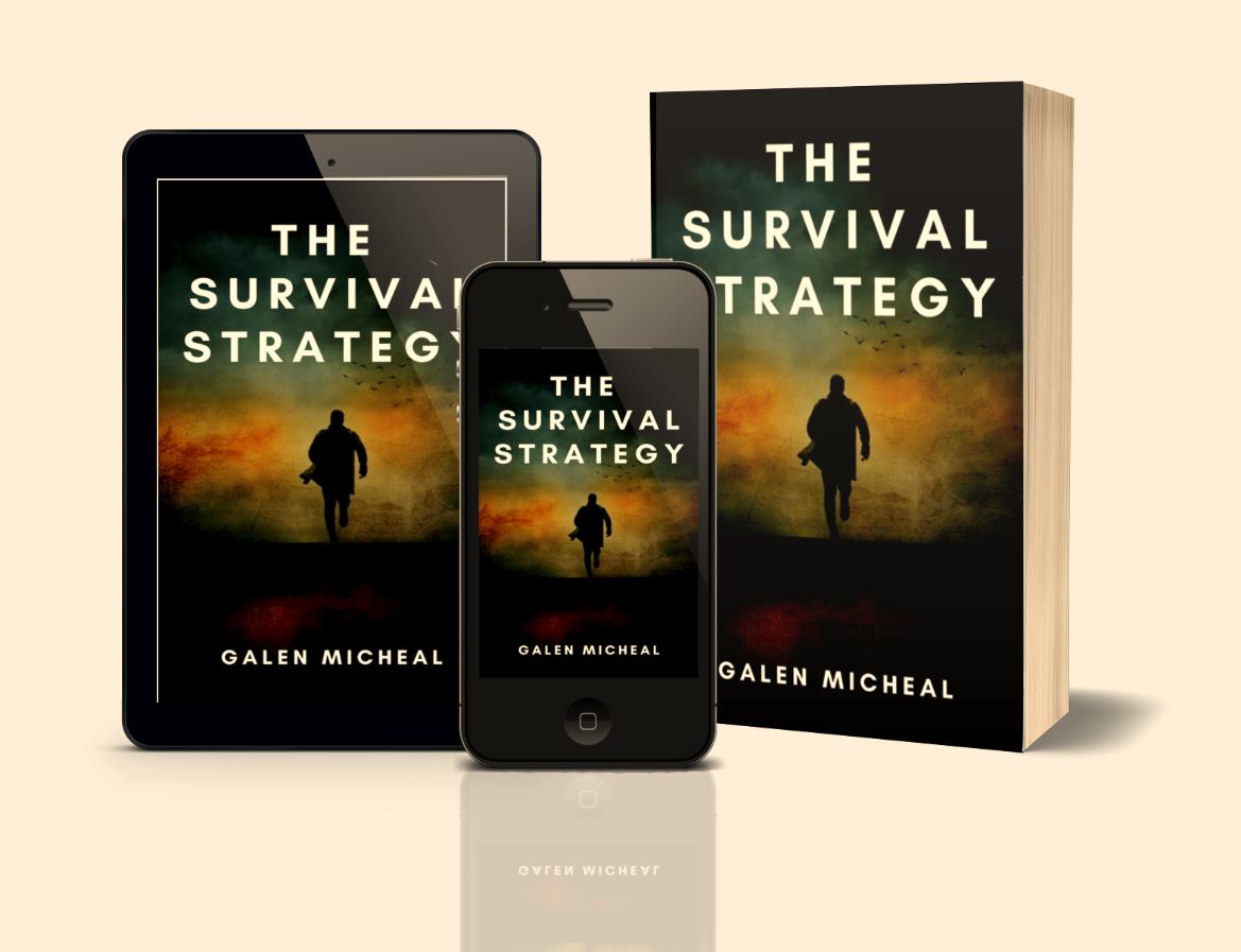
Title: I’m tentatively going with “Cooties” for now, though I’m open to suggestions. You may notice I haven’t put this title or my byline on the cover yet, and the art’s a bit rough.

Explanation: this being a first draft, I haven’t actually spent any money on higher-resolution copies of the stock images I used here yet. As for the title and byline, I’m not quite sure what kind of lettering to use: see, I’m pitching this sort of like I would if it were a Y.A. romance, but the story’s a bit more mature (as in, it would probably get a PG-13 rating if it were a movie) and a lot longer (as in, slightly upward of 100,000 words) and more in-depth than any Y.A. novel typically would be. In short, this is only a rough draft, and I need some advice on how to refine and caption it.

Nathan says:

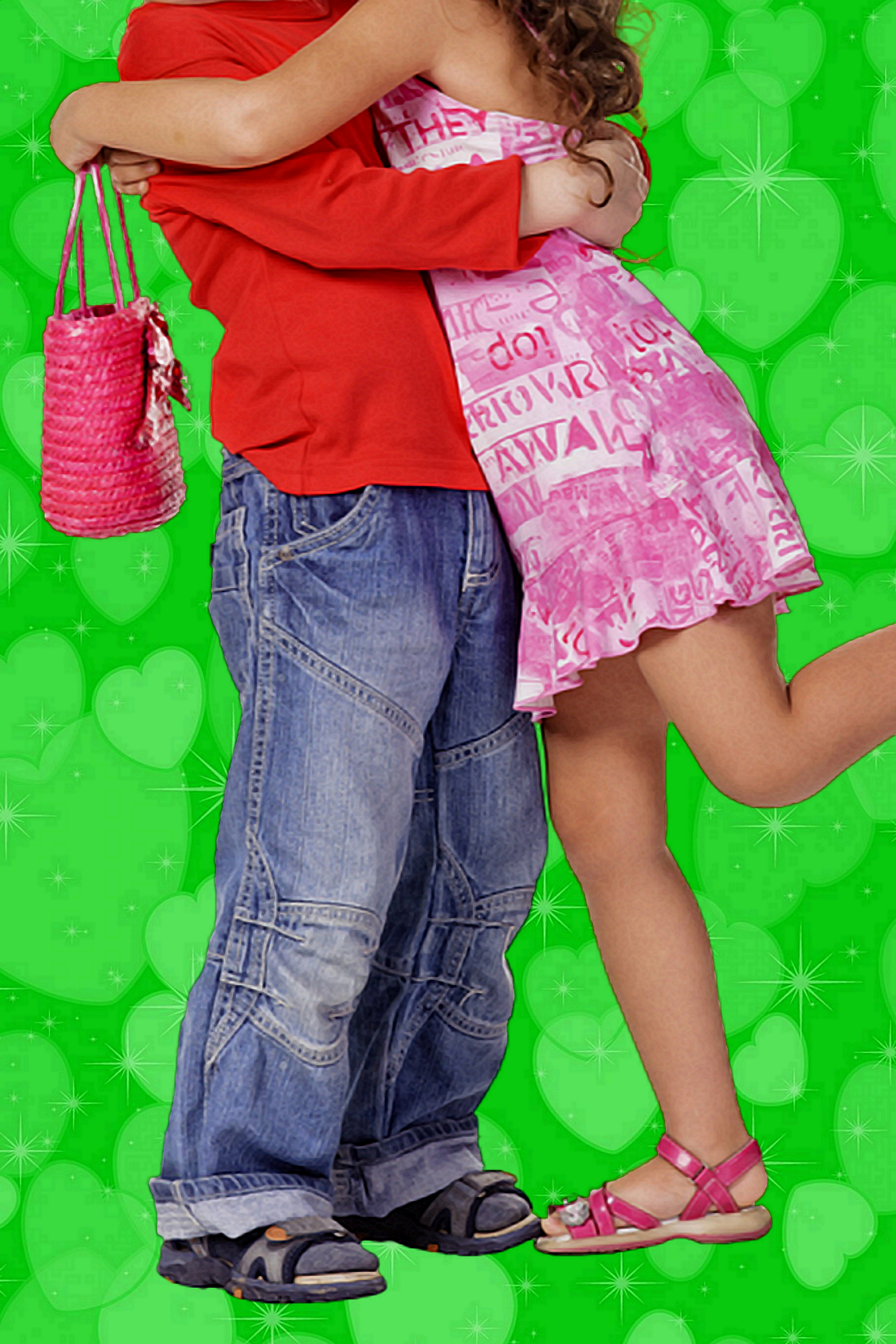
Showing people in an embrace — especially headless people, which takes away most age identifiers — is definitely going to hit the WRONG audience for this.  I didn’t catch the age of the cover models until I read your description and then went back, looking for cues, which is the wrong way for a cover to function.

You’re definitely going to have trouble finding the right image for this book, because it’s got to portray preteen protagonists without giving the impression that it’s for a preteen audience.  And “preteen romance” isn’t exactly something that stock photo banks specialize in.  My first idea was of a preteen boy and girl sitting at a lunchroom table, with their heads facing straight ahead, but with sidelong glances and subtle smiles…
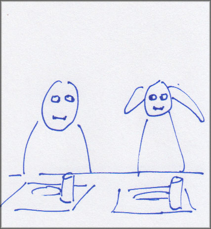
(I R ARTIST!)

…but that may still give too much of a middle-grade-audience vibe.

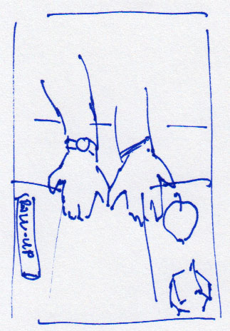
My related second idea is, I think, a little less obvious, and thus a little less likely to seem aimed at a middle-grade audience.  Two lunch trays (with apples, drinking boxes, whatever conveys a grade-school cafeteria) and between them a boy’s hand and a girl’s hand, with their pinkies reaching out to each other:

But again, these are off-the-cuff ideas. I think your best bet is to sit down with someone who understands cover design from a marketing perspective and figure out how to convey a grade-school romance without attracting a grade-school audience.

Other comments?

Indescribable Ordeal

The author says:

Non-fiction history of the German 65th Infantry Division. A standard divisional-level history, in English, of a World War II German formation that served in Netherlands, France and Belgium as coastal defence, and in combat in Italy throughout the Italian Campaign. The division is not well known, definitely *not* one of the elite formations of the war, and suffered heavy losses throughout its combat career at the Sangro, Anzio, the Gothic Line, and the retreat over the Po where it was finally destroyed. Nicknamed the “hand grenade division” after its distinctive vehicle insignia.

Nathan says:

I think you’ve got the makings of a workable cover here.  Here’s what I would do:

  • Crop out the unused border space.
  • Take out that scribbled-over texture on the photo; it only obscures and doesn’t add anything. In fact, I’d experiment with putting over the plain gray-green background instead.  And make the photo “pop” more with lighter highlights.
  • There’s no reason for the byline to be the smallest text on the cover. There’s also no reason to italicize it.
  • I don’t think that the “title flush left, subtitle flush right, byline centered” scheme works.  Just put the byline flush right under the subtitle, with just enough space between to separate them.

Other comments?

Flames of Lethe [resubmit]

The author says:

Hell let her go…but not all the way. And each time Jo falls asleep, it drags her back to be consumed by creatures of the dark. [Sequel to Flames of Lethe & 2nd of planned trilogy]

Setting: earth & hell

Time: present day

Genre: dark fantasy-romance

Target audience: fantasy & paranormal romance readers

As before, I created this cover using Canva & stock images. Please rip it apart and tell me everything wrong with it! Thank you all!!

[original submission and comments here]

Nathan says:

Like the first submission, I think this is very good.  However, it is no better than the original submission — just different. And it doesn’t look like any of the changes made were to address issues brought up by commenters the first time.

  • There might be just a smidge more indication of the romance that you originally mentioned in the story description in the medallion, but I think you have to be looking for it; I would guess that most people, when seeing someone “embraced by death,” think of it as a common metaphor, rather than an indication of romance.
  • The handwriting font at the bottom is still the same font — the words have changed, but the problem remains that the font both (a) clashes with the style of the rest of the cover and (b) is hard to read against a busy backdrop.
  • The same grunge elements on either side of “Lethe” still make it hard to read, especially at thumbnail size.

By and large, I’d have to call this a lateral move rather than an improvement.

Other comments?

Vanguard and the Bloody Bones

The author says:

Jack Sinclair can lift a car, but what good does that do him? He doesn’t have any _real_ powers like the League of Order downtown, so he figures it’s best he keeps his head down and pretends he’s not a superhuman. But then a supervillain called Bloody Bones attacks his high school and he has to step up and protect his friends.

Vanguard and the Bloody Bones is the story of a young, modern-day Bronx kid who lives in a world where superhumans are real, and heroes and villains battle over the fate of the world. Jack only survives his fight with Bloody Bones because another group of high school students teleport in and defeat the threat for him. These kids are from The School, the premier training facility for young superheroes. They recruit Jack to join them at The School, setting him on the path to becoming a hero called Vanguard.

Vanguard and the Bloody Bones is the first novel in an eight-book series called Becoming Vanguard. The series is Young Adult, dealing with Jack’s years in high school, and is meant to appeal to kids of about the same age.

Nathan says:

Hmm. The first thing that jumped out at me was the shadowless face under the helmet, compared to the heavy shadow defining the body.

The second thing that jumped out at me — and boy, was the jump strong! — was the odd shape of his upper legs.

Beyond those, I think that there’s this unexamined instinct to put the entire human figure on the cover, when a cropped-down version might work better. If the image were reduced to this…

…you could put the title across the (problematic) legs, not lose any important details, and have a cover that conveyed more information in thumbnail.

Other comments?

Kuffar

The author says:

The army seals off a village in the night, and disappears the inhabitants. A factory fire begins to spread a radioactive cloud. As the first UK ISIS cell spreads destruction, DCI Strange must stop them before London is contaminated—and at the same time, rescue his girl from the clutches of Sheikh Maulan.

Nathan says:

Is it a graphic novel? Because the assumption of 99% of the people who see this cover will be that it’s a graphic novel.