The author says:
It’s a dystopian thriller set in the near future. It’s action-packed, and fast-paced. It’s similar to books like The Hunger Games, The Maze Runner, Gone, Uglies, Divergent..etc. The title, “The Survival Strategy” is a working title. I’m not positive I will keep it. I’m also considering Fight or Flight as a title, because it seems fitting to the story, and the cover. All thoughts are welcome!
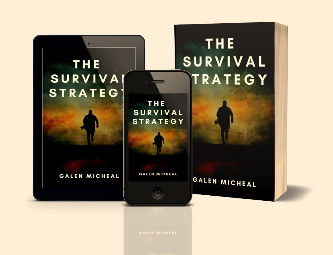
Nathan says:
It’s a well made cover, but my first guess was that it was a spy thriller. (Something about silhouettes of men wearing trenchcoats…) I don’t know what kind of dystopia we’re talking about — cyberpunk urban, post-apocalyptic, etc. — but a hint of that would go a long way. Even just adding some pure green glows will give it more of a futuristic vibe. And have you tried a distressed typeface?
Other comments?
I agree with Nathan. The cover is certainly competently done…but it doesn’t really convey any sense of what sort of book this is or what it might be about. I am afraid that the only suggestion I can think of is that you may want to reconsider the cover image from scratch.
My immediate first impression was an investment guide.
I echo the distressed typeface sentiment as it would go a long way to redirect the potential reader’s mind toward fiction.
I don;t mind the cover image, but the presence of birds doesn’t suggest dystopian. It could also use one or two cues regarding the setting. Perhaps a warning sign not unlike those depicting the Prawns in District 9.
Presenting it as books also makes it more difficult to manipulate to offer examples. You’re here for critique and feedback, not to sell us your book.
The good news first: the work is very competent and clearly you have the skills to put together a cover that looks professional.
It’s also great that you’re thinking about this design is going to work across different formats. Many non-designers don’t think of this, and its important. Book designs now have to exist in lots of effective formats – the Audible edition, the social media graphic, the Amazon thumbnail etc.
In those ways you’re on the right track, but not in the choices on the cover itself I’m afraid.
You’ve given a list of books yours is similar to: The Hunger Games, The Maze Runner, Gone, Uglies, Divergent. This is set whose shared defining characteristics are:
1. They are YA
2. They are all about their own very particular high-concept dystopia. The Hunger Games is about a world where teens must battle to the death for sport; Gone about a world where all the adults have died and it’s kids only etc.
That’s not the only way to do dystopia but it’s the way all these books do dystopia so I must assume yours does too. Based on your list of ‘similars’, yours must be a YA book and feature a society or situation defined by a single, striking concept.
So… what’s your premise?
Because that’s got to be where you draw cover and indeed title from, for success in capturing the attention of the right readers.
If you look back through that list you’ll note that each title really encapsulates that book’s central unique ‘thing’ quite clearly and pithily.
You read the title ‘The Hunger Games’ and it immediately conjures up an idea of a deadly, high-stakes competition in a setting where people’s basic needs aren’t being met. ‘Uglies’ instantly gets across the idea of a setting where people are defined by – and condemned by – their looks. ‘Gone’ gives less away is but pins the central big fact of the universe at hand: something really important is ‘gone’.
As for your own book, you have suggested two titles and neither of them contain any strong indication of a premise. They are titles that could be used for any thriller. ‘The Survival Strategy’ is the better of the two in that it’s a phrase that builds a slightly more specific picture of a situation. ‘Flight or Fight’ could refer to almost anything. But really neither title gives enough clues to content to intrigue.
There’s a million books in print that could reasonably be called ‘The Survival Strategy’, so there’s no particular impetus to pick that book up. But if I see a title like ‘The Hunger Games’ I want to know more.
The same really goes for your cover. You have an image that would fit absolutely any action thriller.
But the starting point is nailing the title, because all covers start from the title. When a designer approaches a cover they start by considering the title and what clues it is already packing. Then they can start thinking of how imagery can play off the title to make the whole package ever more intriguing and possessed of its own identity.
This is kind of repeating what others have already said, but just to give my two cents: on first impressions, the cover looks professional but really bland. Even the typeface is generic, if professional. In other words, if I was scrolling through the billions of books on Amazon and this was in the list, there is nothing that would make me slow down. But I like the minimalist idea, the simplicity, it’s clear and easy to read, looks good across different devices, etc.
Yeah, I think overall, as did Joey, I’m simply repeating what everyone else said. Workmanlike cover, unexciting and I agree strongly with Kata–without a better title, I think this one is DOA. Sorry to speak so bluntly, but there’s nothing about your existing or proposed title that tells anyone what they’re looking at, or what they may be looking at.
I’d sit down, think about what is unique about my Dystopian future and then fashion a title around that. Once you have that nailed, I suspect a clearer, more suitable cover idea will come to you.
Sorry I don’t have more. I will say, it would be hard to be more vanilla than that font.