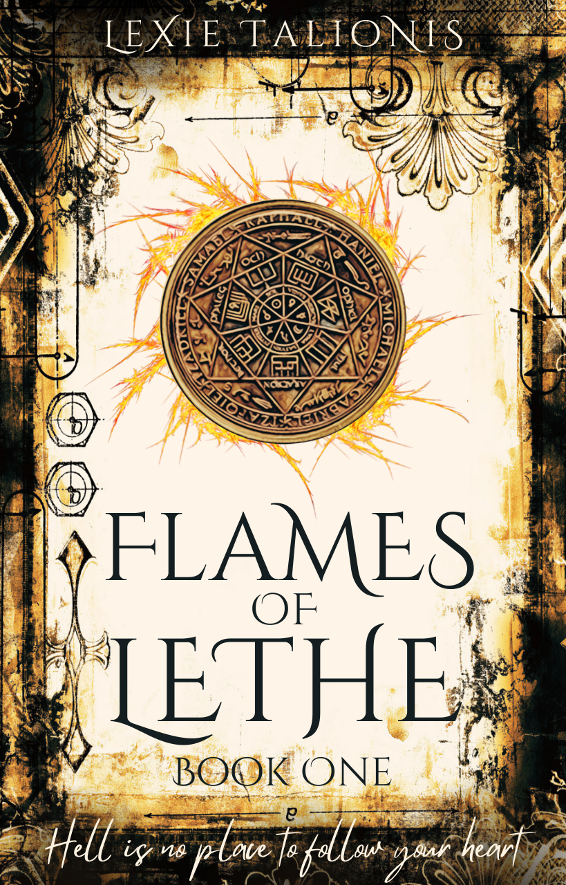
The author says:
In a hell world where memories have disappeared, a young woman must rely on two very different men for her survival, little knowing one man already destroyed her.
Setting: hell / purgatory (the characters aren’t sure)
Time: present day
Genre: fantasy-romance
Target audience: fantasy & paranormal romance readers
I created this cover using Canva’s stock images, & please rip it apart and tell me everything wrong with it.
Nathan says:
Quite good. I have a couple of technical quibbles — you should clear some of the grunge and ornamentation crowding “Lethe” to make it easier to read, and that handwriting font at the bottom has GOT to go.
My biggest concern, though, is that the cover doesn’t give any indication of romance. Even just adding a gray male-and-female silhouette embracing behind the sigil in the top center might be enough. (You may have to pull back further on the grunge and ornamentation to make it work.)
Other comments?
Pretty nice! Probably the only thing that strikes me right away is how extremely busy the cover is. Fortunately, none of that really gets in the way of the main elements of the cover. I would nudge the title up a little so that there is less space between it and the round sigil. This will give the title a little more breathing room between it and the bottom of the frame. You could then also move “Book One” up, too. I am not too crazy about seeing your name tucked up into the top margin and the tagline, aside from being in a completely anomalous typeface, is almost totally lost. So I think that, overall, what you need to work on most is the layout and placement of the various visual elements.
Thank you! I’ve reworked it and posted the latest updated version on my website. I still have my name at the top and I still just love the scribbled tagline, even though I do see the problems with it. I just haven’t liked the placement better anywhere else.
Might nesting the burning wheel inside a heart, or the wheel inside a flame filled heart, do the trick for romance and hell?
Mostly, I like it. I agree with Nathan–the grungey bits at the bottom, around LETHE, make it far less readable. It makes me think, at thumbnail, that it says “LETHEL” or the like.
I agree that it’s not saying romance to me at all. I would also note that it doesn’t really say fantasy to me, either; if the author is known, in her genre, then great. If she’s not…then you may want to at least add a heart (as Kristopher F Grows said) or something like that. I tried to think of a way to use the “o” in “of” as a heart icon or the like, but it’s just too, too trite and corny. I do agree that if the medallion being crispy-clear isn’t required, a heart filled with flames, holding the medallion, might do it for romance.
Sorry, I don’t really have much else. It’s a skoosh monochromatic, but it has enough contrast, I think, to offset that.
Overall, I would NEVER have guessed Canva, I’ll say that! Remarkable job with it.
Great font work except for the very bottom part, which for me is the problem: without reading that, I had no idea of what the book was about. Romance never occurred to me. The title appears to be unique which is great. I have no idea what Lethe means so I looked it up: “In Greek mythology, the Lethe was one of the five rivers of the underworld of Hades.” ‘Flames’ and ‘river’ … hmm. Considering you made this yourself I’m impressed.
All right, I can… sorta… see an indication of fantasy in that vaguely occult-looking heptagram (though it’s not so easily spotted at thumbnail size, mind you) there in the center of the cover, but romance? My guess would have been that this was one of those A Song of Ice & Fire imitations. To be sure, there’s doubtless some romance amid all the sex and violence in George R.R. Martin’s medieval encyclopedia/dungeon master’s guide/porno, but that’s definitely not its primary genre.
If you want to attract those paranormal romance readers, you’ve pretty much got to show something more than the grunge and vaguely occult symbols of dark fantasy on your cover. I’m not saying you necessarily have to lighten the mood—a passionate romance developing in a dark fantasy setting might actually be a kinda refreshingly innovative blend of genres—but you definitely need some more hearts or flowers or romantic symbolism like that on your cover at the very least. If you want to keep the mood dark, I’d recommend going with a black-and-fiery-reddish-orange color scheme instead of the yellowed-parchment-and-antiqued-bronze one you’ve got now; think “Valentine’s Day in Hell” and let that idea guide your use of ornamentation and symbolism in your cover design.
Here’s my five-minute revision.
See what I mean? Flowers, hearts, fire, and that vaguely occult-looking symbol at the middle speak of dark fantasy and romance in a flaming Hell. (I probably could have done a slightly better job vertically centering that symbol, but… as I say, five-minute revision.)
It really depends on marketplace. If you were planning to sell on Amazon etc I’d advise that this cover is very competent but not going to work hard enough / signal its content and genre enough to catch those readers.
But is that the forum we’re talking? If you’re publishing to Wattpad there’s different priorities. I.e. the marketplace of Wattpad is, I guess, already people who understand they’re in the place for romance so maybe you don’t need to signal that part hard.
One point that stands either way is that this cover would be immediately improved by introducing some colour outside the sepia range. It looks dull and uninviting, with no liveliness if it’s all in the same range.
You can also use colour as a quick way to better indicate specific vibe. If you look at these variations each gives a slightly different sense of the book: https://www.kathrynrosamiller.com/post/cover-advice-flames-of-lethe
You guys are awesome. Thank you for the wonderful advice! I tried to incorporate a lot of it, but I’m still keeping my tagline. Lol. Sorry, I just love the scribbled look, and even if people can’t read it at first glance, I think they will stop for a closer look. And I just didn’t like it placed anywhere else.
You can see my updated version if interested on my website here: https://www.lexietalionis.com
Thank you again!!!