The author says:
First Kyss is a paranormal romance featuring wolf shifters, magic, and Norse mythology.It is set in modern day Missoula, Montana with trips across the Rainbow Bridge to Asgard. My target audience are readers who love paranormal romance, particularly wolf shifter romance. It would appeal to readers of Nalini Singh’s Psy-Changeling series and Maria Vale’s The Legend Of All Wolves series.
Nathan says:
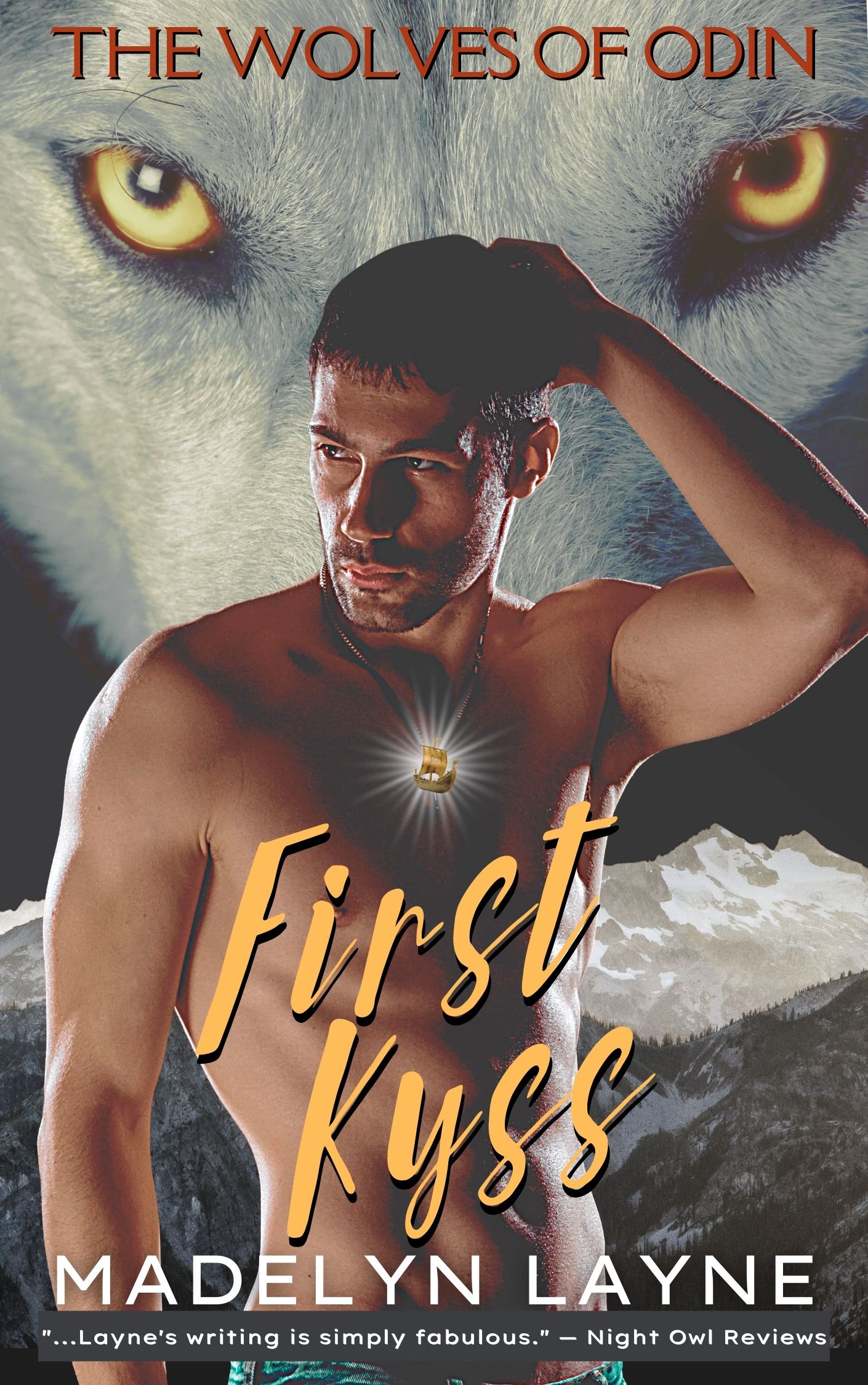
Well, it certainly hits all the bases for the genre — a quarter-second is all it takes to identify it as paranormal romance involving werewolves.
Two technical things stand out to me:
- The glow on the medallion is very artificial-looking. It might be beyond the skills of your designer to add reflected highlights on the pecs beneath, but even breaking up the regularity of the glowing beams would help a lot.
- It seems oddly muted, as if you purposely pulled back on the contrast. I would say, go the other direction. Punch it!
Other comments?
Does what it says on the tin. I agree with Nathan about the contrast, and personally I’d adjust the bar at the bottom containing the review and make it stretch beyond the ends of the writing. Also, you can cut the ‘…’ opening the quote.
The genre isn’t really one with which I have a lot of familiarity–either of them. Romance or shifter-romance, but it certainly appears to tick all the boxes.
What I will say is that the text badly needs kerning and tracking; I would track “THE WOLVES OF ODIN” wider, to give it more impact and gravitas. I would kern the byline (MADELYN LAYNE) so that the Y stops hard-shouldering everything on both sides of it inside both names. The cover designer should be paying a bit more attention to typography.
If Ash Adler, above, is saying “lose the quote,” I concur. I don’t think it’s doing anything for the cover, really and it’s useless until you’re up close with it. By that time, by the time someone gets close enough to read it, the cover’s already done its job–lured someone to click and come to the sales page, so the quote is superfluous to the purpose. Excess to requirements, as the Brits say.
And lastly, ditto on the contrast. I don’t understand why everything was muted, UNLESS one of the pieces of art came that way and there’s not much choice. I would certainly amp up the title’s brightness, fersure, if naught else.
“Lose the review” – Me.
Can’t read the title at thumbnail size.
The color is washed out.
the overall image is washed out.
The “glow” doesn’t work.
I would locate the dude lower in the image and place the title on a single line using a readable typeface that fills the space.
Increase the color saturation and bump up the contrast to crush the blacks a bit.
Remove the supernova glow and have the ship pendant itself be brighter, giving off a subtle glow of the same color, gently illuminating the dude where it rests.
I didn’t know wolf-shifter romance was a genre now, but I guess I should have. A couple things I notice:
The dark grey background behind the review looks amateur. I understand you were trying to make it stand out with the background, but I’d try to do it a different way. Same with the medallion, you artificially darkened the guy’s chest to make the glow stand out, but a glowing light should make his chest brighter not darker. My advice is, rather than manipulating the original image to fit the components you’re adding to it, figure out how to make the components stand out without manipulating the original drawing much (or at least do it more subtlety).
Nice how you make the title color match the eyes, but I can’t read it in the thumbnail. Make it big and bold.